In this blog post

It seems that cart abandonment is a nightmare for many online stores. Sales Cycle shows that the average cart abandonment rate is between 89 and 73 per cent depending on the industry. Even if your Shopify store fits that statistic, it doesn’t mean that you can stop reading. There are methods to reduce the number of incomplete purchases in your online store, and we will show you them.
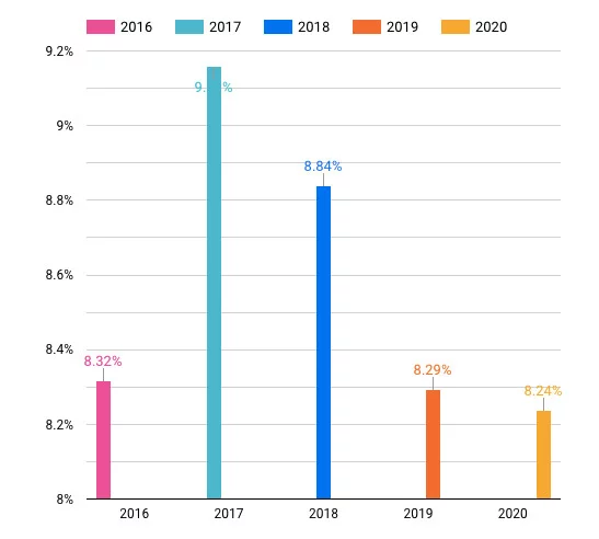
As a Shopify client, you have automatic cart abandonment emails available at your store. That’s a huge help in getting online shoppers back to your store. Yet, emails may not be enough. Data tells us that sending a recovery email campaign recaptures around 8 per cent of customers (see below the graph with Cart Abandonment Email Conversion Rates: 2016-2020). That’s why it’s important to learn why customers are leaving online stores without making the purchase, and then, fix them.
What are the most common reasons for cart abandonment?
Before you can do anything to boost cart recovery in your Shopify store, let’s see what are the reasons why shoppers leave their online shopping carts. The most cited – and recent – study on the topic is done by Baymard.
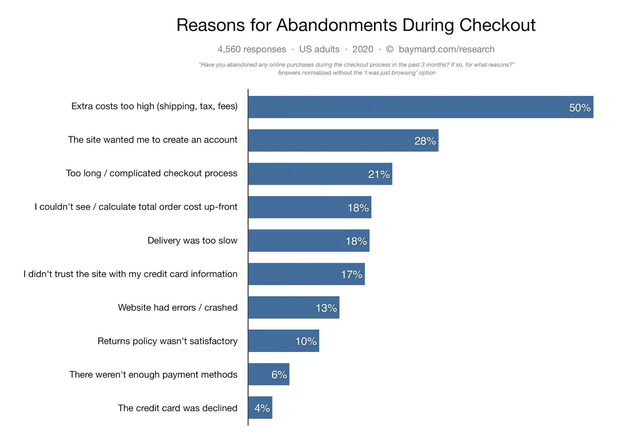
You can see the most frequent responses on the graph above. We decided to group them in terms of four areas, that is:
- information clarity (extra costs too high, I couldn’t see/calculate total order cost up-front, return’s policy wasn’t satisfactory, I didn’t trust the site with my credit card information)
- service (there weren’t enough payment methods, delivery was too slow)
- UX design (the site wanted me to create an account, too long/complicated checkout process)
- site’s performance (website had errors/crashed)
The first is information clarity. The information regarding costs, return policy, and the like is either presented too late in the buying process or it’s not satisfactory for the buyer. What’s more, 17% of customers left their carts because they didn’t trust a website. The reasons for that may be plentiful, but let’s say that the online store that they visited seemed to be unsafe for what they could tell by their visit.
Another area is service. By working with a different payment provider or carrier service, a shop owner can quickly get rid of that issue. The next one – UX design – is concerned with the kind of experience a user has with our store. Is it simple enough for the user to make a purchase? Is there any step that blocks them from completing the task? Are they forced to do something which isn’t necessary like the mentioned account registration? All of those things are UX design problems.
The fourth area of customer’s concerns with the site is its performance. Shopify has a great performance by default. Apps, however, can lower the performance of the site. If that’s your issue, we can help you optimize your Shopify store performance. Just leave us a message in the contact form.
Cart abandonment can be result of lack of features
Those four areas – information clarity, service, UX design, and site’s performance – are by no means exclusive. Still, some customers are just browsing through the online store (as much as 46% admit that they were just browsing) while others are not ready to buy.
For those kinds of customers you may enable a “make a wishlist” feature that allows them to mark products to favorites, and then, either save the list in their account or mail it to themselves. You can also use pop-ups and banners announcing free shipping, limited-time offer or easy-returns policy.
We know the most popular reasons for abandoning online shopping carts. Let’s see how to spot and correct issues that lead to cart abandonment at a Shopify store.
6 tips to solve high cart abandonment rates in Shopify
Shopify tries to support merchants in fighting high cart abandonment rates. It has a 99.99% uptime, so shoppers can go through the checkout process without server crash. As we mentioned above, Shopify allows you to set up automatic cart recovery email campaigns, so you may win some clients back. Let’s see what else you can do to lower cart abandonment rates.
1. Take care of information clarity
Be it product copy, policies, information about taxes, shipping, and any extra costs, make sure that store visitors can easily find and understand what a service at your store looks like. Otherwise, you may risk losing the trustworthiness factor.
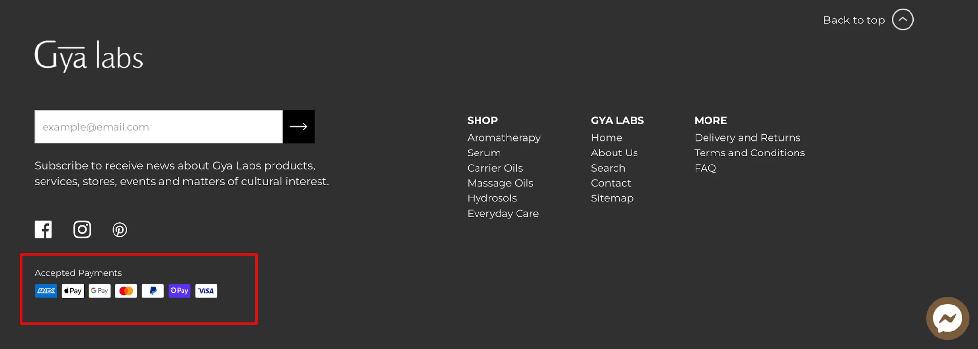
How to check if your information about your services is clear enough? First, go to your store. Where can you find return policy and information about delivery and payment providers? If you struggle to find it, so does your customer. Most e-commerce websites have this kind of information in the site footer. Then, customers can see it no matter which page they are on.
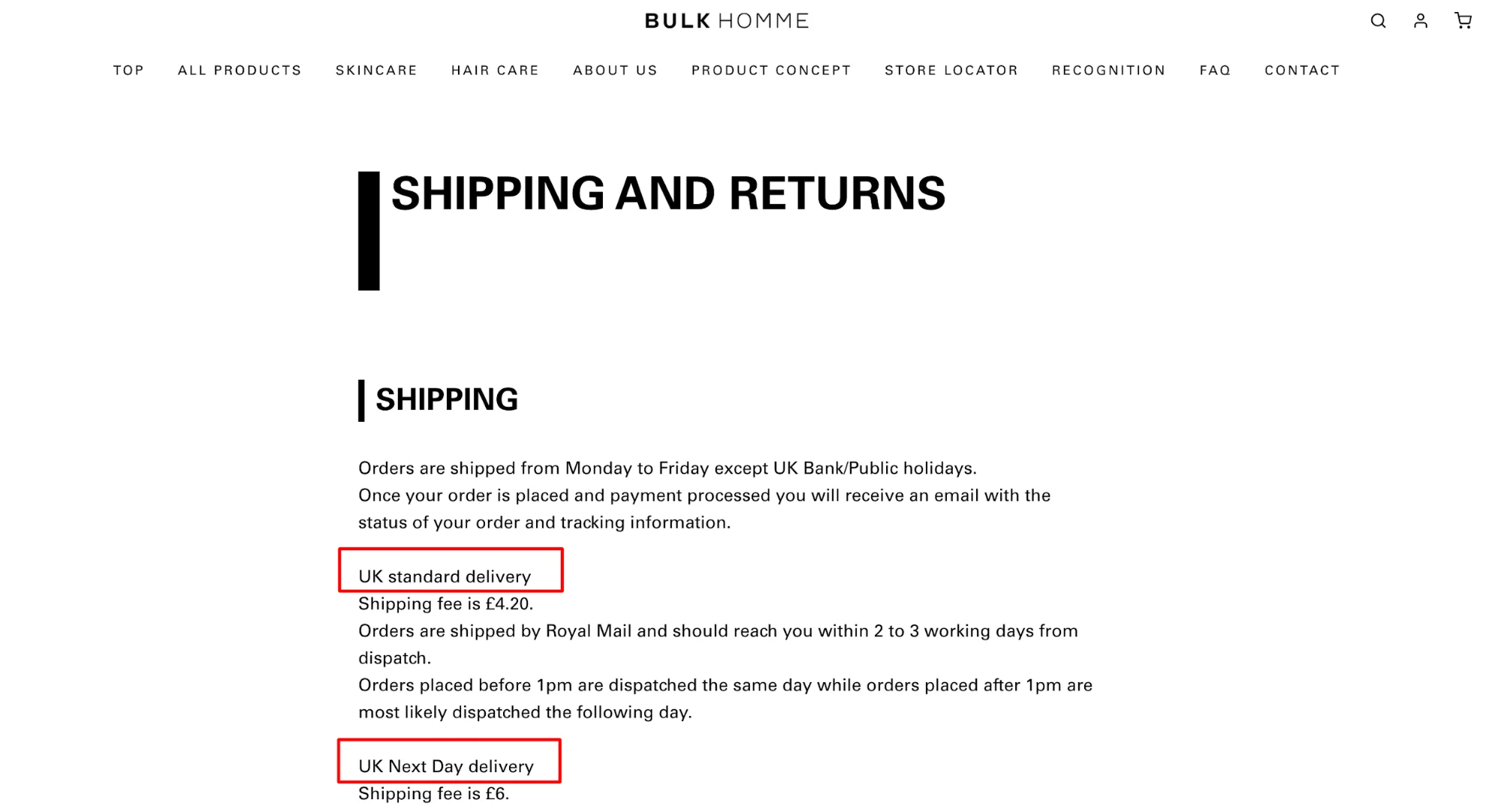
Some online stores put a separate pages with shipping and returns policies, and then, link to them in the Shopify footer. Then, customers get clear information about shipping fees even before going to the checkout.
Aside from the footer, you can put delivery information on the product page. Then, shoppers see upfront how long it takes for them to receive the product.
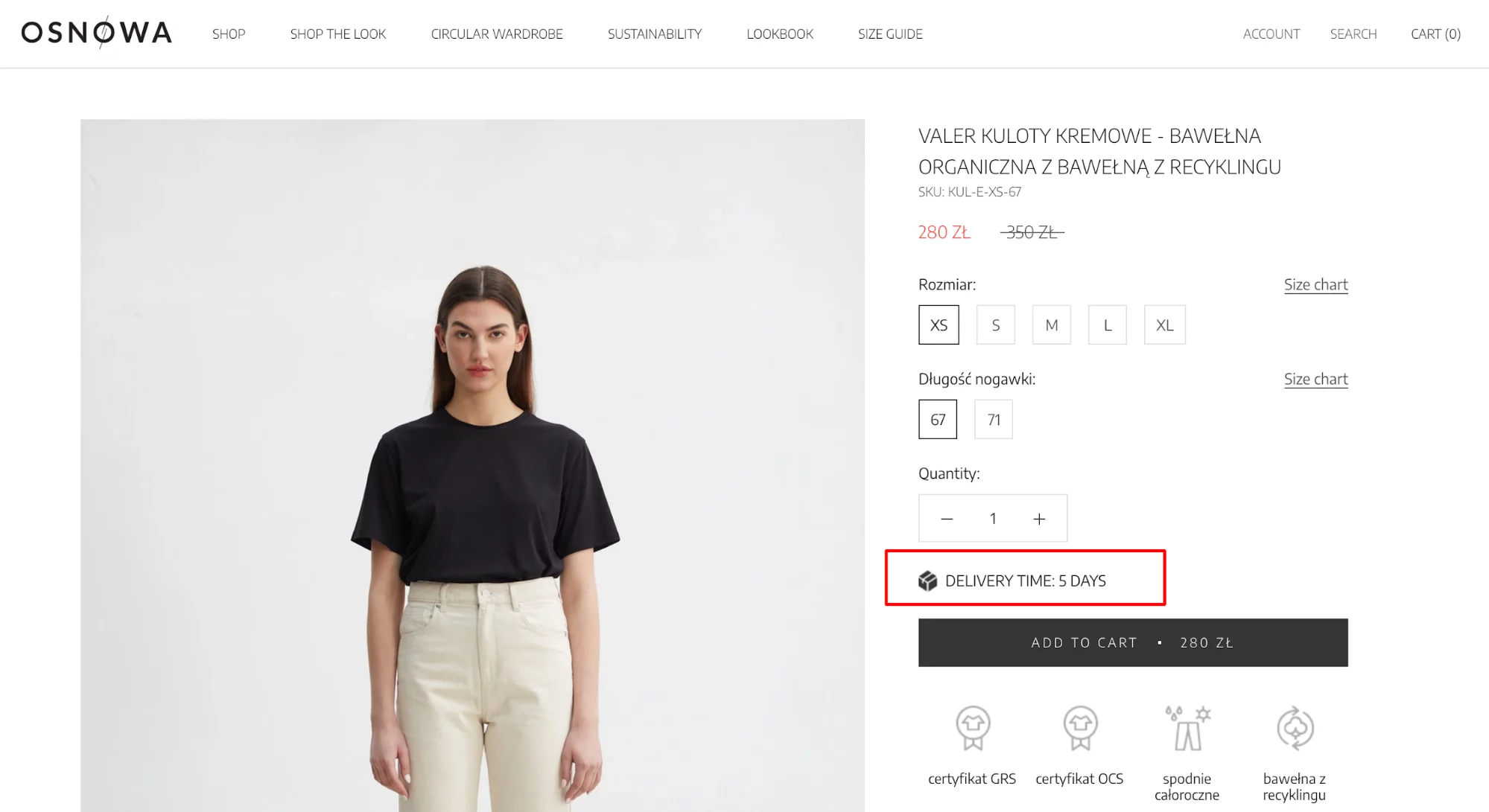
The language you use can also help you gain information clarity. Apart from checking if delivery, payment, return and other information is easy to spot, see if its language is understandable. For that, use short sentences and avoid passive voice. Make sure the content is easy to scan.
What if you did all of that and the cart abandonment rate is still high? Try installing a live chat. Anytime a customer has doubts about your service or products, they can chat with you. We recommend you try Tidio a for a live chat app. Remember to write down all customer concerns about the clarity of your Shopify store and update site content.
Let’s go to the next tip for lowering cart abandonment rates.
2. Offer variety of payment and delivery options and providers
We’ve learned that people abandon carts because they couldn’t find enough payment methods from the graph above. Well, from our experience, the same can happen with delivery options. Shoppers have preferences when it comes to payment gateways and courier services.
Also, when you’re opening a shop for targeting a foreign market, adjust the payment and delivery options to the local consumers. Polish shoppers, for example, prefer Przelewy24 and PayU to PayPal.
3. Optimize site’s performance
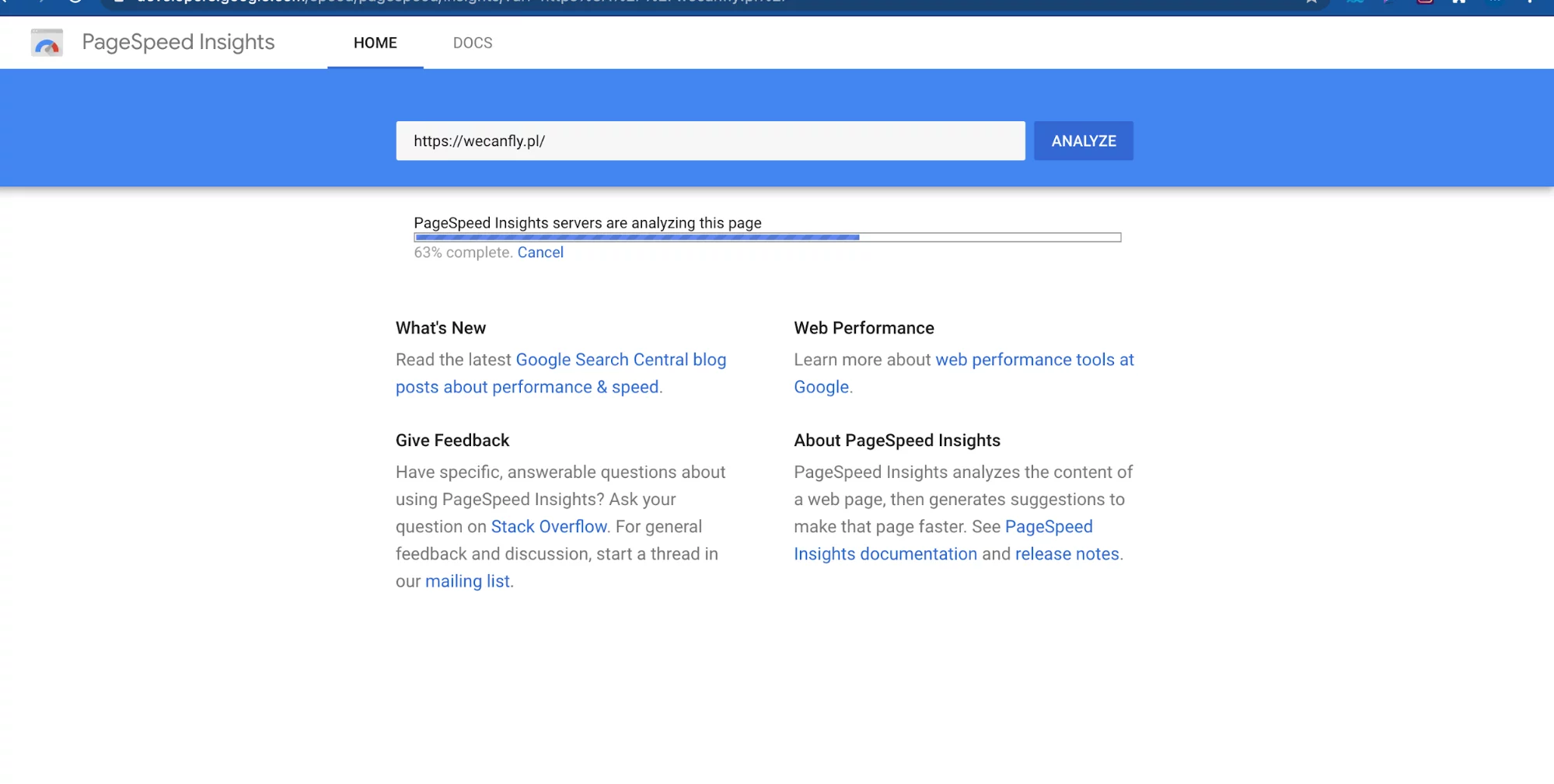
Even though Shopify servers are more than reliable, it may happen that apps, add-ons or legacy code slows down your site’s performance, and you may not even notice it. That’s why checking site speed should become a habit for you and your team. There are many tools for improving loading times of your site that you can easily find on the web, such as Google’s Page Speed Insights.
4. Install add-ons and build features that boost sales
So far, we’ve talked about improving information clarity, optimizing site performance and adding more payment and delivery options and providers. Let’s talk about tools that can help us persuade users to complete their purchase.
What kind of tools you can try to boost Shopify conversions?
- Optinmonk’s exit-intent pop-ups with a special offer (such as free shipping) that fires up whenever someone wants to close the tab;
- Eggflow’s “buy now” button that is added to a product page to help you speed up buying process;
- Flair’s limited time offer to incentivize customers to buy from you
- Wishlist King’s “add to a wishlist” feature that can be saved in the client account or downloaded.
- Carts Guru’s retargeting ads for cart abandoners
The apps above are only suggestions. You’re free to search the Shopify App Store and find alternative solutions.
5. Conduct UX audit
More often than not it’s not the site content, service, site’s speed or fancy add-ons that are causing us clients but poor site’s user experience (UX). How to check if your Shopify’s store UX is to blame for cart abandonment?
For a full view into your site’s UX, we would recommend you getting a full UX e-commerce audit performed by a Shopify agency or Shopify specialists. Since they have experience in Shopify, they know exactly what to pay attention to and where is a low-hanging fruit in terms of e-commerce businesses. Whenever we audit Shopify’s store UX, we give clients exact instructions on how to improve UX.
There is also a thing that you can do by yourself almost on the spot in terms of your UX, that is review your checkout. As you remember from the graph above, most customers complained about the final stage of buyer’s journey (the site wanted me to create an account, too long/complicated checkout process.)
So, let’s see your checkout, and make sure that you follow well-optimized checkout rules:
- creating an account at your store is optional (but it’s well-incentivized)
- the number of fields that a user needs to fill in is kept to a minimum
If you follow our Instagram, you know that we’ve been publishing a series of mobile commerce UX tips. Two of our carousels are devoted to optimizing the checkout experience. Although it’s about m-commerce, the conversion tips we shared are universal, and they can be applied to desktop too.
Perfectly optimized m-commerce checkout
6. Get feedback from customers who leave their carts behind
What if you asked your store visitors what it is that prevents them from buying from you? Asking them about their experience can give you tons of insights. Use a pop-up form to collect customer feedback. That’s the best method to get information on what to optimize.
We can help you decrease cart abandonment rates
In this article we went through six tips for solving high cart abandonment rates. All of them were based on the most common reasons that shoppers cited for quitting their buying process. If you need help in reducing cart abandonment, we are here to help. Leave a message below and we can help you optimize your Shopify store.


