Want to reach more people with your new or existing lingerie brand? Creating an online store is an excellent way to do that. And what is a better platform to create an online store with than Shopify? You can build and set up your online store in a flash – no coding skills are needed, at least at the beginning. Moreover, numerous Shopify fashion themes and store plugins are available – also for lingerie brands.
What you might need to spend more time on is ensuring that your store visitors have a smooth and pleasant store experience to make sure they stay on it for longer. And to know how exactly you can do that, in our next articles we will show you a few examples of lingerie stores with exceptional UX design for inspiration. But first, let’s talk about why you even need to focus on UX.
What is UX design for lingerie e-commerce?
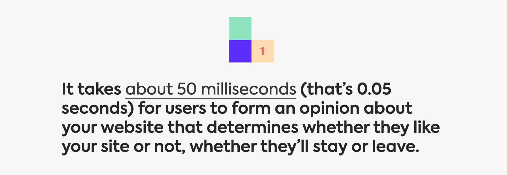
When it comes to first impressions, we’re all visual creatures. But that’s not the only reason why a well-designed online store is essential for e-commerce. Users expect websites to be intuitive and run smoothly.
UX design for e-commerce is simply about making sure that your clients can easily navigate through a website, quickly find what they are looking for, and that their overall experience is enjoyable. The aesthetic interface is also a must!
Taking care of these factors will allow you to build a positive brand experience, directly affect conversions and increase sales in the store. Not convinced yet? Read on!
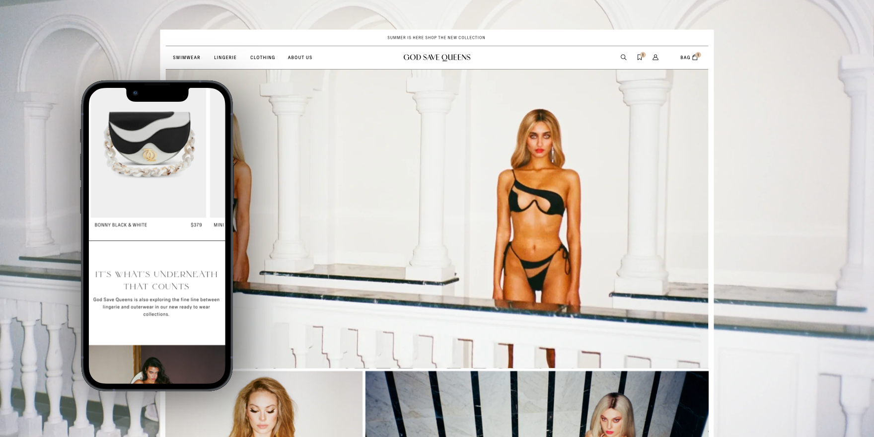
source: God Save Queens
Why is UX important for online lingerie stores?
In past years, if you had a good product at a reasonable price, you usually didn’t have to worry much about getting sales. Now though? With millions of stores running online, online shoppers got picky. Just on Shopify, there are 3.9 million websites, with nearly 9k of them being lingerie brands – so the competition is pretty fierce.
If you want your store to be successful, you shouldn’t rely on the products and pricing anymore – especially since that’s no longer the most important thing for the customers. According to one survey, 84% of people say that the experience provided by a business is equally important to the product or service they’re using – and in many cases, the user experience is actually the thing that can either convince them to buy a product or to leave the store for good.
Hence, you need to pay just as much attention to how easily your customers can navigate the store and purchase the products as to the store’s design.
Here’s where User Experience (UX) for lingerie stores comes in.
In e-commerce, user experience refers to a customer’s overall experience when interacting with an online store. This includes everything from the site’s design and layout to how customers can navigate the page and how easily they can purchase a product. A good lingerie e-commerce store UX makes it effortless for your customers to navigate your website, find what they are looking for, purchase it, and move on. And when you make it easy for people to buy from you, they’ll buy more and return more often. Therefore, your company should ensure its UX is as good as it can be – both on desktops and mobile devices.
Not convinced? Here are a few stats to prove how vital UX is to an online store’s success:
- Businesses lose 35% of sales due to bad UX.
- 52% say a bad mobile experience makes them lose faith in a company.
- Mobile users have a cart abandonment rate of 85.65% – with a poor mobile website or app performance as one of the biggest reasons for abandoning their baskets.
- 32% of users will leave a brand they love if they have one bad experience.
So basically, if your online store UX is frustrating for the shoppers or makes them doubt whether your company is trustworthy, they won’t hesitate to go elsewhere. Why should they put up with a poorly optimized mobile page or slow checkout inside your store if there are hundreds of other shops around?
Meanwhile, if your online lingerie store is fast and intuitive, more people will come to shop there and buy more often. Plus, high user satisfaction and engagement also means that they might recommend your store to their friends – making increasing your conversion rates while reducing costs of lead generation a piece of cake.
Now, how exactly can you boost the user experience on your website?
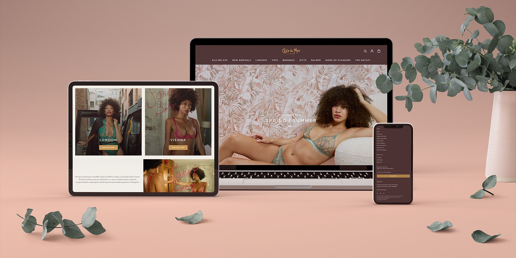
source: Coco de Mer
5 Shopify UX design best practices for underwear stores
One of the reasons why the Shopify platform is amazing is that a lot of things needed to run the online store are already taken care of for you. For example, you don’t have to search for store hosting and domains, and (at least at the start) you don’t need to know how to code to build and keep running the store. In addition, there are hundreds of ready-made themes customized for the lingerie brands you can pick if you don’t have the time or budget for a custom theme. Plus, there are thousands of Shopify plugins you can add to the store to have exactly the features you need.
If you combine these Shopify features with some of the e-commerce best practices, then you can be on the right way to bringing more people to your store – and convincing them to buy something.
So now, let’s talk about those UX best practices for lingerie store.
1. Test and optimize your mobile page
Mobile internet usage has exploded in recent years – and together with it, shopping on mobile devices as well. That’s why your mobile website’s user experience (or mobile UX) should receive as much attention as your desktop website’s – or you risk turning the mobile shoppers away. Just consider that 85% of smartphone users think that a company’s website when viewed on a mobile device, should be as good or better than its desktop website! That’s a lot of people you can discourage from shopping in your lingerie store just by having a poorly working mobile store, right?
source: Sweor
What’s also important is that Google will also judge your site based on the speed and performance of your mobile version. Lingerie stores with fast, intuitive, and optimized mobile pages get a significant boost in the search engine rankings – those with no mobile page or poorly optimized one meanwhile get pushed down.
So what can you do to optimize your lingerie store for mobile users?
- Optimize the store navigation for mobile devices (especially make the buttons and links bigger and easier to click)
- Make it easier to get back to the home page. A good tip is to allow people to return to the home page just by clicking on the store logo.
- Optimize all images to lower the page load time. A good idea is also to get rid of all widgets you don’t need on the mobile version.
- Shorten the checkout/customer account creation forms. The longer the form on a mobile device is, the more we have to type – and that’s annoying even for tech-savvy people. Adding a guest checkout nowadays is also almost a must: if shoppers have to make an account before buying anything, they will most likely leave the page and look for one with guest checkout.
With a user-friendly mobile lingerie store, it’s much easier to grab your customers’ attention, build trust in your brand and convince them to buy something on it – so working on enhancing your mobile store is definitely worth the work.
2. Stick to clear, readable fonts
With so many fancy fonts available online, it may sometimes be tempting to choose something original rather than yet another “basic” font. The problem is though, not all devices can correctly display such fonts. So what looks fantastic on your computer, might unfortunately look like a set of random signs or empty squares on shoppers’ computers or smartphones. When that happens, you can be sure that (after a moment of confusion) the visitors will leave your page.
Thus, sticking with classic, minimalist fonts that work across various devices is safer. Which one though? You might want to check the Rocketium blog and their round-up article of 20 fonts that work best for e-commerce shops.
3. Use high-quality visuals
When asked by Top Design Firms what visual elements they value on a company website, 40% of consumers said images, 39% said color, and 21% said video – and for clothing stores, having high-quality images is more important than for any other kind of online store. Unlike a physical store, online shoppers can’t touch or try out the jeans or underwear before buying it – their only option is to rely on descriptions, reviews, and visuals such as images or videos. So the more photos they can see on the product page, the more likely they are to trust your store and purchase the product.
The images can’t be blurry, pixelated, or poorly lit, though – because then the shoppers might think the products are of poor quality as well. So while adding the images to your store, keep an eye on the quality.
It’s also a good practice to show the product from different angles or add detailed images that focus on important elements of the product (like decorations, brand tags, or washing instructions). Those help shoppers imagine the product better – and also lower the risk they will return the product.
However, remember that all images you add to your e-commerce store should be compressed – otherwise they can significantly slow down your store.
4. Add breadcrumbs to your e-commerce store navigation
When visiting a website for the first time, 38% of people look at its page layout and navigational links. Having easy-to-navigate store pages makes it effortless for visitors to find the products they’re looking for – and click the “Buy” button. Any friction in navigation meanwhile might lead them to abandon the page straight away.
In fact, 61% of respondents in a GoodFirms survey said bad navigation is the main reason they abandon the page. Meanwhile, optimizing your website navigation could improve conversion rates by as much as 18.5%!
So what can you do to make navigating your store easier for them? A good idea is to add breadcrumb navigation to your store. Breadcrumbs show the visitors where exactly they are on a website and help them return to one of the earlier categories whenever they nee
For an underwear store, an example breadcrumb navigation could look like this:
Home→ Women → Bra →Triangle.
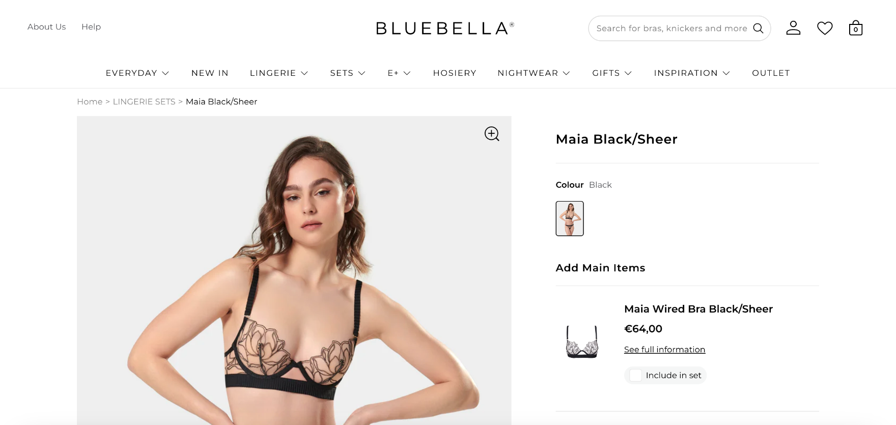
source: Bluebella
This way, instead of having to go back to the homepage when they want to go back to the previous category, the store visitor can just click on the category name – saving them a lot of clicking around.
5. Ensure your store pages are loading fast
The majority of online shoppers are pretty impatient when it comes to how fast they think a store page should load. 39% of shoppers think pages on e-commerce sites should take, at most, 2-3 seconds to load – and if they don’t, the shoppers are ready to leave the store. In fact, businesses lose $6.8 billion a year because of slow-loading websites!
So, keeping an eye on how fast your store loads is crucial if you want shoppers to stay on your site. If you want to find out how quickly your store loads, you can use Google’s free PageSpeed Insights tool. The speed analysis tool will analyze your store page and then give you recommendations for improving it. Remember to check your e-commerce mobile store speed as well – 53% of mobile site visits are abandoned if pages take longer than 3 seconds to load.
For some practical tips on how to speed your e-commerce meanwhile, how about looking at our other article on Shopify speed optimization? In this article, we gave you some suggestions on how you can speed up your store to encourage more people to browse your store – and this way, boost your conversion rate as well.
Conclusion
Now that you understand why taking care of a delightful UX can help you grow your lingerie brand, it’s time to act! And if you’re not sure where to start and need a hand with e-commerce redesign, Shopify design services, or even migrating to Shopify from another platform – drop us a line! Our experts will come up with a tailor-made solution for your business.
WeCanFly