
The Shopify homepage is one of the most important pages on your online store. It’s the very first thing your customers see, and depending on how they rate it, they will either continue to browse your store or leave right away without even giving you a chance to show your products. Jakob Nielsen even called the homepage the “most valuable real estate” any business might have.
Designing a homepage that will encourage your visitors to enter and look around isn’t such an easy task, though. That’s why we want to share with you some of the best practices for designing a homepage that not only looks good but also works smoothly for your visitors.
So, grab a coffee, get comfy, and let’s make your homepage shine!
Importance of Homepage Design in Shopify E-commerce Store
Imagine you are looking for a new coffee machine and decided to visit a few stores with home appliances. The first store you enter has a visibly damaged door, a dirty store sign above the entrance, and you can see cardboard boxes and items scattered everywhere. There’s no sign of anyone from the staff being nearby either. What would you do? Most likely, leave without looking around or buying anything.
The next store is much cleaner, and as you enter, you are greeted by the store clerk and asked what you are looking for. Once you mention you need a new coffee machine, they say they actually got a few new models today and give you directions on where you can find those.
Which of those stores you would be more likely to shop at? Obviously, the second one, where both the store design and the store staff attitude makes you feel welcome from the very beginning.
Just like a tidy and well-organized physical store attracts more shoppers, a well-designed website homepage can make customers feel comfortable and encourage them to shop more. So that makes crafting or optimizing (either yourself or with the help of Shopify website design services) a fast and visually appealing homepage one of the most important tasks for your brand.
Fundamentals of User Experience and User Interface in Shopify Homepage Design
How you can build a similarly user-friendly shopping experience for your Shopify store visitors? The key here is to think about how your current and potential shoppers will interact with your website, what they might be looking for, and how you can give them an outstanding shopping experience. And since there’s no store staff that can answer their questions or guide them to the right aisle, you need to design your store so that shoppers can find any item they need effortlessly.
That’s exactly the task for User Experience (UX) and User Interface (UI). Since those two terms are quite often confused, let’s first define them briefly to make sure we are on the same page.
User Experience (UX)
Homepage UX, or User Experience, is all about how people feel when they visit your Shopify store. A good UX means your website is easy to use, loads fast, and customers enjoy their time shopping. Such an experience makes them want to come back again and again. If shoppers struggle to use your store though (for example, because it takes a while to load or because the mobile website is difficult to use), they might simply decide to look elsewhere.
User Interface (UI)
User Interface (UI) meanwhile refers to the visual and interactive elements featured on your Shopify home page. Homepage features such as buttons, search bars, scrollbars, and everything else that your users can interact with are a part of the UI.
In that way, home page UI design directly impacts the user experience – if the navigation is confusing or the buttons are too small/too big to work smoothly on mobile screens, then users will get frustrated and leave. But if your store looks good and is intuitive to use, customers will have a much better time shopping – and are likely to spend more.
UI and UX best practices for engaging Shopify homepage
Now it’s time for what you have been waiting for: our 10 UX/UI tips on how exactly you can craft a new (or optimize the old) homepage to encourage visitors to enter and buy something from your store. While implementing those might take some effort, the effects will be more than worth it as they should visibly boost your website’s UX/UI performance.
If you want to get recommendations tailored to your store and brand, you can also reach out to our Shopify consultants who will analyze your store performance and then give you suggestions on how to improve it.
Defining the target audience and user persona
The very first thing you should start with, whether you plan to build a new store or optimize your current one, is to do thorough research on your target shoppers. You shouldn’t skimp time or resources on this one stage – the more you know about who your customers are and what are their preferences and shopping habits, the easier it will be for you to tailor your homepage (and later, your offers) to their preferences and your site’s purpose.
For example, you want to attract environmentally-conscious people to your brand. To grab their attention, you could highlight sustainable practices you are following in your company or show certificates proving you take environmental practices seriously.
User personas such as “Minimalist Mike” or “Budget-conscious Bella” meanwhile will help you tailor product recommendations and offers for them. This way, you could show, for example, organic but affordable t-shirts for Bella and simple, versatile jackets for Mike.
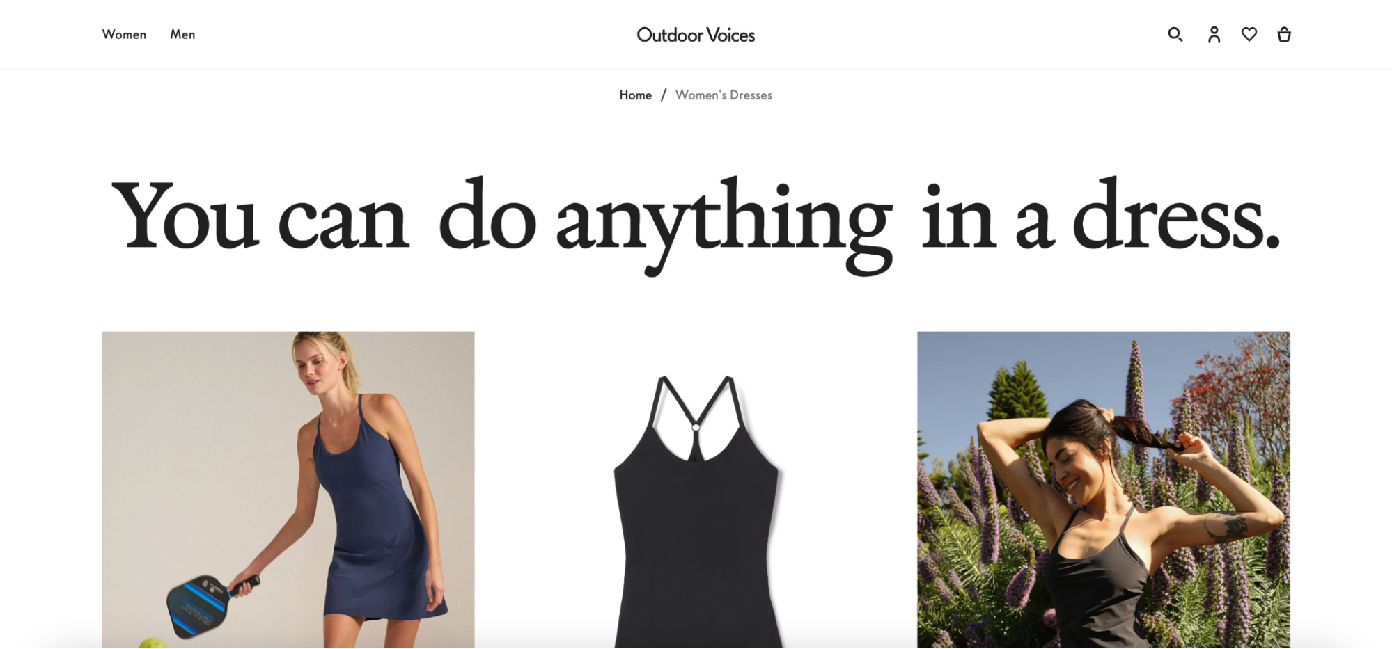
Creating a great first impression
The potential visitor’s first impression of your Shopify store sets the tone for the entire shopping experience. And you don’t have much time to make a good impression – Storyblok found that for 42% of consumers, 10 seconds is enough time to decide whether they will stay in the store or leave.
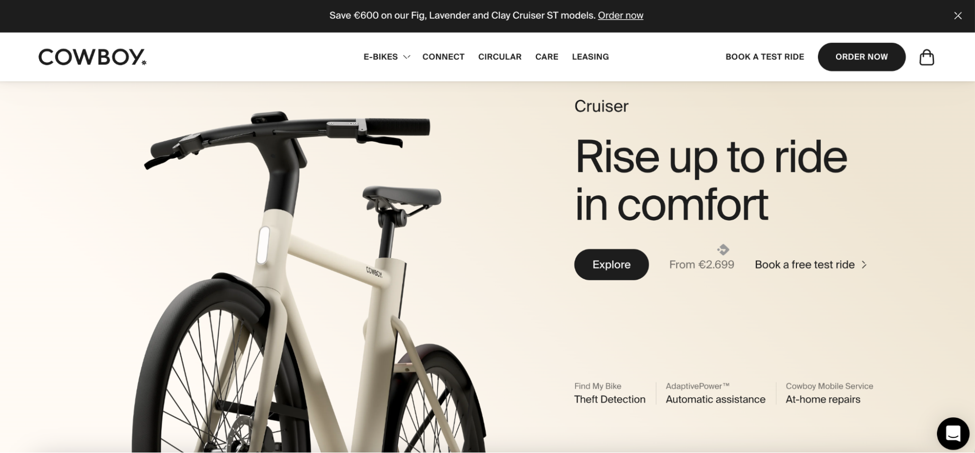
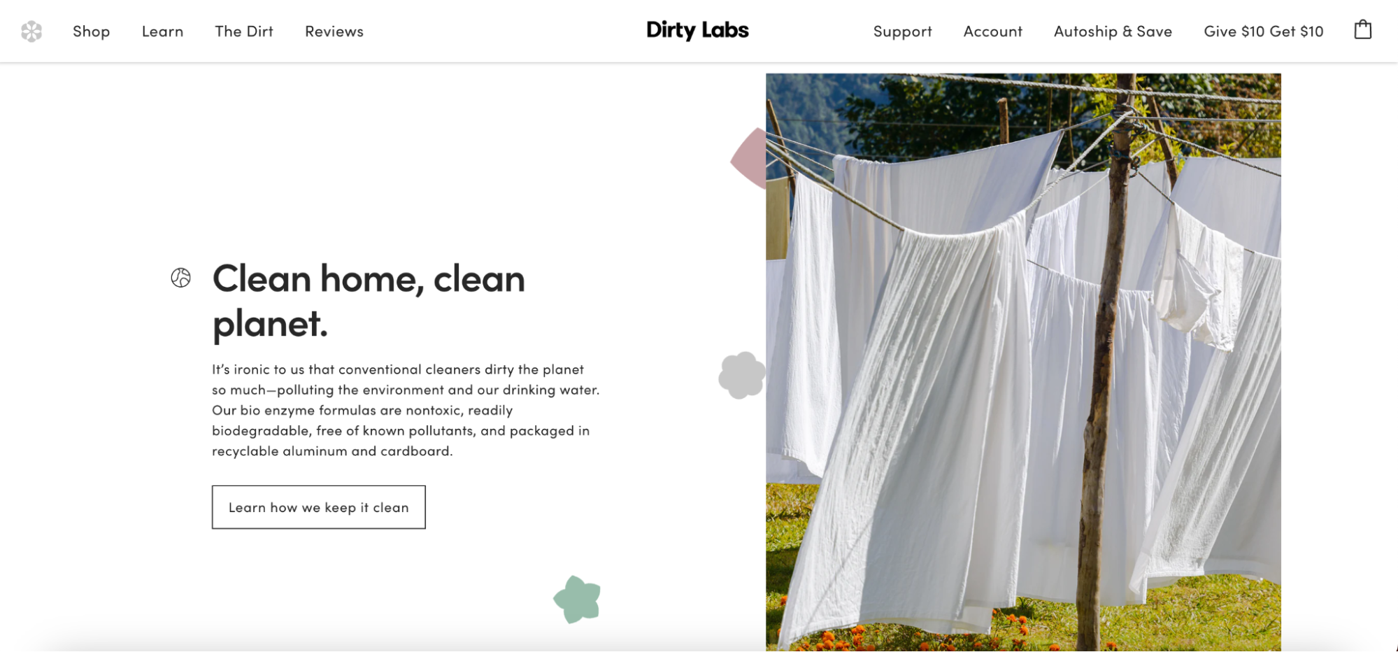
What can help make the first impression positive? High-quality photography straightforward language, intuitive navigation, and a clutter-free layout can all make users feel right at home inside your store.
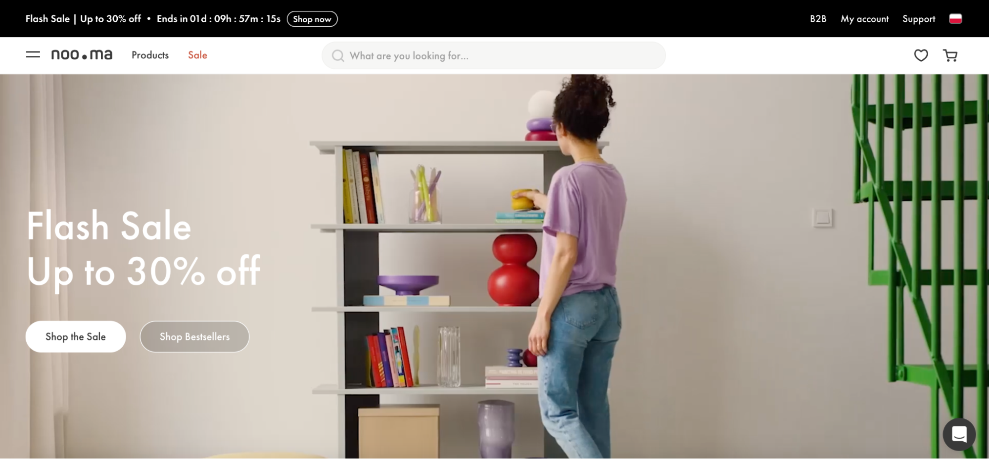
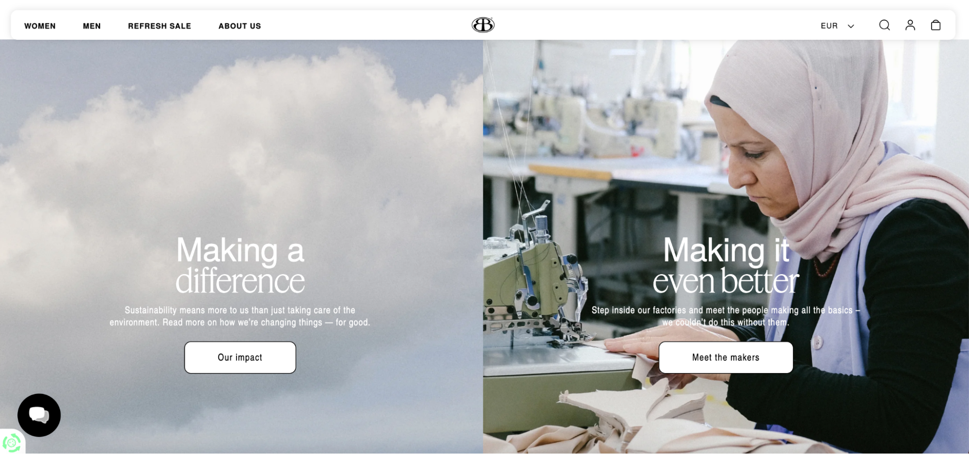
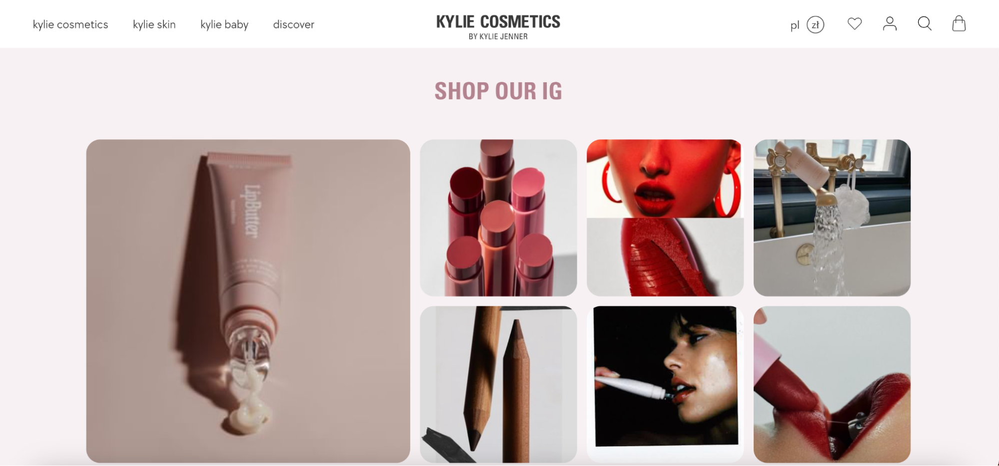
But you will also need something that will grab the visitors’ attention – for example, a rotating banner showcasing your new products or top products. Another smart idea is to use bespoke imagery that shows your products in real-life settings. You could, of course, use regular “cut-out” images here but bespoke images are better at capturing attention and giving “the feel” of your brand and products.
Protip: Be very careful with adding pop-ups ads or overlay sign-up banners on the homepage, as many users find them to be annoying.
Creating a clear and compelling value proposition for the homepage
Another thing that can have a tremendous impact on your users’ first impression is the value proposition they see on the homepage. A value proposition is something that makes a product or online store stand out. It’s the reason why customers should choose your store over another. Lower prices, unique products, excellent customer service, or sustainable materials used – anything that makes your brand stand out can be used as a value proposition, as long as users can “see” themselves and their needs in it.
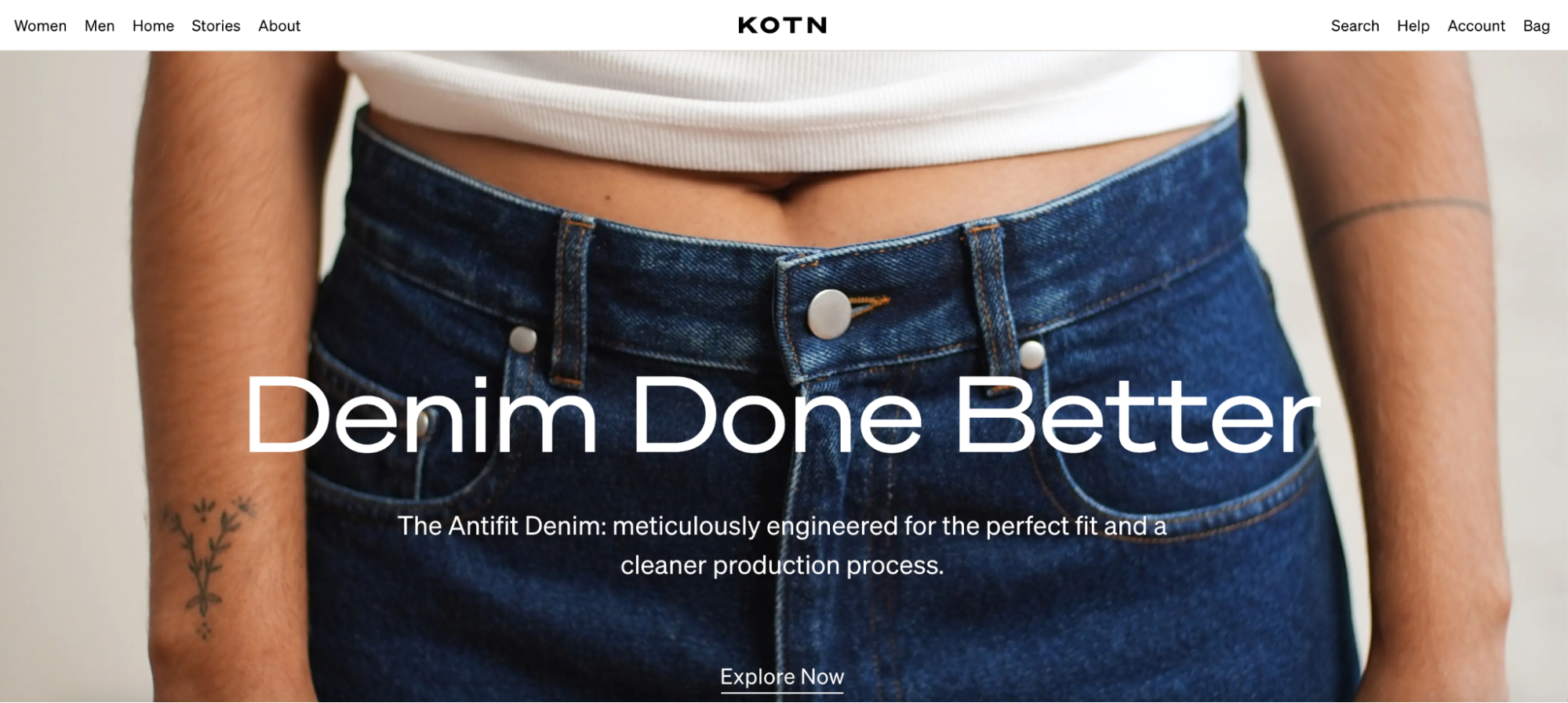
How should you write it though? It should be short – a maximum of two or three short sentences describing what your store has that the rivals don’t. It should also be positioned in a visible place – for example, near the top of the homepage.
Protip: Be careful with hype words such as “Best” or “Free” as they are often overused. Instead, you should focus on the distinct benefits and value your product delivers.
Are you thinking about building a similarly stunning headless store like KOTN? We are experts when it comes to Shopify headless ecommerce development – so we might have a few tips for you on how to make your headless store work and look amazing.
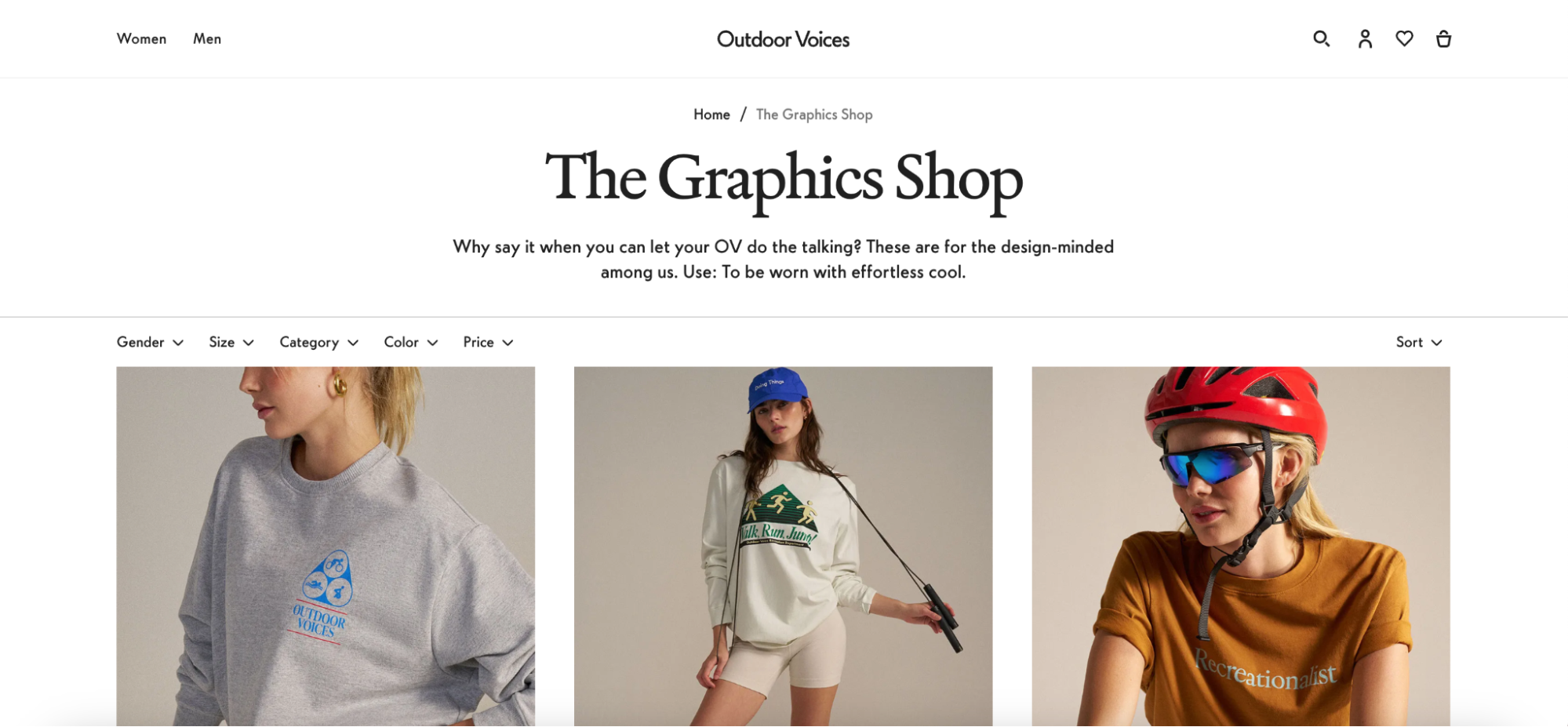
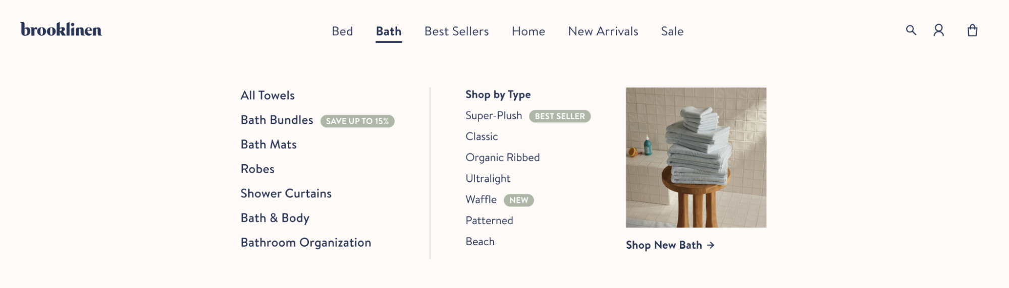
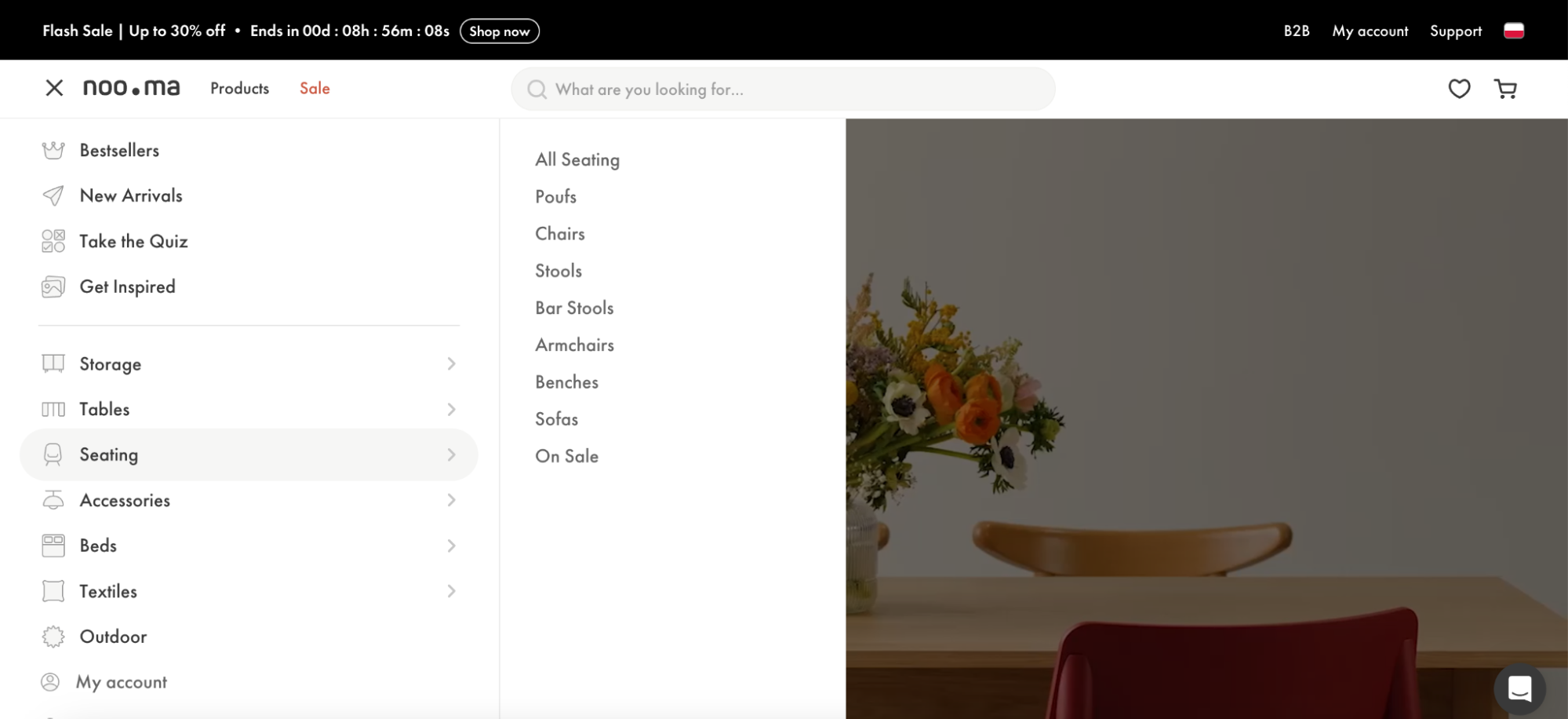
Streamlining navigation and providing easy access to key pages
Poor website navigation is one of the things that can very quickly convince potential website visitors to look for another store. Goodfirms survey found that poor navigation is the main reason to abandon a website for 61% of people – especially since there’s no friendly assistant to show the way.
Based on Baymard Institute’s research, about 22% of websites fail to clearly feature the search field on their homepage. This creates challenges for users who rely on search functionality as a backup while navigating or shopping online.
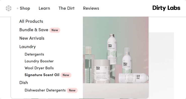
A well-structured navigation system acts as a roadmap for your visitors, helping them effortlessly navigate product listing pages or store categories and quickly find what they are looking for. For example, you could highlight the current scope in the main navigation by using text styling, contrasting colors, or other visual elements to make it look different from the main category.
If the main categories are all under a single navigation item like “Shop” or “Products,” then to make it easier for the users to find their way, you should highlight the relevant main navigation options. Don’t forget about connecting the site logo to the homepage as well – many users instinctively click on the logo when they want to return to the homepage.
Protip: Add a hover delay of 300–500ms before drop-down menus are triggered to avoid accidental activation, as those might irritate your users.
Implementing responsive design and mobile optimization
According to Statista’s Market Insights, mobile e-commerce sales reached $2.2 trillion in 2023 and now make up 60% of all e-commerce sales around the world. In 2027, experts predict that it might even reach $3.4 trillion!
If you want to bring mobile users to your store though, then having a responsive and mobile-optimized website is a must. Why does it have to be responsive? Because compared to desktop computers or notebooks, different smartphone or tablet models have different screen sizes – so what looks good on one phone or tablet might not look so good on another.
A responsive design ensures that your Shopify store adjusts and looks impeccable whether viewed on a desktop, tablet, or smartphone. As a bonus, making your page responsive is also a fantastic way to make search engines rank your page higher, as SEO crawlers give more points to mobile-optimized websites. So if you want to boost your search engine optimization efforts, making your website mobile-friendly is a good idea here.
Where should you start, though? Here are some of our on tips how you can make your website more mobile users friendly:
- Separate the links so that they can be clicked separately.
- Use legible, large text that can be easily rendered on mobile/tablet devices.
- Buttons and links (such as those for selected items) should be large enough to be tapped on comfortably
- If you decide to include ads on the homepage, make sure they aren’t visually distracting.
A good idea might also be to replace product carousels with static images – users might quickly lose their patience if they have to wait for each product to load. If you do want to use the carousels though, then:
- Ensure the slides don’t autorotate
- Allow users to use touch and gestures while browsing the carousel
- Add visible navigation controls to the carousels (such as back-and-forth arrows)
Otherwise, shoppers might have difficulties in looking through the items inside the carousel – and that might frustrate them enough to leave the store altogether.
We are running a mobile responsiveness audit as a part of our Shopify usability audit as well, so if you are planning to optimize your mobile website, our audit on how good your shoppers’ experience is on various devices should come in handy.
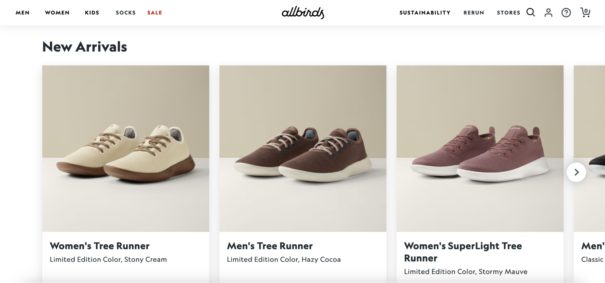
Showcasing popular products and categories to drive sales
Highlighting what’s popular or new can act as a magnet for visitors’ attention, so it’s always a good idea to show some of the products you are selling on the homepage. By dedicating sections of your homepage to best-sellers, new arrivals, or your top bundles, you’re essentially showcasing what others love or products that just arrived.
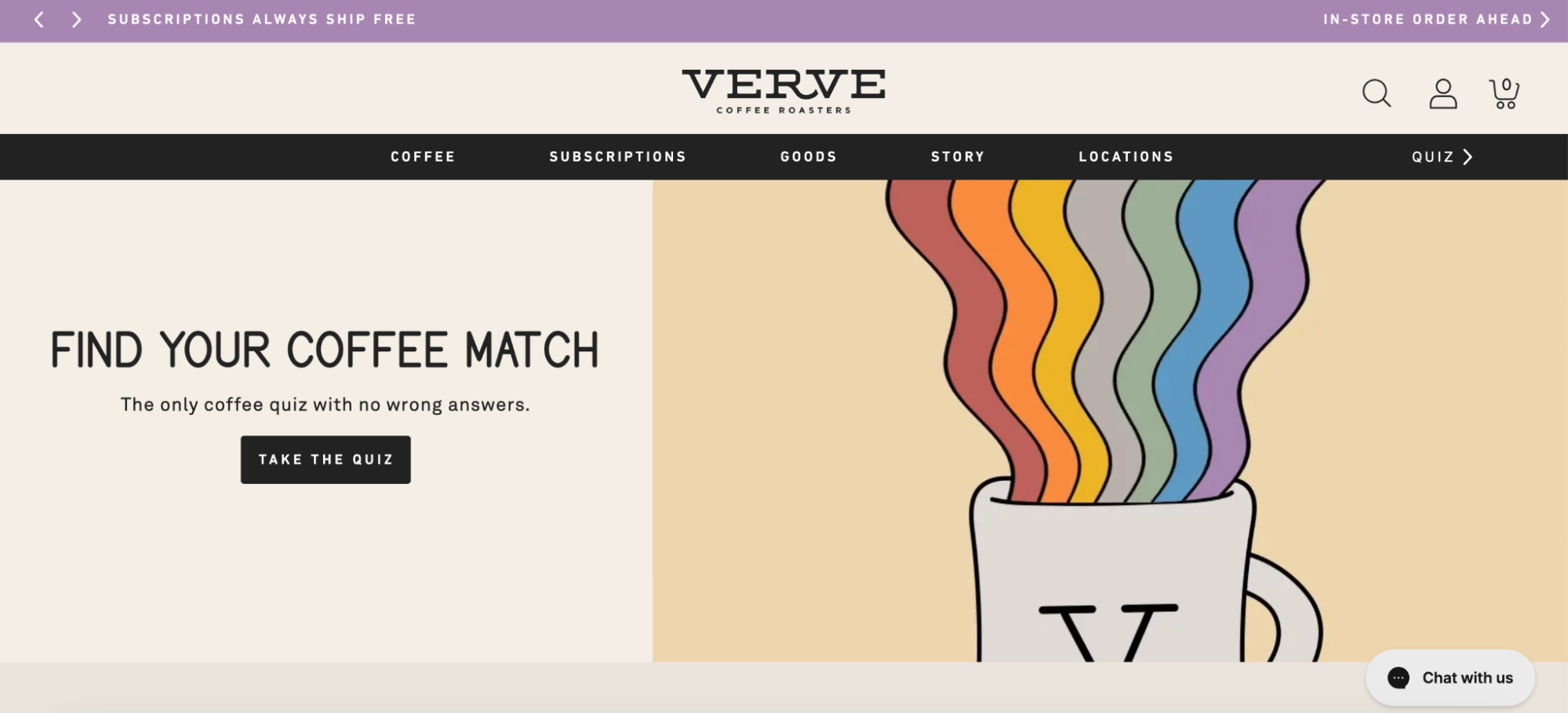
Think about featuring interactive wizards on the homepage. Provide a prominent link to them or incorporate either the first step or the entire wizard directly onto the homepage. Make sure they’re easy to find in the top navigation bar, as they can help users pick the right product.
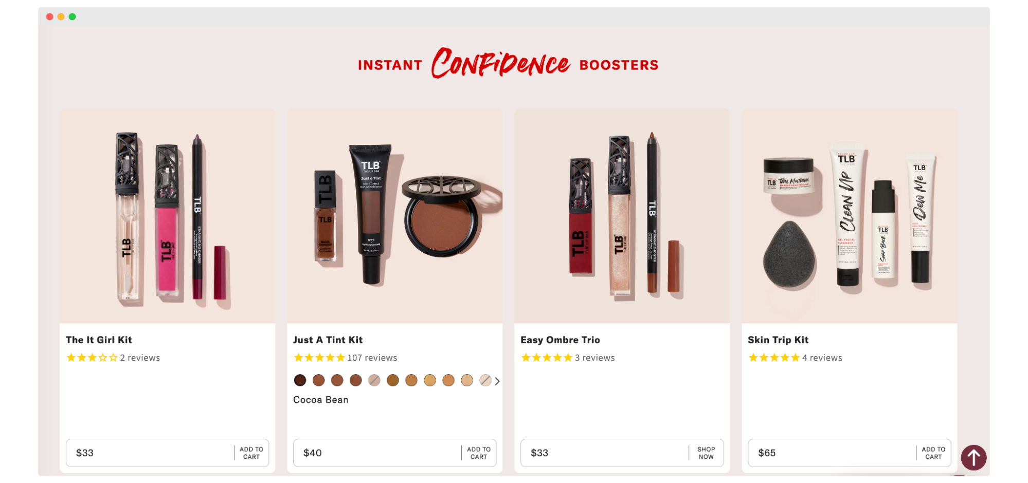
How many items should you feature on the homepage? Typical small catalog sites should aim to feature at least half of the product catalog on the homepage and at least 1 product for each product type. For example, a handcrafted products site that sells 9 products in three different categories should feature at least 1 product from each category and at least 5 products in total.
This will be enough to let the shoppers see what you offer but without overcrowding the homepage. You can use product carousels for this, just make sure they are properly optimized – Baymard found that 75% of sites that use carousels implement them incorrectly, and then they might frustrate users rather than introduce them to the store’s offer.
Protip: On sites with a small catalog (e.g., less than 25 products), intermediary category pages might not be needed. Instead, focus on providing details about individual products and the brand.
Incorporating social proof and user-generated content
Dixa found in their 2022 study that 93% of customers read online reviews before purchasing. In another study, this time from Brightlocal, 46% of consumers even said that online business reviews are as trustworthy as personal recommendations from friends or family.
That way, having honest feedback or other content coming from actual customers (like images showing them using the products) could significantly boost your store’s credibility. Even if you have just five customer reviews or so, highlighting those can give you a visible conversion boost.
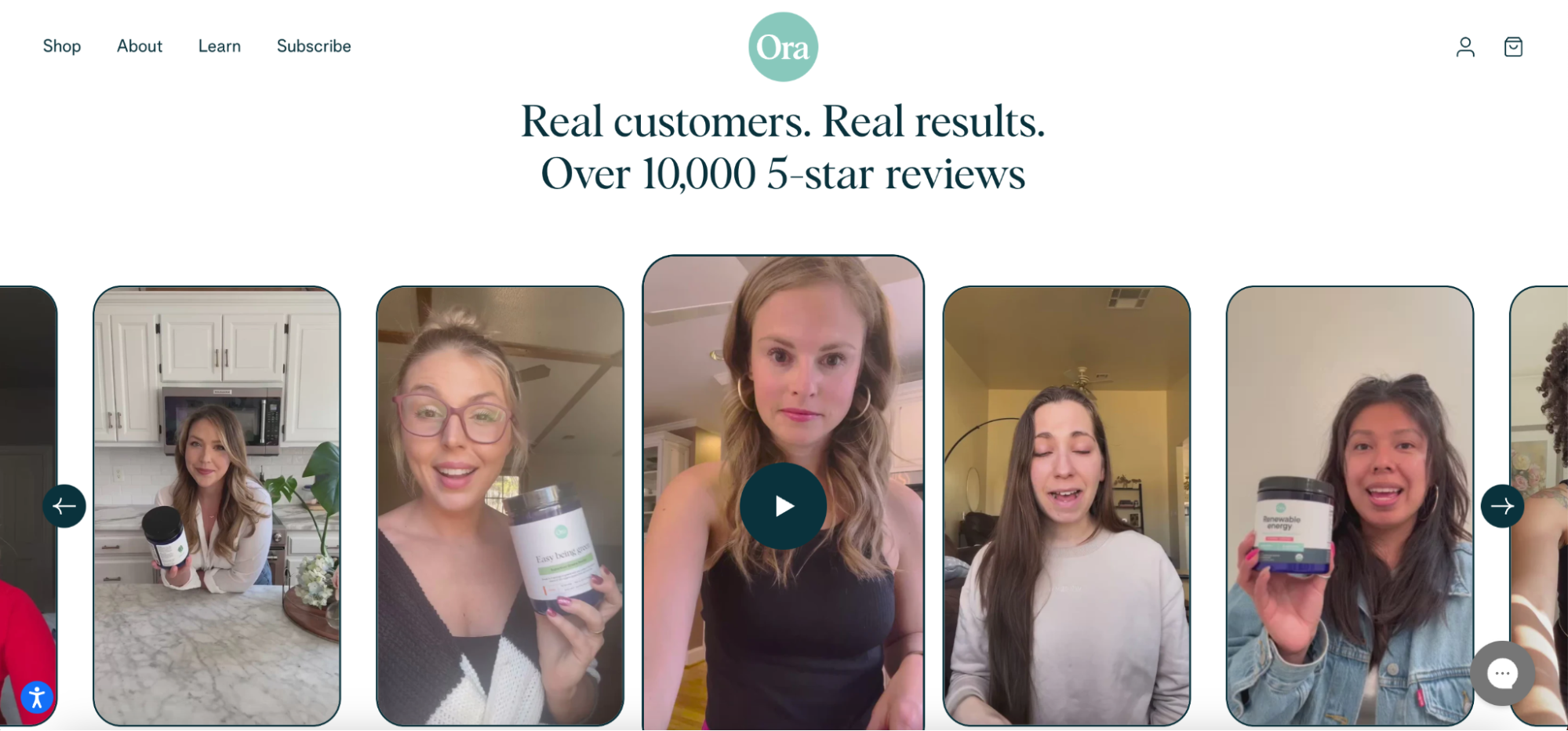
An excellent way to do it would be to design a “Happy Customers” gallery where users show themselves wearing or using your products – together with glowing testimonials. You could also create a dedicated page with case studies on your home page – and show teasers of those on the homepage. Consumers are more likely to buy items when they identify with the client’s story – because they see themselves as the “next success story.”
Best practices for Call-to-Actions (CTAs) on the Shopify homepage
Properly positioned and visually attractive direct Call to Action buttons can also help you encourage visitors to take specific actions – such as taking advantage of your newest promotion. For instance, a “Limited Offer” badge with a bold “Grab Yours Now!” button can create a sense of urgency and prompt users to add the items to their cart.
Crafting those will take some work though – running A/B tests on your CTA button is your best bet here. What colors convert best? What words encourage your visitors to click on the button more often? Which CTA shape works better?
Create a few versions of the same CTA button using different colors or copy and see which one generates a higher click-through rate. Remember to test only one or max 2 elements at a time – otherwise, you might get confused about which changes exactly give you more clicks.
Also, a very good idea is to tailor your CTA to user intent and “lead temperature”. While some shoppers might be ready to make a purchase or subscribe to a newsletter straight away, others might want to learn a bit more first. If you adjust the messages to each of those groups, you increase the chance they will click on the button.
Optimizing page load speeds for a seamless user experience
Goodfirms survey from 2021 we already mentioned earlier found one more thing – 88.5% of visitors will leave a website that is loading slowly.
A Portent survey also found that a site that loads in 1 second has a conversion rate 3x higher than a site that loads in 5 seconds. Do you need any more proof that a blazing-fast website is crucial when you want to bring more people to your site?
How can you speed up your website? The first thing you should look at is the size and format of your visual elements such as product photos, animations, or graphics you use as banner images. For example, converting your .jpeg images to .webp can significantly decrease the file size without affecting their quality. This can make a big difference in loading time when it comes to images, especially on product detail pages.
Another good idea is to analyze and reduce HTTP Requests or use a Content Delivery Network (CDN). By combining and minifying CSS and Javascript files, the browser has to send fewer requests to the server, so the website loads faster. CDN meanwhile can deliver content to the users faster, thanks to the network of distributed servers spread across multiple locations.
We included some more tips on Shopify speed optimization in our other article, so you might want to read it to learn more about how else you can boost your store’s speed.
Implementing analytics and tracking to monitor user behavior and improve performance
The last tip we’ll share here is that you should regularly monitor and analyze your store’s performance metrics.
Knowledge is power – especially knowledge about how your users behave on your website. Using modern analytical tools, you can learn which products are most viewed, where visitors tend to drop off, and which CTAs are most effective. You can then use those insights to update and optimize your website design and functionality.
For example, if a specific product page regularly gets plenty of traffic, but the conversion rate is very low, you might want to look closer at the page to pinpoint and solve the main issue causing low conversions.
Key takeaways and next steps for Shopify homepage design
If you want to make a lasting impression on your shoppers, then spending a bit of time on planning and crafting your user experience design and interface is essential. For this task, you should follow the best practices for website UX/UI we mentioned above:
- Learn as much about your current and potential customers as you can
- Plan your user interface design carefully to make a great first impression
- Prepare your value proposition
- Design an intuitive navigation to boost user experience
- Don’t forget about mobile optimization
- Test your CTA buttons and website performance regularly
Does all of this sound slightly overwhelming? Then maybe our experts at the the Shopify Plus Agency WeCanFly could help enhance your store’s UI and UX? They can craft a stunning homepage from scratch, create a custom integration for your store, or run a Shopify usability audit, and then fine-tune your website design based on the results.
Not to mention, they will also be happy to share a few tips and tricks on how you can make your store shine.
So, if you’re aiming for a homepage that truly stands out, reach out to us via the contact form, and we’ll schedule a meeting to learn more about your needs and goals for the Shopify homepage.
Conclusion
Your Shopify homepage is like a front door to a store. If it looks clean and welcoming, more people will want to come in and shop – and that’s exactly what you want, right? With our tips, you can build a homepage where your visitors will have a great time, and thus they will see your store as their favorite place to shop.
And if things get tricky, you can always count on the WeCanFly professionals’ skills and knowledge to make your homepage even better. So, give these ideas a try and watch your store become a hit!
WeCanFly