


Summarize with AI
Remember the days of spending hours wandering through massive furniture stores, overwhelmed by choices and frustrated by limited layouts?
Remember spending hours wandering through huge furniture stores, overwhelmed by choice? More and more of that journey now happens on a phone, and the store has to answer the questions a showroom used to.
Furniture is a hard category to sell online. People buy it rarely, spend a lot, can't touch the fabric, and worry whether a sofa will fit through the door. The UX of a furniture or home decor store has to remove that uncertainty step by step: from the menu, through the product page, to delivery.
Below are the practices we see working in 2026, with examples we checked on live stores in October 2026. Some of them come from our own projects: OPTISOFA, vetsak, Oakywood, Home Carpet One, Monolith and Selsey are wecanfly clients, and for each one we say what our part of the work was. IKEA, Tylko and TAMO Design are stores we only observe as shoppers.
What good furniture e-commerce UX looks like in 2026
- Several paths to one product: by product type, by room and by collection, with filters that change per category.
- Product pages that replace the showroom: many photos and lifestyle shots, video, exact dimensions and materials, and a configurator or 3D/AR view where the product has many variants.
- Honest delivery information: lead time or an estimated delivery date on the product page, plus what delivery, carry-in and assembly include.
- Ways to reduce risk: free fabric samples, reviews, flexible payments and easy contact with a person.
- A link between online and offline: showrooms, consultations and measuring help.
Why UX in furniture e-commerce is different
A good overview of the category comes from Mirosław Mikołajczak, CEO of Selsey, a Polish furniture brand that has delivered about 2 million parcels in 13 years. In our podcast episode with him he describes a few things that shape furniture UX:
- People buy furniture rarely, so loyalty and lifetime value are hard to build. Every visit has to work on its own.
- The market is fragmented. Manufacturers that used to make furniture for big retailers now open their own stores and sell on marketplaces, so shoppers compare a lot.
- Parcels are heavy. A small piece of furniture weighs about 30 kg, a corner sofa over 50 kg, and damage or a wrong choice means an expensive return.
- Reviews matter at board level. Selsey's management reads customer reviews every week, and they open the weekly results presentation.
That's why having "some e-commerce" is not enough. The store competes with IKEA, large marketplaces and dozens of similar brands, and it wins on how confidently a shopper can make a big decision. We wrote more about the brand side of this in how to build a furniture brand when customers buy every few years.
Listings and filters in a home decor store
Tip 1: Give shoppers several paths to the same product
When a customer visits your store, they should find what they're looking for in a few taps, on mobile as easily as on a computer.
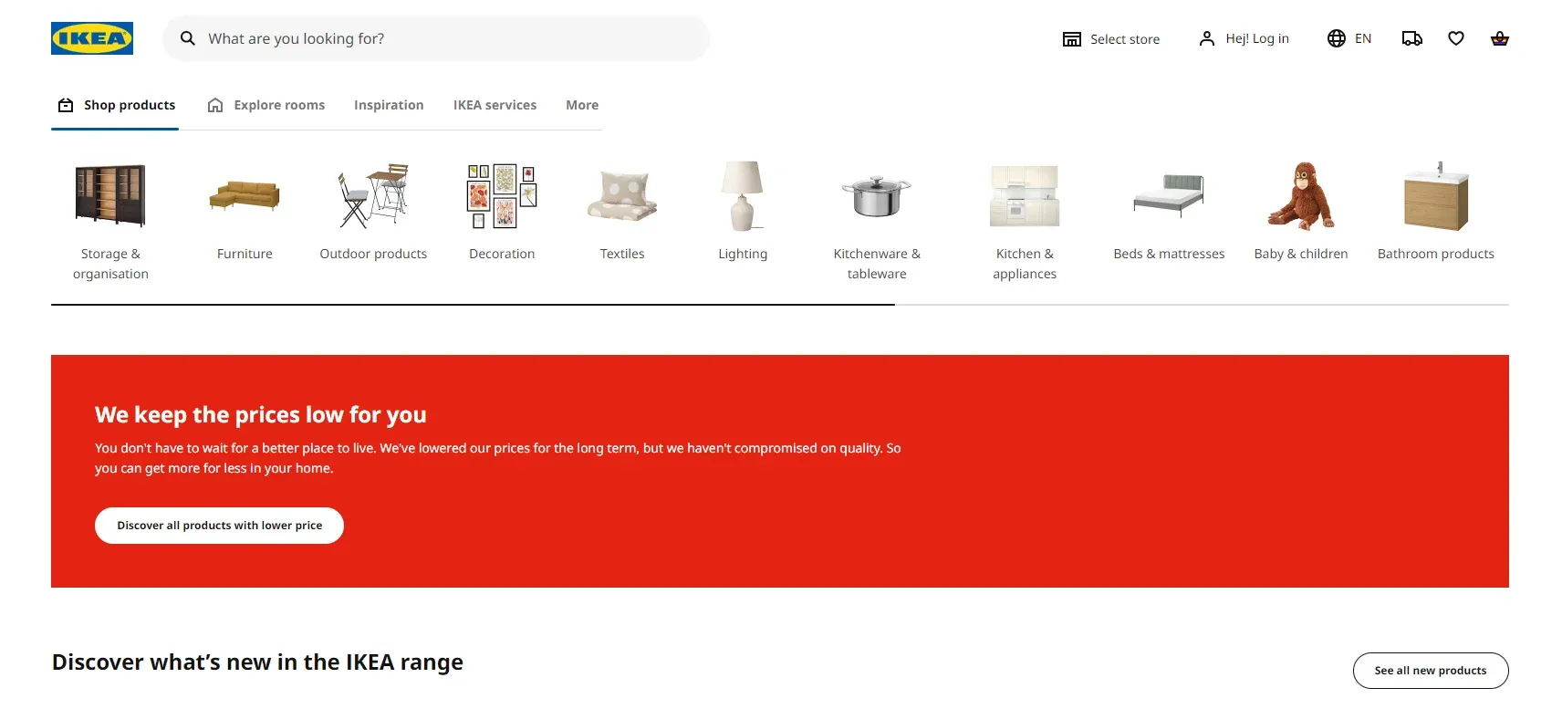
IKEA is still the reference here. On its Czech store in English, you can reach sofas in several ways:
- Products: Sofas, then sub-categories such as two-seat sofas, three-seat sofas, corner sofas or sofa modules.
- Rooms: for example the living room, with everything that belongs there.
- Design & ideas: inspiration that links to products.
- Search: for shoppers who already know the product name.
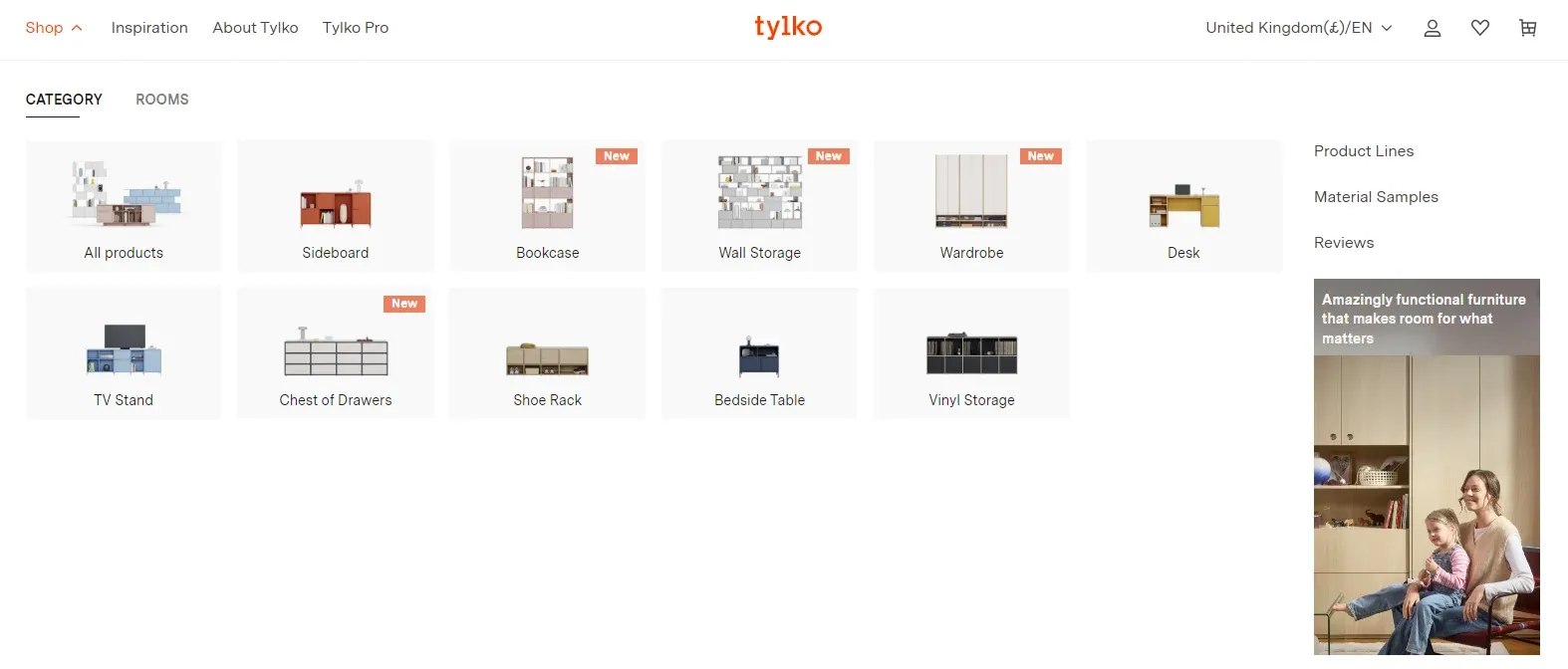
💡 If your catalogue is narrower, say you specialise in storage furniture like tylko.com, you need fewer paths. Tylko's homepage leads by category (sideboards, bookcases, wardrobes, sofas) and by room. OPTISOFA, which sells mostly upholstered furniture, splits its menu into product types (sofas, modular, corner sofas, beds) and named collections. The idea is the same: as few clicks as possible to the right product.
Navigation pays off. When Selsey moved to Shopify (we help with the migration), Mirosław Mikołajczak listed better navigation among the first changes he noticed, next to a faster site and more products per cart.
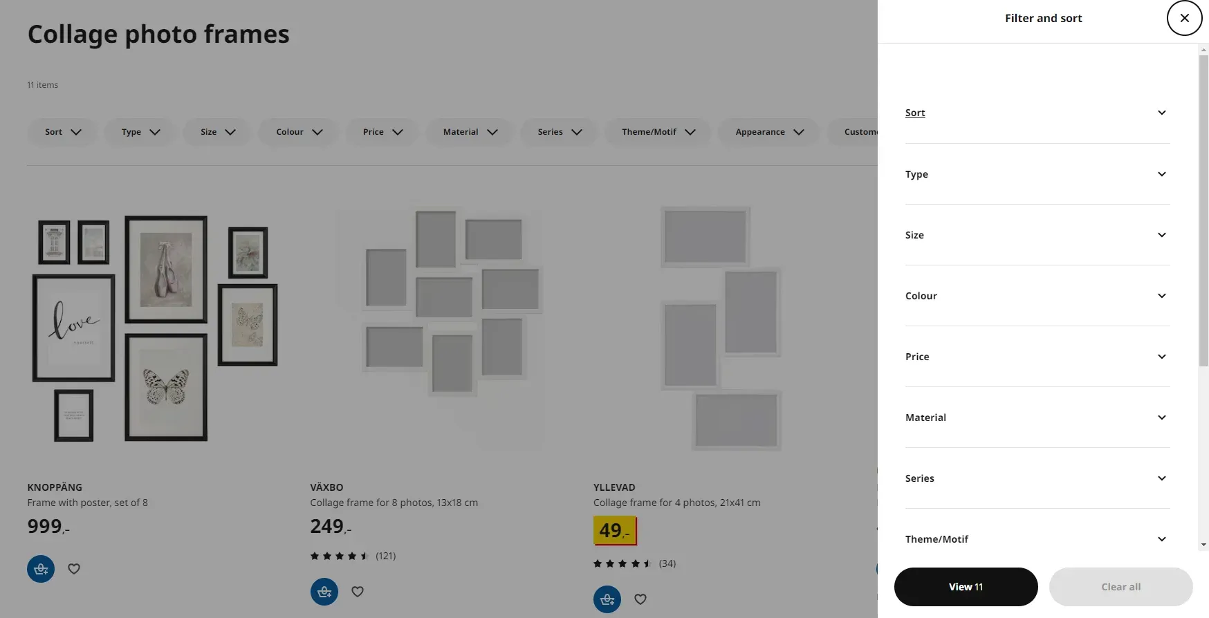
Tip 2: Design category-specific filters
The next step is filtering. Filters let shoppers narrow the catalogue to what fits their room: type, size, material, colour, style. Each category should have its own set, because a sofa and a picture frame are chosen by different criteria.
Filters work best when shoppers understand them. For Monolith, a Swiss brand of solid-wood and epoxy-resin tables, we designed and built a new Shopify store with a filter-based catalogue. Filters come with icons and tooltips that explain details such as resin transparency or the type of tabletop, so the customer doesn't have to guess what a term means.
On Shopify, filters are set up in the free Search & Discovery app. Besides the standard filters (availability, category, price, product type, tags, vendor), you can filter by product options and metafields, for example seat height or fabric type. Two limits are worth knowing: a store can have up to 25 filters, and collections with more than 5,000 products don't show filters at all, so large furniture catalogues need a sensible collection structure. Filters also have to be supported by the theme.
The product page is where furniture UX is won or lost
Tip 1: Use many high-quality photos
High-quality images let shoppers see every detail and imagine the piece in their room. Poor photos do more harm than none. Show the product from several angles, close-ups of the fabric, seams and legs, and the back of the piece, which matters for sofas that stand in the middle of a room.
💡 How many photos? At least 3–5 per product, and more for upholstered furniture sold in many fabrics.
Consistency matters as much as quality. In our podcast episode with OPTISOFA, published in January 2024, Mateusz Kasprzak, its E-commerce Manager, explained why the brand moved from photographer's shots to renders of every product in every fabric: "you can't reproduce 100, 200 or 500 photos in the same way, because the conditions simply change" (translated from Polish). Renders and a configurator gave them one consistent look across the whole catalogue.
Tip 2: Show the product in a real room
Pack shots are not enough. Lifestyle photos show the real scale of a product next to a person or other furniture and help shoppers see how it fits into a home. Present the product in several real-life settings, and you set the right expectations and reduce returns caused by "it looked bigger in the photo".
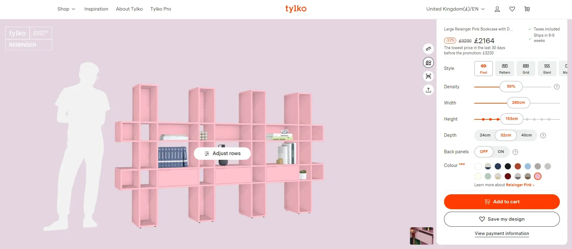
Tip 3: Make configurators accurate
For furniture with many sizes and finishes, a configurator is often the product page itself. What matters most is accuracy: the visualisation has to change with every choice and match what arrives at the door.
- Tylko is a good benchmark. On a bookcase page you set width, height, depth, back panels, finish and colour, see the result straight away, can save the configuration or order samples, and get the shipping time ("Ships in 3-4 weeks") next to the button.
- vetsak sells modular sofas with a 3D configurator where shoppers choose the size, configuration and covers. In the vetsak project we migrated the store to Shopify Plus, designed the UX/UI with a focus on the product card and the configurator's design, and opened stores for several regions. The configurator itself was built by Vazco.
- Oakywood uses a 3D configurator built with Precismo, where customers change dimensions, colours and textures and then view exactly what they configured in AR. In the Oakywood project we moved the store from Shopify to Shopify Plus, designed it and built the custom functionality, including the OakyBlocks bundler.
A configurator doesn't automatically mean a custom headless front end. In 2023 we moved OPTISOFA from WooCommerce to a headless Shopify store with a 3D and AR configurator by Mimeeq, which our developers implemented. At a later redesign, the store went back to a custom Liquid theme: the team valued changing the store quickly, installing apps and testing ideas without a developer more than the speed gain of a custom front end. We describe that decision in our guide to Shopify Hydrogen and Oxygen. For more examples, see 7 furniture configurators worth a look.
Tip 4: Give complete product information
In furniture, the way you describe products makes a huge difference. Each product should explain what makes it special, how it's made and what exactly the customer gets. Make sure the page covers:
- exact dimensions, including seat height and depth, and the size of the largest parcel;
- materials and fabrics, with their technical properties (abrasion resistance, pilling, cleaning);
- colour, with a standard code where it makes sense (more on RAL colours below);
- assembly: whether it's needed, how long it takes and whether the store offers it;
- care instructions and the guarantee.
Decide whether some of this information belongs in the photo gallery (for example a dimension drawing) or in a separate specification section. Clear information builds trust and reduces returns and customer service questions.
Tip 5: Add video
A short video shows the product from different angles, in different light and in use, and conveys the feel of a fabric better than photos. For Monolith, the Reformation theme was chosen partly because of its video slideshow, so the brand can show its tables in high-quality video, photography and animations.
Shopify lets you add videos directly to product media: up to 10 minutes, 1 GB and 4K, or embedded from YouTube or Vimeo. Keep the first seconds informative.
Tip 6: Be clear about lead times, delivery and returns
If you sell furniture made to order or large pieces with expensive shipping, clearly display information about:
- the lead time or an estimated delivery date;
- delivery options: to the door, carry-in, installation;
- what is included in the price and what costs extra;
- returns: how long the customer has and who pays for collecting a 50 kg parcel.
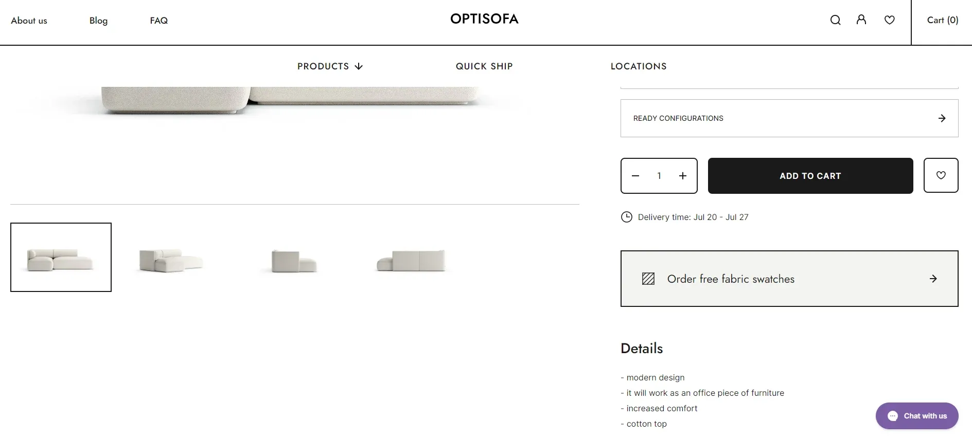
Look at how OPTISOFA handles this on its product page. A corner sofa page says the sofa is custom made and gives a delivery date range calculated automatically from previous orders, and the header promises free delivery and installation and 14 days for returns. TAMO Design states "Lead time - 8 weeks" right on the product page, and Tylko shows the shipping time next to the add-to-cart button.
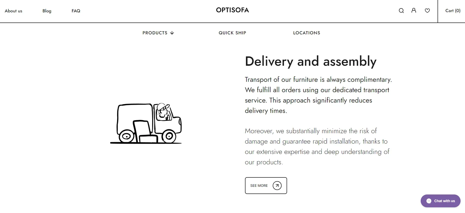
Be especially clear about carry-in. As we said in our podcast episode on furniture UX, nobody wants to find out that the sofa is left at the bottom of the stairs and carrying it up costs extra, payable on the spot. Show whether delivery includes carry-in, or better, include its cost in the product or shipping price.
Delivery is part of the experience long after checkout. If you want to go deeper, read our guide to furniture logistics in e-commerce.
Tip 7: Use cross-selling to complete the room
Showing related products, bundles or items from the same collection helps customers picture a complete set and raises the average order value. OPTISOFA's sofa page has a "Match a coffee table" section and a "You Might Also Like" carousel. Oakywood went a step further with the OakyBlocks bundle, where the cart shows the lower bundle price for products chosen together.
On Shopify, the Search & Discovery app lets you set related and complementary products by hand. Related products are similar items (substitutes), complementary ones are bought in addition, such as a footstool for an armchair. Complementary products only show when they are in stock, and the theme needs sections that support them.
Tip 8: Use 3D and augmented reality (AR) carefully
AR lets customers see how a product looks in their own room, which can make a big difference for large pieces. But a poorly built AR view, with an inaccurate model or unclear instructions, confuses shoppers instead of helping them decide.
On Shopify, you can upload 3D models (GLB or USDZ, up to 500 MB) as product media. Shopify converts them so both formats are available, and the model uses the device's camera to show the product in the customer's surroundings on iOS and Android. Your theme has to support 3D models. Specialised tools go further: at Home Carpet One, where we ran the discovery workshop and built a custom Shopify store, we integrated RoomVo, which shows how flooring looks in the customer's room.
Tip 9: Collect and show reviews
Reviews on the product page have a strong effect on sales of expensive items. According to its CEO, Selsey has collected about 40,000 reviews in 13 years, and its management reads them every week. On the store side, OPTISOFA shows its Trustpilot rating with selected reviews, and Tylko shows a rating based on reviews collected on its own store.
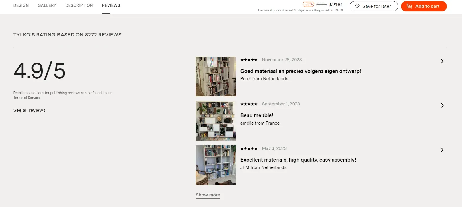
Photos from customers are even more convincing than text, because they show the product in real homes. Shopify's own free Product Reviews app was retired in 2023, so today stores collect reviews with third-party apps (for example Judge.me, Okendo or Yotpo) or through Shop product reviews in the Shop app.
Tip 10: Offer free samples
For products available in many materials, such as upholstered furniture or flooring, free samples are one of the best trust builders. Shoppers can feel the fabric and compare colours in their own light before a large purchase.
For a new online brand, samples also prove that the company is real. In the same conversation, Mateusz Kasprzak recalled that OPTISOFA sent free fabric samples from its very first store: "a tangible contact with us, a company that is online and back then was not known at all" (translated from Polish). The customer could touch the fabric and see a carefully prepared parcel before buying a sofa.
Make the offer visible in the navigation or on the product page. Samples are often offered next to colour or fabric swatches, which some shoppers miss, so it's worth linking to them from the main menu as well. OPTISOFA promotes free fabric samples in the header and on product pages, vetsak links to free fabric samples from its homepage, and Tylko puts "Order samples" right under the configurator and has a separate Material Samples page grouped by product line, with sofa fabric samples for free and finish samples for a small fee. At Home Carpet One we designed a sample box: customers collect samples while browsing and can add them to the basket at different stages of the visit.
These tips cover the product page. For the steps after it (add to cart, cart, checkout and testing), see our Shopify home & decor CRO practices.
Other tips for furniture and home decor stores
Tip 1: Offer consultations with a person
Hesitant shoppers often need a conversation before a big purchase. Offer video calls, chat or WhatsApp with someone who knows the products. For Monolith we added live chat and WhatsApp to the store so customers can ask about a table before ordering.
Tip 2: Connect the showroom and the online store
Many furniture customers start in a showroom and finish online, or the other way round. OPTISOFA lists its showrooms in the menu, and Selsey announced a return to a showroom in Warsaw after a brand study showed that many people had its furniture at home without knowing the brand. Don't expect a showroom to drive online sales directly, though: in the same podcast episode, Mateusz Kasprzak said that when a Warsaw location where OPTISOFA displayed its sofas closed, online sales there didn’t drop, and that sales kept growing in Germany and Austria, where the brand had no physical presence. He sees showrooms mostly as a matter of image and of letting people touch the product. QR codes on showroom tags that open the product page help carry the journey from the shop floor to the store.
Tip 3: Offer instalments and deferred payments
Flexible payments make large purchases easier. Shopify's own Shop Pay Installments is available only to stores based in the US, Canada, the UK and Australia (Australia in early access), so stores elsewhere use local buy-now-pay-later providers. OPTISOFA, for example, lists Klarna among its payment methods. Show the instalment option on the product page, not only at checkout.
Tip 4: Help customers measure their space
One of the most common worries is whether a piece will fit. Offer guides on measuring the room, the doorway and the staircase, with videos or diagrams and a list of common mistakes. Calculators help too: at Home Carpet One we built a pack calculator that converts a room's area into the number of flooring packs needed, with an option to order 10% extra.
Tip 5: Give colour codes for paint matching
RAL is a European colour-matching system that defines standard colours for paint and coatings. Listing these codes on your products lets customers find exactly the same or a complementary wall paint. It's especially useful for shelves, cabinets and tables that should match an existing interior.
What we learned from our furniture and home decor projects
Our clients in this category range from a Swiss maker of resin tables to a Polish furniture brand selling in around 8 European markets. A few lessons repeat:
- Uncertainty is the main enemy. At Home Carpet One, a US flooring retailer, we started with a three-day discovery workshop and answered shoppers' doubts with two calculators on the product page, the sample box and a contact form that checks whether measurement and installation are available for the customer's ZIP code.
- A configurator is only as good as its 3D models. Oakywood had every product scanned in 3D by Precismo, and those scans power its configurator and AR views.
- Sample orders are a signal, not just a cost. Furniture and home brands we work with use the number of samples ordered, both free swatches and paid sample sets, as an early signal to forecast sales and plan production. That's why we treat a sample order as a conversion step in its own right: tracked as an event in analytics and followed by an email flow that brings the shopper back to the product.
- Choose technology for the team, not only for speed. OPTISOFA's move from headless back to a Liquid theme taught us to weigh operational speed against a faster front end.
- Platform changes show up in UX metrics. After Selsey moved to Shopify, where we help with the migration and build stores for new markets on Shopify Plus, its CEO noticed better navigation, a faster site, more products per cart, a higher post-purchase NPS and faster product uploads, and the German store launched much faster than earlier markets.
If you want to see what these stores look like, we describe five of them, with screenshots, in 10 home decor Shopify stores with inspiring UX.
Working on a furniture or home decor store?
wecanfly is a Shopify Premier Partner. For furniture and home decor brands we run discovery workshops, design and develop Shopify and Shopify Plus stores, migrate stores from other platforms and look after them after launch. See how we work with home & decor brands.
Prefer listening? Our UI lead Bartek Musiał covers this topic in the podcast episode UX for e-commerce in the furniture industry (in Polish).