In this blog post

Designing a Shopify store is more than just choosing pretty images and colors — it’s about creating an intuitive, responsive, and trustworthy space that guides customers effortlessly from homepage to purchase. These 14 tips cover everything from theme selection and navigation to call-to-action styling and usability best practices to help your store look striking while performing smoothly.
Oh, we know this feeling. The perfect Shopify website caught your eye, and yours need to be at least as good. All of the elements need to be perfect (preferably all at once). Then you start designing and bang – things don’t look as you imagined.
It’s easy to feel overwhelmed. Designing a Shopify store requires many steps to take care of. And sometimes there are too many to handle. Don’t know which ones you missed? No more guesswork. This Shopify style guide will help you make your dreamy website sparkle.
Importance of Designing a Professional Shopify Store
The design and all the visual elements of the website that you see with the naked eye are just the beginning. The truth is, there are many other things that make up an effective, well-working Shopify website.
You need to choose a reliable Shopify theme, then decide on the right tools and payment options that go together. Also, your website needs to have great navigation and be optimized for SEO to be visible. And not to mention responsiveness so that the customers can get a cohesive customer experience across all devices. When you dig deeper, you discover that all of these are just the tip of the iceberg.
It’s quite a lot. That’s why a pretty smart move is to put designing the Shopify store in the hands of professionals. If your store is built well from the very beginning, you can avoid unnecessary costs of its “repair” in the future.
Making use of Shopify website design services is just a guarantee you don’t overlook any element and end up with a Shopify store that looks professional – and what’s more important – functions as it is.
Choosing a Shopify Theme Store Design
When selecting a perfect theme, it’s like picking an architectural style for your online space – it must capture both function and multiple style variations. The layout is an ongoing basis that attracts and engages customers. Having a solid foundation is a pretty good place to start.
Overview of Shopify Themes
As Shopify says: “A theme determines the way that a Shopify online store looks, feels, and functions for merchants and their customers.”
You have two options to choose from on how to design a Shopify website. Buy a ready-made theme in the Shopify theme store or build a custom one by coding with, e.g., HTML, JavaScript, or CSS with Liquid (the Shopify template language).
It’s definitely far too much for the newbie. That’s why many companies decide to invest in Shopify theme development services and watch the whole design process calmly from the side.
Ready-made website themes design vs. building Shopify themes from scratch
Pre-designed themes for websites are definitely the quickest way to launch your Shopify store. The blocks and sections are already laid out, so you can select the configuration that fits your needs best. Theme settings can still be customized to some extent, so it’s not like you simply take everything as it is. Even so, you should be aware that configuration options still will be minimal and you won’t be able to skip over some elements, such as all the features available.

You can, however, have full control over the store’s design by using most themes developed by Shopify Partners. To become one, companies need to meet many strict requirements and have extensive experience designing Shopify themes which means getting the highest level of service. Among them is WeCanFly.
Our experienced Shopify developers can create all aspects of your Shopify site, from front-end to back-end. If you want a truly unique store that meets both – outstanding design and great performance, tailored to your store needs, our Shopify Plus agency can help you make it a reality.
UX/UI Tips and Tricks for Designing Your Shopify Website
It’s time to get to know all Shopify design tips and tricks to help your store look beautiful and stand out from the crowd. WeCanFly’s design team uses these best UI/UX practices to conduct a Shopify usability audit and create stunning Shopify stores that engage customers and keep them coming back for more.
This checklist can also be a great add-on to Shopify conversion rate optimization. All these steps can help you uncover the gaps that prevent your store from converting – and tweak them to make it run more smoothly and efficiently.
Provide a wide selection of product types on the homepage
Insider Intelligence research shows that Gen Z has a one-second attention span. So, a quick glance at your homepage determines whether they wish to stay or leave. To make them want to stick around, give your potential customers plenty of options and product types to explore.
- Highlight the best-selling products from each category
- Feature trending items that grab attention
- Include interactive media such as videos and images
The goal of your Shopify store homepage is to pique visitors’ interest and encourage them to dig deeper into the pages of your website. Let your customers know that they will find what they are looking for in your store right from the beginning.
Ensure filtering by price, ratings, color, size, and brand is available
With product filters, shoppers can easily navigate your site’s inventory and find exactly what they need. They should have the ability to filter products according to their preferences and quickly find items that fit their needs and budget. The filtering improves the overall usability of your store. Nevertheless, keep a close eye on how smoothly they work – their poor performance can kill your store conversion.
Implement “thematic” filters for categories and relevant product types
When you have a wide offering and product categories, it might be especially challenging to present all of this information in a readable manner. Customers are more likely to overlook some worthwhile products. Thus, add filters that will give them a seamless experience and show them all the options that you provide.

For example, Glov flagship products come in various colors, packaging, and multipacks. WeCanFly’s aim was to clearly show these options on a single page as they will be more readable for customers. Thanks to this move, it’s easy to find all the options that the Glov store has to offer.
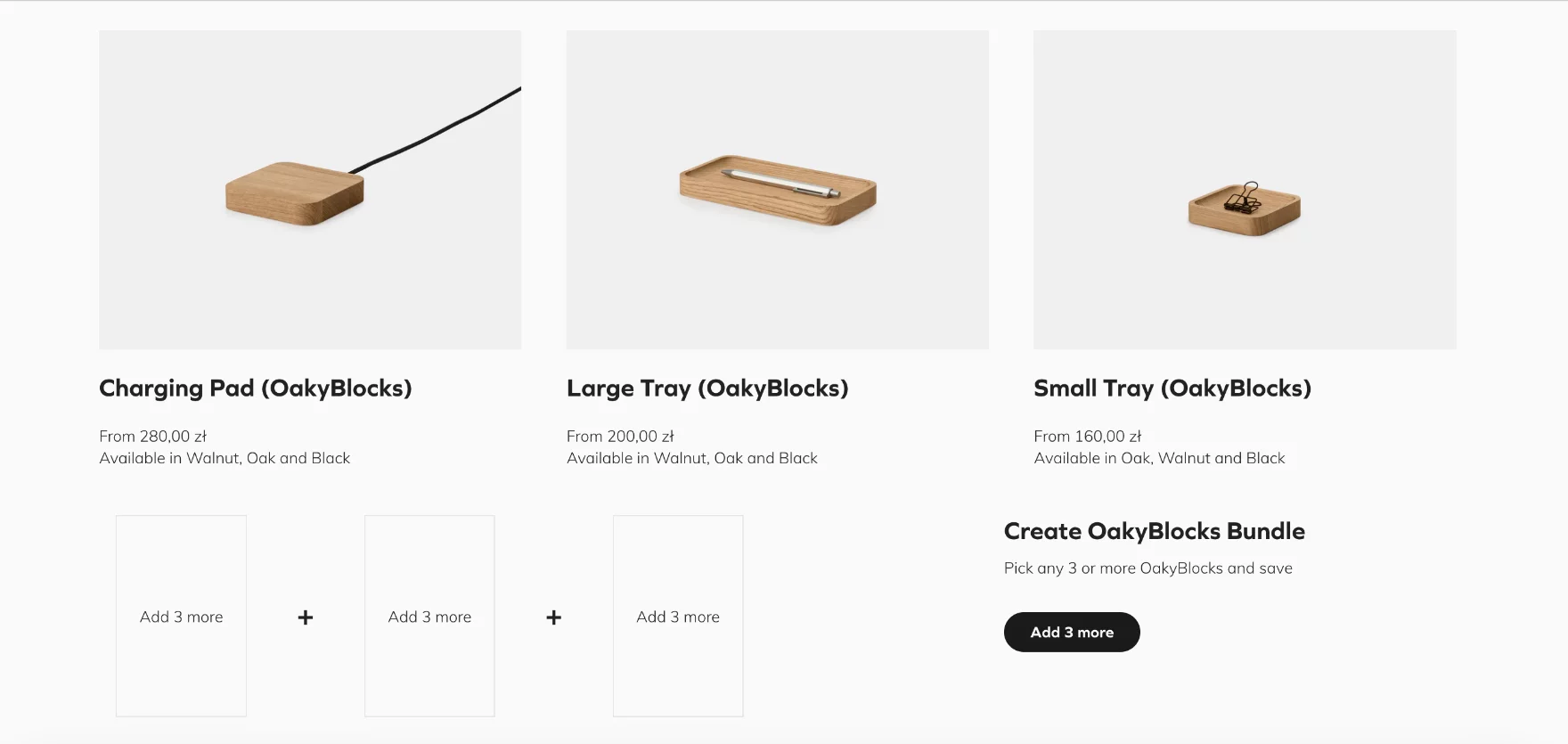
Verify if you have at least 3–5 product images
The right product photos support sales and build a professional and detail-oriented image of your brand. Display your products from every angle and visualize how they can be used in real-life situations. With the right number of high-quality product images, the customers can imagine themselves using the product – triggering their desire to purchase it.
Make return policies simple and understandable
Return policies are an integral part of the e-commerce business. A well-defined one can help save time, energy, and money on customer service inquiries – not to mention unexpected jumps in shipping costs.
However, a well-written piece is not enough. You should put it in the right place on your e-commerce platform to be visible to all customers before the purchase. Save their time by placing your return policy links throughout your website to make sure customers don’t miss them.
A few key spots to highlight your return policy on your store include:
- FAQ section
- Website footer
- Product page
- Website chat
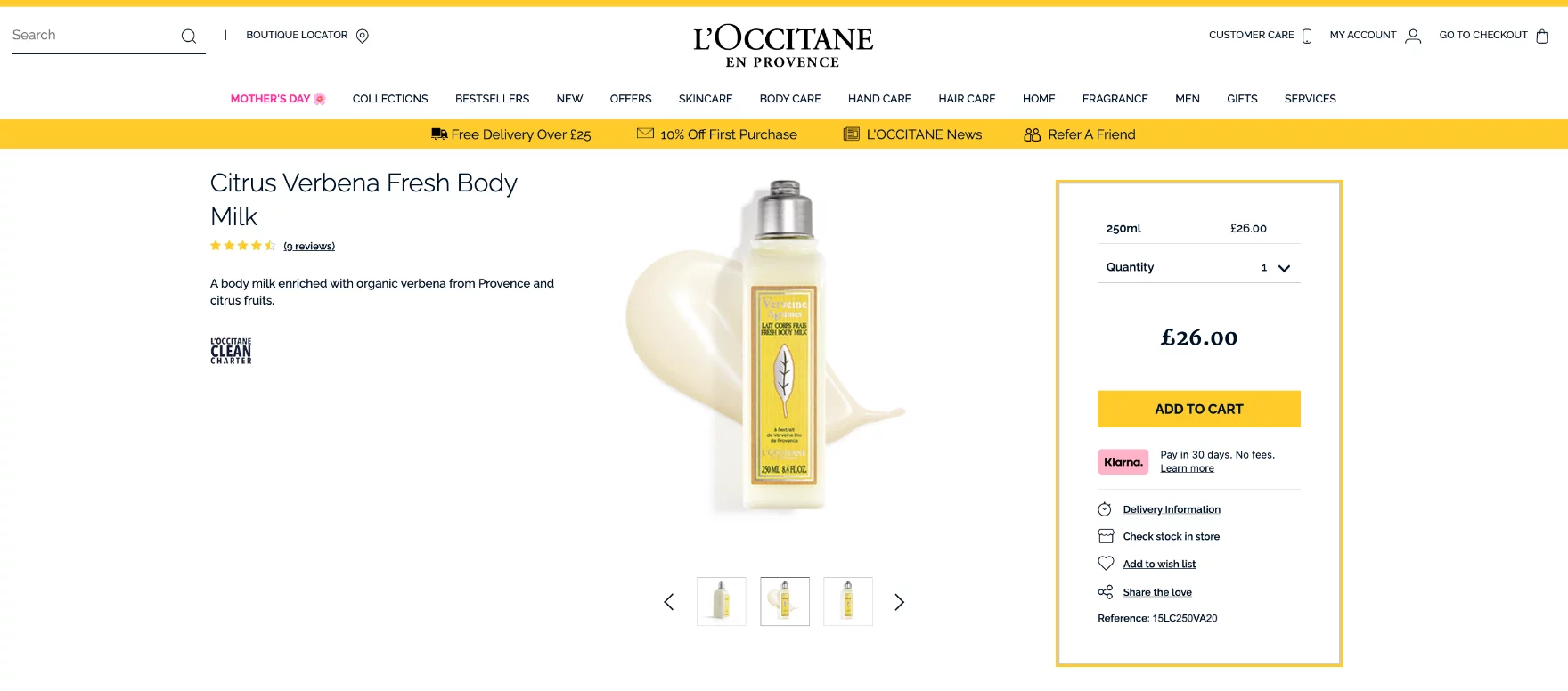
Make sure that “Free Shipping” information is included on or near the “Buy” section
How much is shipping? In most cases, this is what makes or breaks a customer’s decision. 2023 Shopify Commerce Trends report leaves no illusions. People expect free shipping options to buy more items, order more often, and spend more on average. What if it’s not available? They don’t mind walking away. For this reason, it is so crucial to state clearly that you offer free shipping. If you wonder where is the best place to put it, consider choosing a place right next to the product description – so that people will not overlook it.
Place the information about the estimated delivery time near the “Buy” section
Same as free shipping, people desire fast delivery. Their expectations are getting higher, and it’s become a new standard. However, because of supply chain issues, it’s much harder to meet now. Even so, you should still keep your potential customer informed about the estimated delivery time. The God Save Queens store, for example, put these details together with shipping options under one tab in the buy section. A good pattern to follow.

Design a prominent and distinctive “Add to Cart” button
Creating the right call-to-action button is key to guiding customers into a desired action. Using a visible “Add to Cart” button can help customers easily find the item they want and add it to their cart without any extra effort. When this button stands out from your site design, people won’t overlook it – and your store will be able to achieve its goals. The contrast color is a great way to set the CTA buttons apart, making them the focal point of your product page.

Do not overuse “marketing copy” in the product description
Marketing and sales are based on persuasive language, but the key to success lies in finding the right balance and making it sounds natural. Product descriptions are no different. To get customers to desire your product, don’t push it into them too much, but rather show them its benefits. An excess of sales copy may distract from the product and have the exact opposite effect.
Make it possible for users to submit product reviews
Based on Shopify data, reviews are 3x more authentic than brand-created content. People make decisions based on their fellow users’ opinions, so you should make it possible for customers to leave feedback on product pages. It will encourage others to buy with confidence and will also help to improve your SEO rankings.
Streamline the shopping experience with integrations
To fill out the shopping experience, you should integrate your e-commerce store across other channels. “Buy now” buttons and similar shopping tools on social platforms can help you give a complete fraction-free shopping experience.
eMarketer asked its respondents which social media platforms they use most often to make purchases. TikTok, YouTube, and Instagram are great opportunities to reach out to shoppers more efficiently.
Adapt the store to all devices
Today, customers tend to get annoyed when they cannot find what they are looking for when they are on the move, so mobile-friendly e-commerce shops are no longer a choice – they are a necessity. Adapting your store to different mobile devices is critical to providing a pleasant online shopping experience.
However, it’s not just about making sure that shoppers can access your store anytime, anywhere. You also need to make their shopping journey enjoyable from start to finish, including such actions as a smooth checkout process. The responsiveness of all elements of the store should be one of the top priorities for all Shopify store owners. Also, it should be yours.
Don’t be afraid of white space
Less philosophy continues to do well. Keep your store simple and clear and use a white background to separate specific sections on the page. It will help users focus and make decisions faster.

Be aware of the color palette you are using, as it has a big influence on user experience and buying behavior. Use colors that match your brand identity and take into account everything – from the contrast between text and background to the use of colors that represent a call to action.
Test and refine your Shopify store design
Even if your existing site now rides like a new Tesla, you still cannot relax. Test and refine your store’s design again and again. From color palettes and font types to product sorting options and call-to-action buttons, you need to keep up with the latest trends in e-commerce design. Try A/B testing with different designs to see which option works best for your customers. And if you make any changes, verify that they are implemented properly.
And last but not least – pay attention to the loading site speed (it’s a crucial factor affecting UX and customer behavior). Use tools like GTmetrix or Google PageSpeed insights to measure performance and find solutions to optimize it.
How to Design Shopify Store? Get Professional Assistance With Shopify Website Designer
Fast, intuitive, responsive, and good-looking. Is this how you would like to describe your Shopify store?
WeCanFly Shopify Plus agency is a team of experienced people who have designed websites for such former clients as L’occitane, Vetsak, and Durex. And now your brand can be among these names as well.
Our team put together the best design trends along with the best performance. By making your Shopify platform unique, you can bring rocket results to your business. So, no matter what kind of Shopify theme you need or how you would like to tweak your current theme – our Shopify designers can help you find the perfect solution to design a Shopify store.


