Inspiring Shopify Store Examples to Guide Your E-commerce Success
More than 4.12 million ecommerce sites rely on Shopify now. And top Shopify website examples are among them.
It’s no surprise here. The Shopify platform removed all the technical, financial, and operational barriers. Streamlined the e-commerce designing process to a series of intuitive steps. Shopify gives its users the ability to build and scale a user-friendly store in any way they want.
Have you just started selling on Shopify, or are you planning to migrate from another e-commerce platform? We’ll take you through our best Shopify store examples to demonstrate what’s possible with the great platform.
⬇️ Scroll down to take a look at the key design tips and features to add to your Shopify store!
Shopify Website Examples: Examining Successful Shopify Stores for Inspiration
As a Shopify app development company, our team of designers spent dozens of hours building the best e-commerce solutions each week and doing research on the leading ones. They’re working on the best User Experience (UX) concepts to make the purchasing decision path easy for everyone.
What factors do they look at to choose the best Shopify stores examples and draw inspiration from them to your web page?
- Clear and intuitive navigation – best stores examples should have user-friendly navigation that helps users quickly find the products or categories they are looking for.
- Mobile responsiveness – the online store should provide an optimal UX across various devices (including smartphones and tablets) with seamless navigation and readability.
- Page loading speed – fast page loading times keep users on store and prevent them from leaving.
- Visually appealing design – consistent color scheme, typography, and layout create a professional and cohesive brand image.
- Creative solutions – innovative and unique design elements that go beyond the conventional add an element of surprise and make the store memorable.
7 Best Shopify Stores Examples
When deciding on a Shopify store design, you have two choices – build your own theme from scratch, or customize a ready-made one from a Shopify store. No matter which option you choose, Shopify store design services can guide you along the way.
The outcome: An effective, well-designed store with a sparkle. These are our top Shopify store picks that have one. Let’s get inspired.
1. L’Occitane – Globally recognized brand powered by Shopify Plus
L’Occitane is a recognizable beauty products brand around the world. When they made the decision to transition their digital storefront to Shopify from a former platform, they chose Poland and WeCanFly Shopify Plus agency as their pioneer market for this evolution.
Shopify beauty stores development needs a unique approach. We integrated Shopify with the existing ecosystem, included Product Information Management (PIM) and Enterprise Resource Planning (ERP), and tailored an ecommerce theme to resonate with the Polish audience. The results are (humbly speaking) nothing short of spectacular.
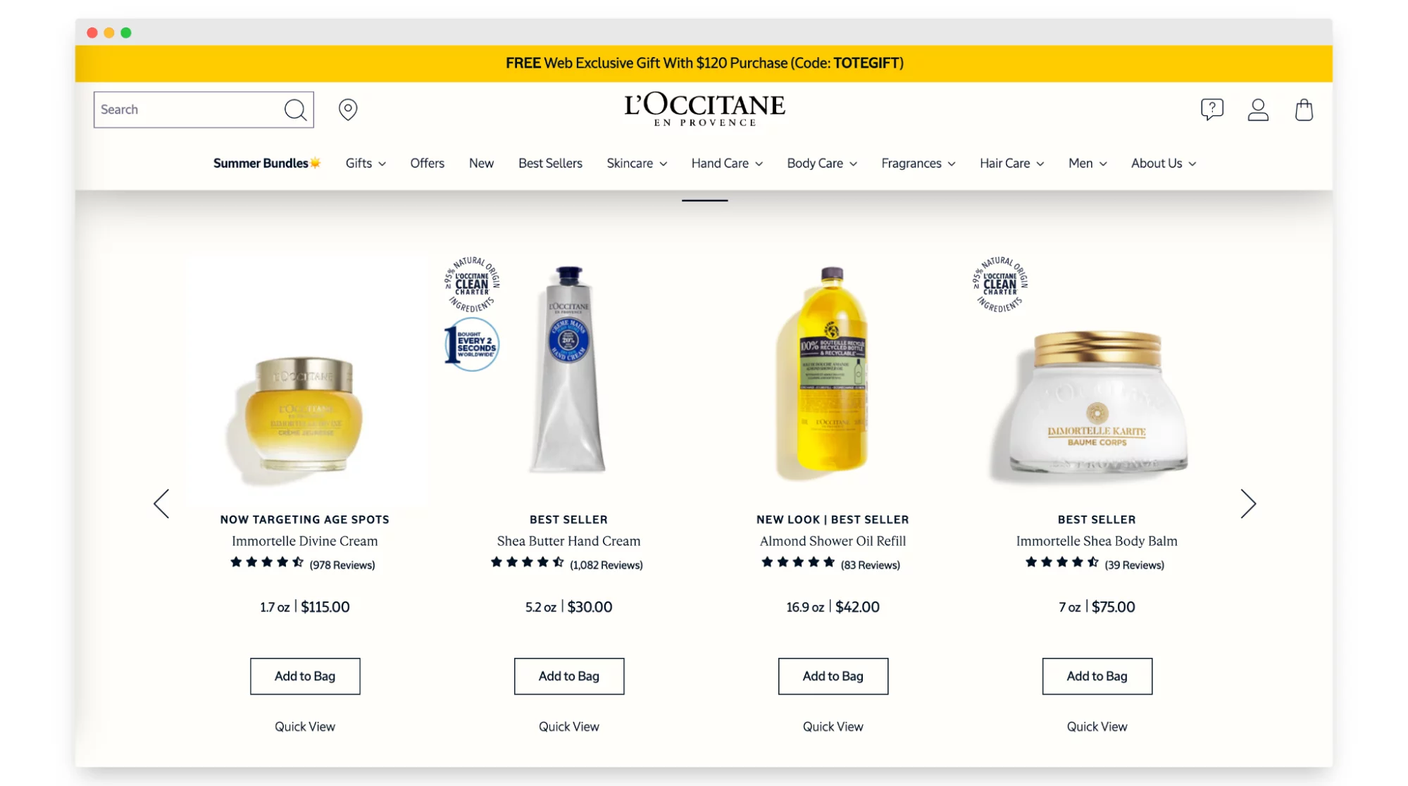
Shopify store category: beauty
Solutions used:
- Shopify Plus
- PIM and ERP
- Customized Shopify store theme
2. Oakywood – Modern ecommerce store offering innovative solutions
With Oakywood home & decor store, we shared one common goal – create a modern, innovative solution that sets the tone for the future of online shopping. And with the spotlight on international sales and sustainable materials, Oakywood is setting the global Shopify shop standard in its niche.
In collaboration with Precismo, we brought to life a 3D furniture configurator. This solution gives users the ability to view the product from all angles so that they do not miss any detail.
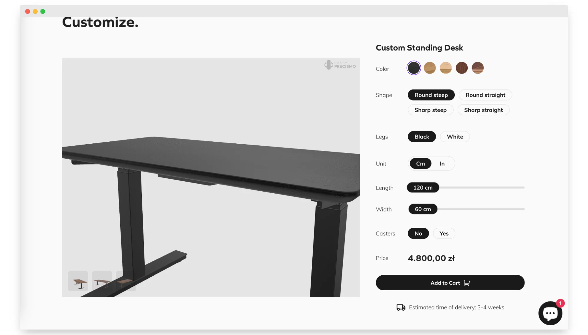
Shopify store category: home & decor
Solutions used:
- Shopify Plus
- 3D furniture configurator
3. God Save Queens – Celebrity-loved fashion brand and successful Shopify store
God Save Queens is a lingerie brand loved by celebrities from Emily Ratajkowski to the Kardashian clan. In response to their success overseas, they open themselves up to international sales. And they couldn’t leave their Shopify fashion store behind.
With Shopify Plus at its core, this store is both a fashion and tech wonder. With a custom-size converter that syncs seamlessly with sizing and high-quality visuals, users can make hit purchases regardless of their distance.
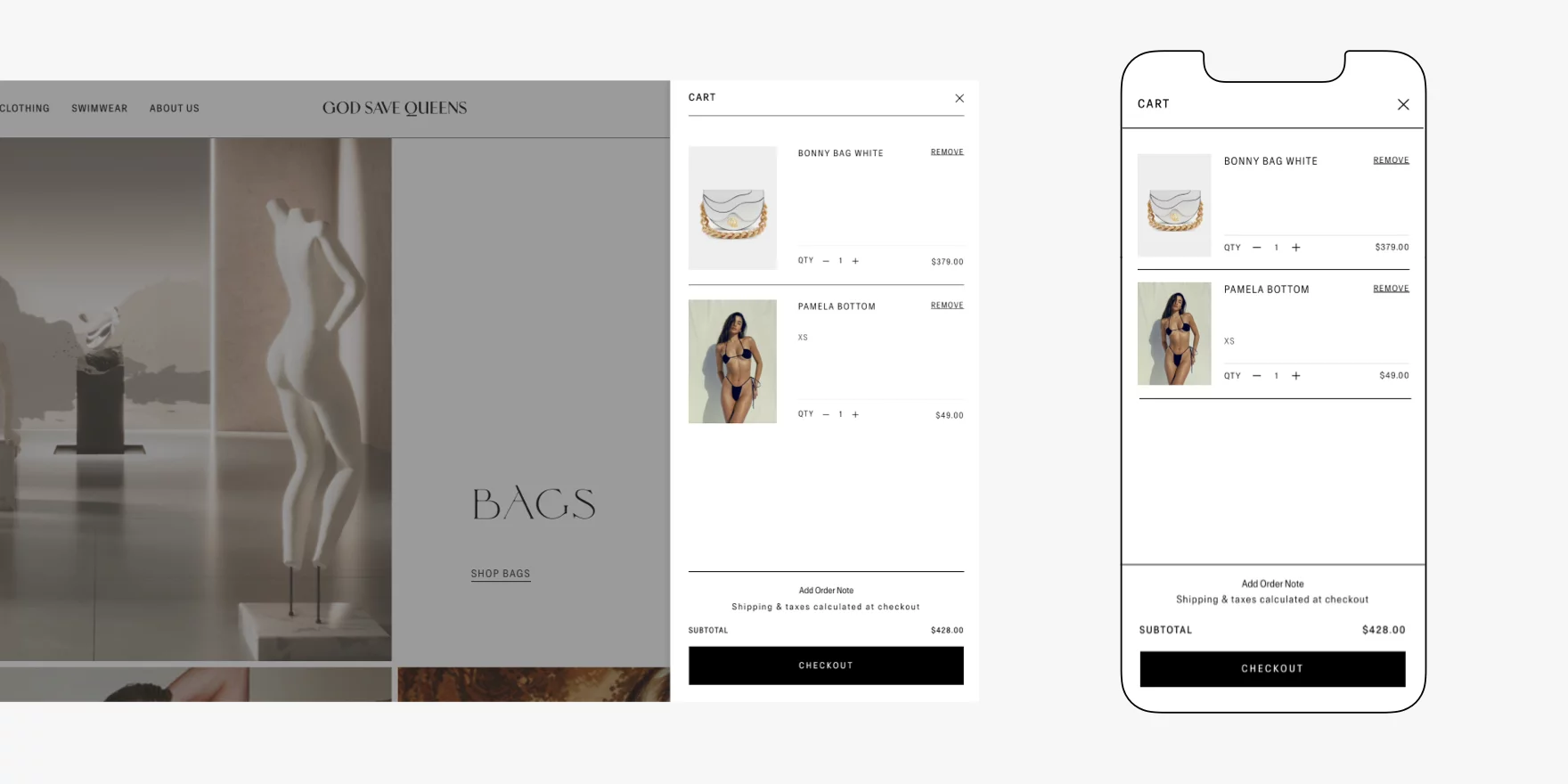
Shopify store category: fashion
Solutions used:
- Shopify Plus
- Custom size converter, tailored to brand sizing
- High-quality photos as the essential element of fashion stores
4. Shoepassion – Redefining shoe shopping with custom applications
Shoepassion is not an ordinary store with comfortable shoes. It’s the store that goes with an outstanding experience (not only the one from the UX design side). Along with shoe buying, it offers customers a premium shoe restoration and repair service. Because of this, we faced the challenge of integrating both these functions into one app.
The result is a custom-made app that aligns real-time inventory alignment with physical stores. To reach this with ease, Shoepassion uses the Shopify POS system to integrate and manage all of its sales channels.
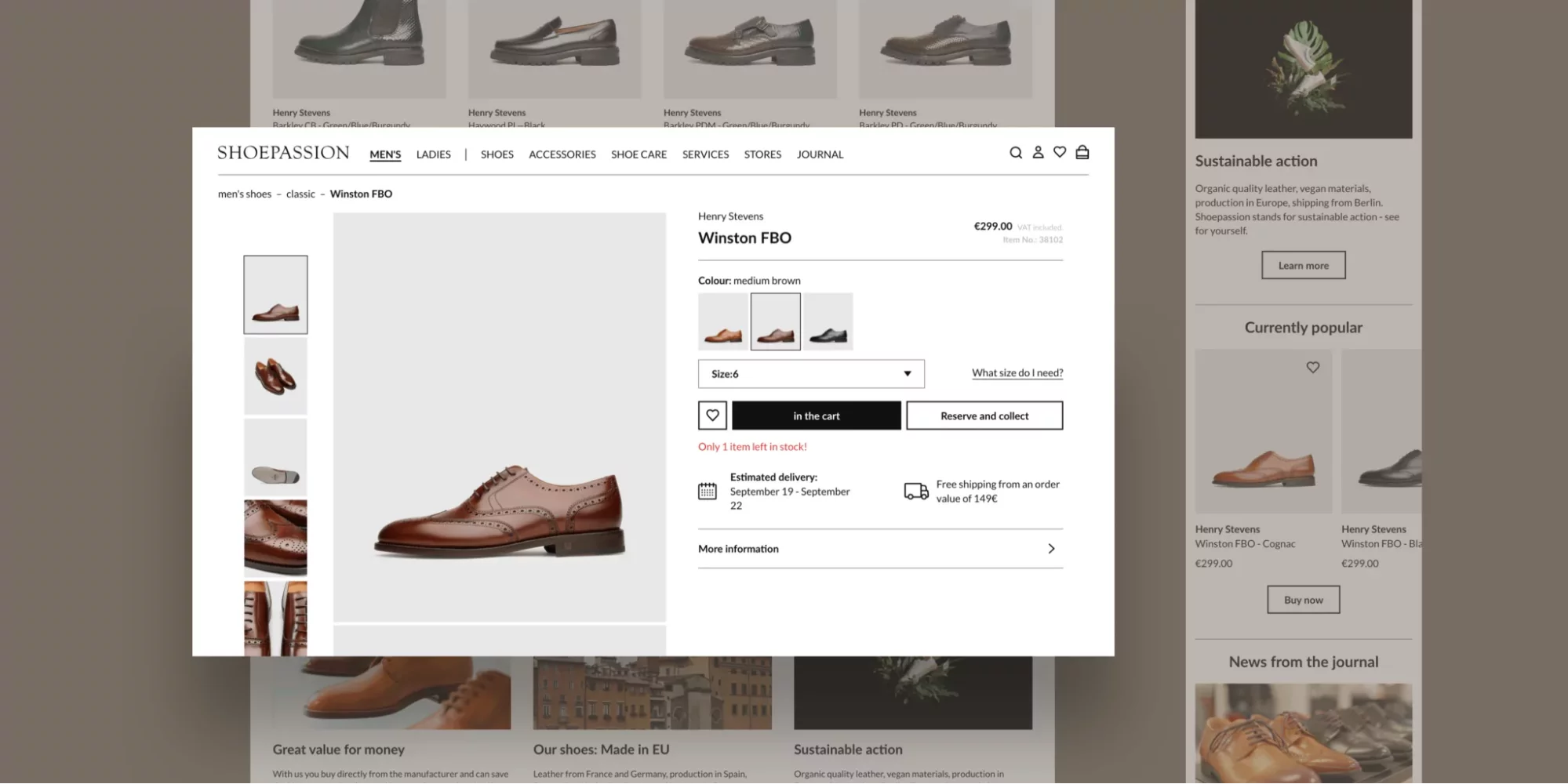
Shopify store category: fashion, footwear
Solutions used:
- Shopify Plus
- Custom application that keeps inventory up to date, correlates with stationary stores and Shopify POS
5. Optisofa – Elevating the shopping experience with custom AR solutions
Among the top Shopify stores is Optisofa. In this store, Augmented Reality solutions enable the customers to find exactly what they are looking for. Using their phones, users can virtually place furniture in a room and see if it fits their living.
As part of the Optisofa AR toolkit, together with Mimeeq we’re developing a 3D product configurator. With custom touches and a chic Shopify site design, this store stands out among other home decor Shopify stores. All of that is to give its customers the best shopping experience.
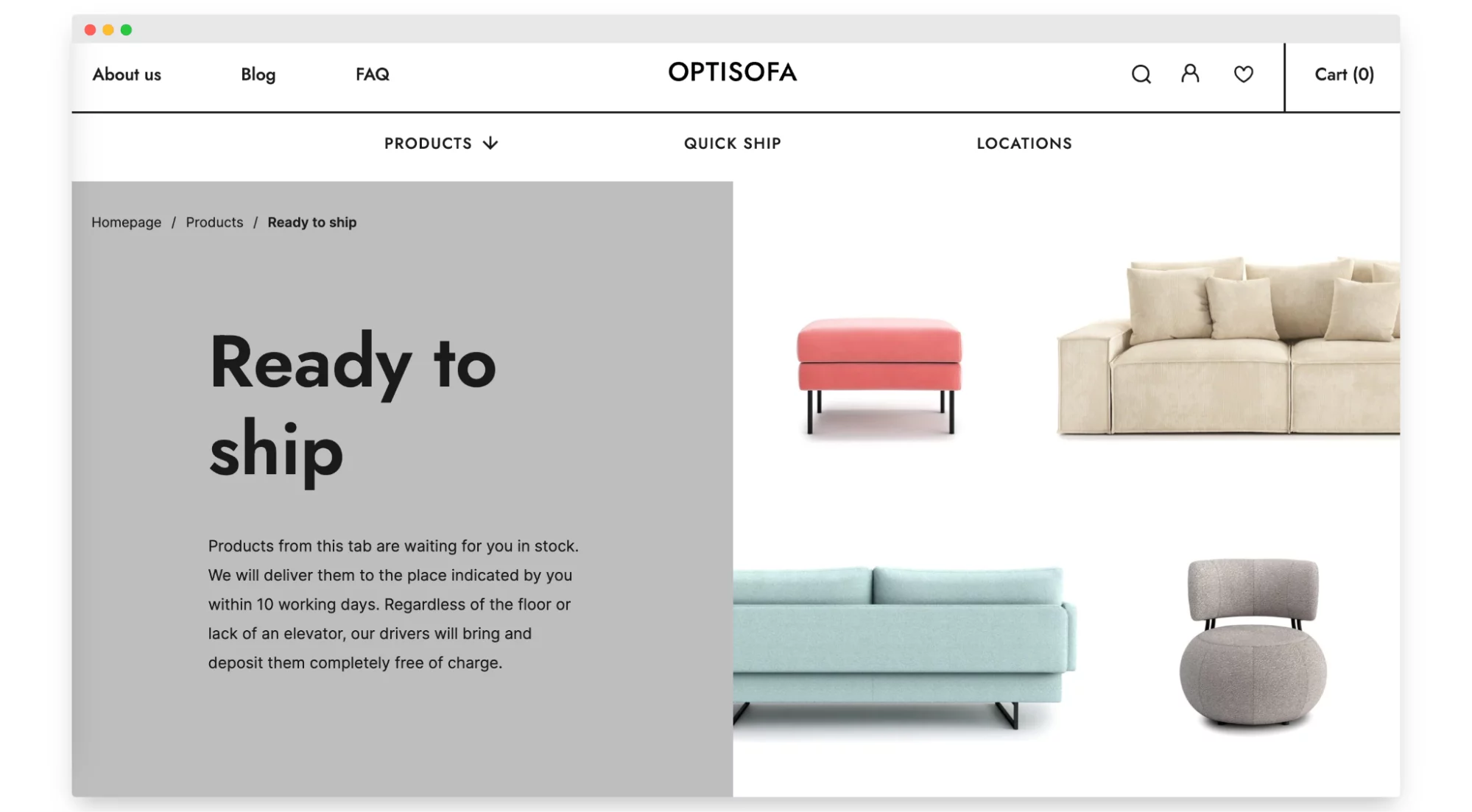
Shopify store category: home & decor
Solutions used:
- Shopify
- AR solutions
6. Vetsak – Shopify website solution with 3D furniture configurator
Vetsak, as a brand that blooms in home & decor, needed an ecommerce solution robust enough to match its rapid growth (especially spanning over five regions).
The result? A spectacular 100% boost in conversions post their Shopify Plus transition. The cherry on top? A 3D configurator, thanks to our collaboration with an international partner.
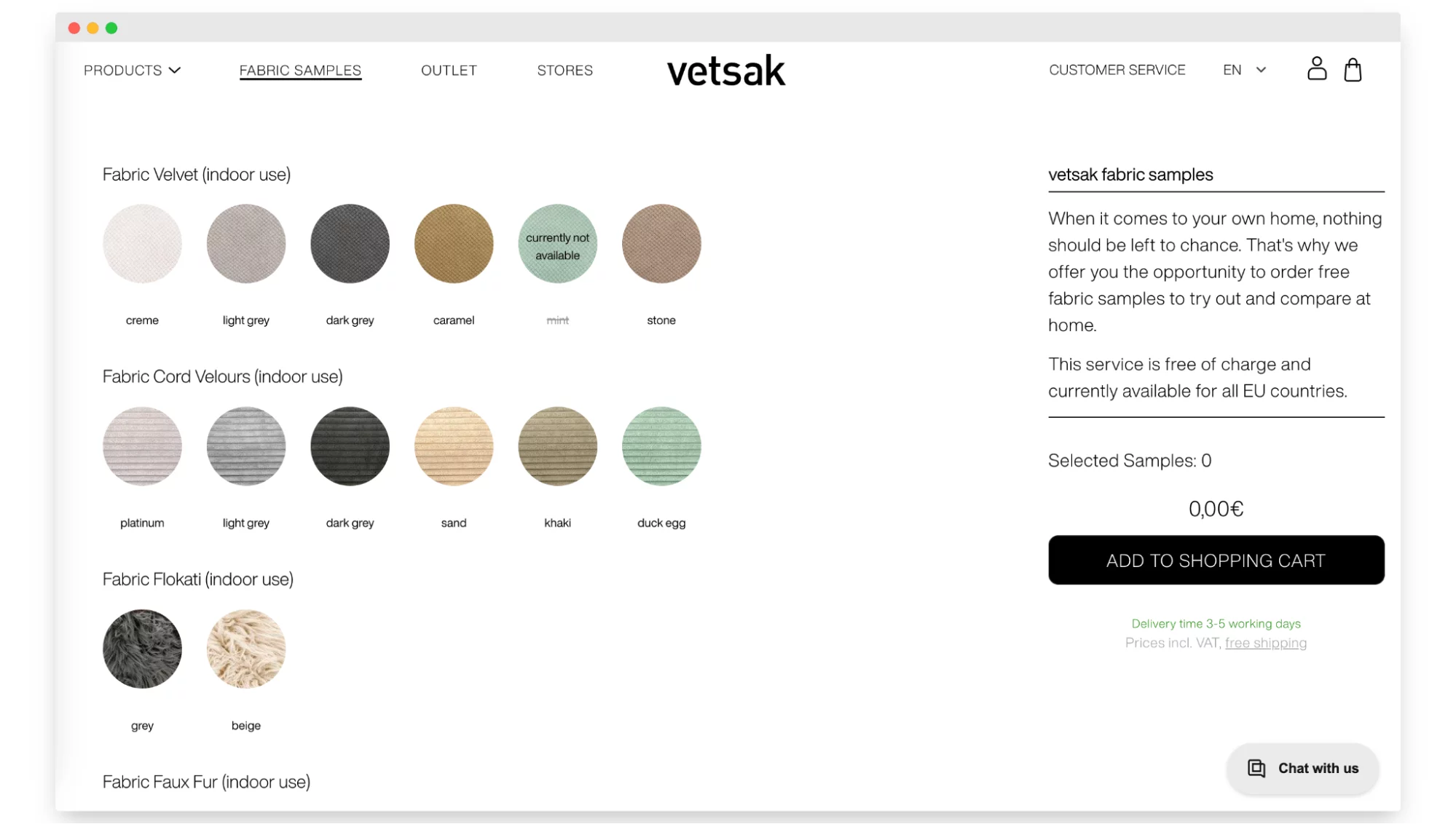
Shopify store category: home & decor
Solutions used:
- Shopify Plus
- AR solutions (developing a 3D product configurator)
7. Glov – Innovative Shopify-based subscription model
Glov is proof of how innovation can be elegantly simple. Women globally loved their magic makeup remover pads. This love had to be reinforced with Shopify’s subscription model.
Complementing Glov’s vision, our custom Shopify apps elevate the overall shopping experience. Because of the large inventory and wide Shopify store offer, designing the website to make browsing through many categories of products convenient was quite a challenge that the WeCanFly agency overcame.
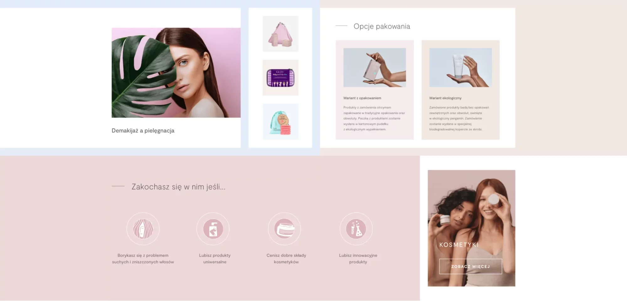
Shopify store category: beauty
Solutions used:
- Shopify
- Subscription model with Bold Subscription application
- Custom Shopify apps
- Baselinker application that enables Shopify and Enova ERP to exchange data seamlessly
Key Lessons from Top Shopify Stores
The best Shopify websites can teach you many valuable insights into how you should design your store (and what to avoid). Here’s the crème de la crème of key takeaways from UX and UI design practices mentioned above that make all the difference between a bad and a good customer experience.
Lesson 1: Tailor user experience
Customize your store’s design to match the preferences of your target audience, whether it’s beauty, fashion, or home decor – to create a tailored and engaging experience. Whenever you develop a product, keep your customer in mind so they can easily navigate the shopping path.
💡 Actionable tip: Conduct thorough research on your target audience’s preferences and behaviors. Use this data to inform your design choices, from color schemes to layout.
Lesson 2: Be open to innovation and modern perspective
Incorporate interactive features into your great Shopify store, like 3D configurators and AR tools, to captivate users and provide a unique way for them to interact with your products.
💡 Actionable tip: Identify opportunities where interactive elements can enhance the user experience. Consider how features like AR can help potential customers visualize products in real-life settings.
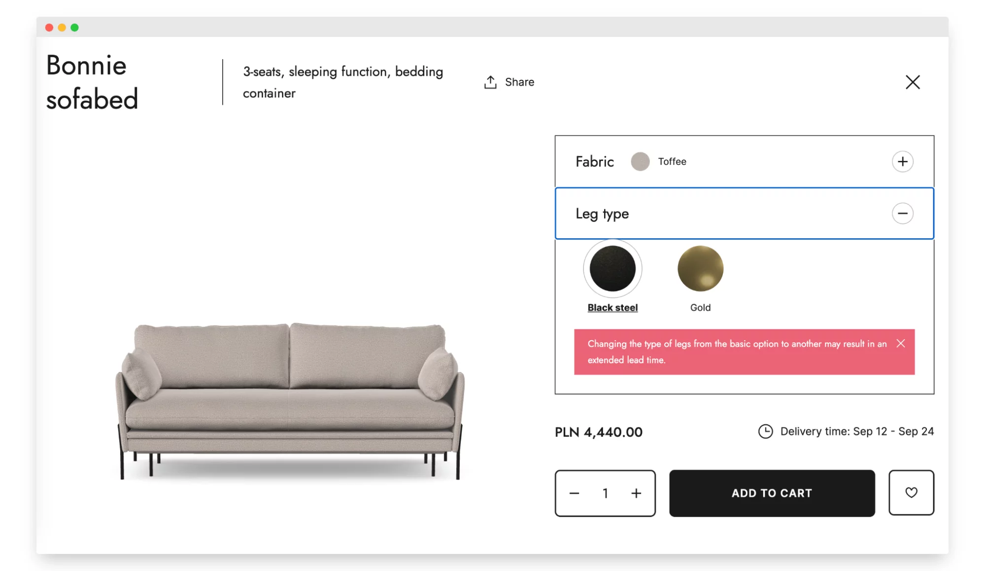
As a great example, on the Optisofa ecommerce website, you can configure the furniture design and see the changes in real-time. You can also view the product in AR. This gives users a more accurate picture of the final product and makes it easier for them to decide.
Lesson 3: Simplify with integration
Seamlessly integrate external systems such as PIM, ERP, and third-party apps to streamline operations and create a cohesive shopping journey. Thus, you deliver smooth operations both for customers and for backend systems. Test the integration thoroughly to avoid any disruptions.
💡 Actionable tip: Prioritize integration, not only in essential tools like inventory management and order processing systems. You can also implement upselling, marketing automation, and user-generated content elements.
Glov, as another Shopify store example, automated personalized email campaigns based on user behavior and cart abandonment. It allows them to nurture leads and encourage conversions.
Features to Consider for Your Own Shopify Store
If your online business is almost ready, it’s easy to get caught up in the excitement of launching your website right now. But before you do, there are some crucial features inspired by top Shopify stores that you should consider to optimize your site’s user experience.
User-focused Shopify theme layout
The best Shopify stores listen to their users’ needs from the moment they land on the page. The layout should be intuitive and make navigation easy.
- Clear categorization – customers should be able to find what they’re looking for without hassle.
- Visible search bar – sometimes, users know exactly what they want. Make sure they can search for it easily.
- Responsive design – ensure your store looks and works well on all devices, from desktops to smartphones.
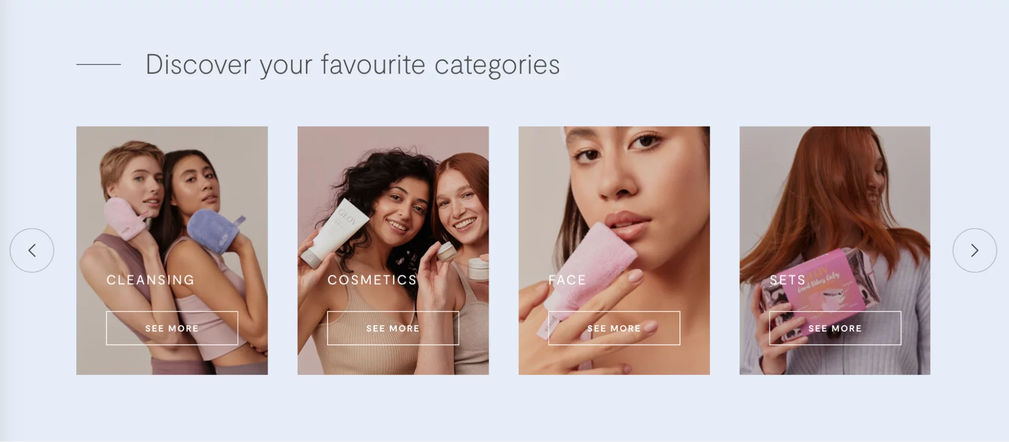
Custom Shopify theme development is something that can make or break your website design. In the case of Glov, for example, a large inventory makes it easy to get lost. So, the WeCanFly team developed a custom theme that fits all these information architectures and categorizes them for easier navigation.
Safe Shopify checkout
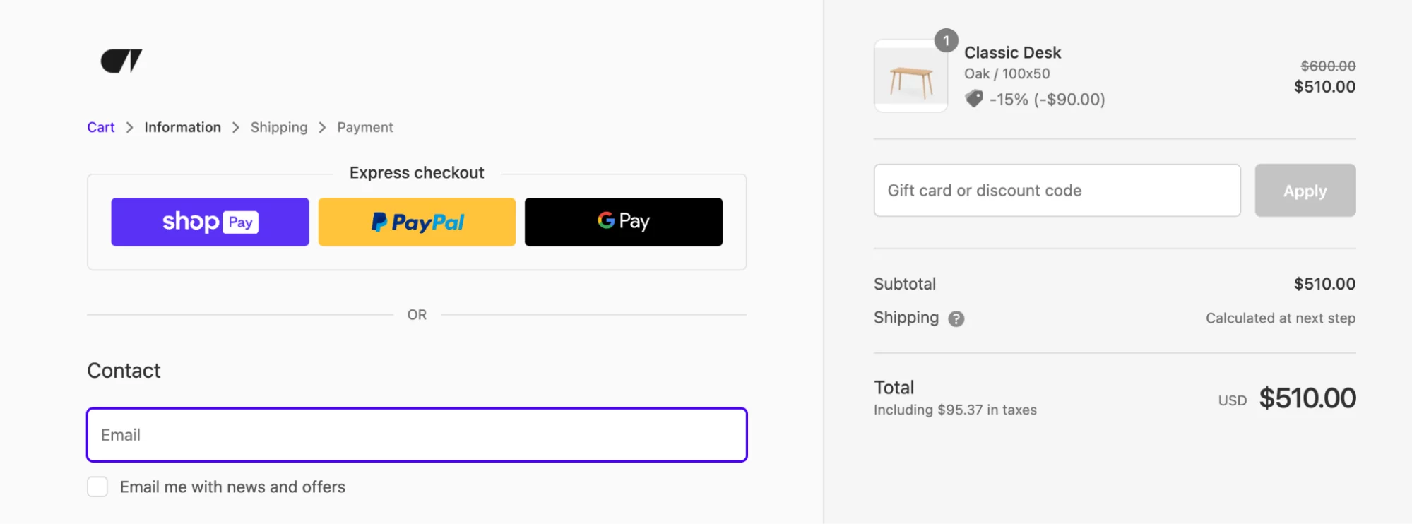
Online shopping is all about trust. You can deliver a smooth and transparent checkout process with Shopify checkout. With Shopify Plus, you can customize the checkout experience even further – manage its functionality and appearance.
- Decreased cart abandonment – users are more likely to complete a purchase if they trust the transaction process.
- Improved reputation – show that you prioritize safety with SSL certificates and recognized payment gateways.
- Clear transaction steps – don’t leave your customers guessing. Show them where they are in the checkout process.
Perfectly timed pop-ups
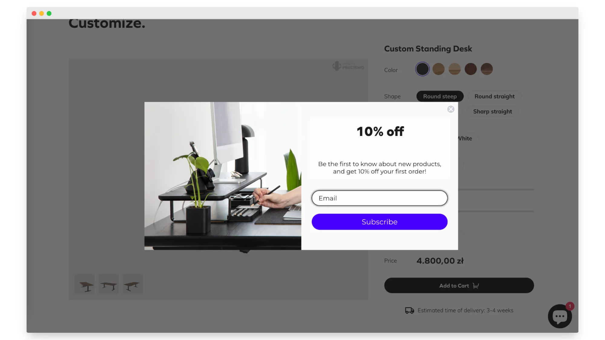
In Shopify website examples, pop-ups that are triggered by certain user behaviors (like leaving the store) are highly effective. However, while pop-ups can be a gold mine for conversions, they can also be annoying if not done right.
- Time them right – don’t interrupt the user as soon as they land. Maybe show a discount after they’ve viewed a few products.
- Make them relevant – personalized pop-ups based on user behavior can make a huge difference.
- Easy exit – always give users an easy way to close the pop-up if they’re not interested.
Shopify stores FAQ
Most frequently asked questions on your store are a section allowing customers to make the unknown known. Think of the FAQ section as a handy tool to address the common questions your customers usually ask. It covers topics like shipping, returns, or product details. By giving clear and direct-to-consumer answers, you’re giving them the power to shop with confidence.
- Customer questions – look at what customers usually ask. Use those questions to guide what you put in your FAQ.
- Easy language – keep it simple and avoid fancy words. You want everyone to understand.
- Keep it fresh – your store changes, and so do the questions. Update your FAQ to stay helpful and current.
Conclusion: Take hints from top players in the game
As you approach the final stages of your Shopify store launch, it’s vital to take advantage of the valuable advice from Shopify website examples who have already succeeded. Just like a skilled player uses smart tactics in a game, you can also learn a lot from the tips and knowledge of experienced e-commerce experts.
Meanwhile, let’s continue to share Shopify expert tips here. If you want to launch your own business, send us a message or give us a call – we’re here for you. Let’s stay in touch on our LinkedIn or Instagram.


