
In this blog post
Shopping for furniture and home accessories online comes with a unique set of challenges – shoppers need to visualise products in their space, compare styles and materials, and make informed choices without seeing items in person. The best Shopify home & decor stores solve these challenges with flawless UX and effortless interaction.
Some brands rely on interactive product pages, others focus on precision filtering or personalisation tools. No matter the approach, the key to an inspiring UX is making the entire shopping process feel natural, intuitive, and engaging.
In this roundup, we showcase leading Shopify stores in the home & decor space, breaking down the UX choices that make them stand out.
What makes a great home & decor Shopify store UX?
A well-crafted UX is what makes standout home & decor Shopify stores so effective. Instead of just looking good, they focus on clear layouts, intuitive navigation, and a frictionless shopping flow. The elements that shape an effortless customer journey include:
Well-structured navigation
A clear and logical menu helps users find what they need without frustration. Stores use mega menus, category-based filters, and room-specific browsing to guide shoppers efficiently.
Smart product discovery
High-performing stores enhance exploration with interactive features, such as “Shop the Look” sections, spotlighted bestsellers, and customisable filters that refine choices based on material, size, or style.
Engaging product presentation
Detailed product pages include high-quality visuals, multiple angles, and real-life context to help customers visualise items in their homes. Many brands also offer 3D configurators and augmented reality (AR) previews for a more immersive experience.
Personalised shopping features
Shops increase engagement by providing bundling suggestions, smart upsells, and configurable options that allow users to personalise their selections before purchase.
Streamlined checkout & support
To minimise drop-offs, stores maintain a clear add-to-cart flow, display transparent pricing, and include quick customer support options, such as live chat or FAQs, directly on product pages.
UX-optimised blog & inspiration sections
Content-driven brands integrate style guides, real-home inspiration, and expert tips into their stores. These sections both educate and encourage purchases through the products in real settings.
Top home&decor Shopify stores with the best UX
In the home & decor industry, where visuals and details matter, UX helps customers interact with products, learn about them, and feel confident in their purchases.
Below, we highlight the most impressive home & decor Shopify stores that excel in UX/UI design. Each one brings something unique to the table.
#1 Optisofa
UX rate: ⭐⭐⭐⭐⭐
.webp)
Optisofa focuses on giving users full control over their customisation choices. With a detailed configurator, free swatches, and smart product filtering, it makes it easy to find the perfect sofa.
Filters
Optisofa helps shoppers narrow their options with well-designed filters that address specific preferences. Whether they are looking for a 3-seater sofa, a specific height, or a certain ground clearance, the store lets them refine their search with pleasure. Each product also displays available fabric variants and subtly informs about additional options.
Product customisation
To enhance the user experience, Optisofa offers a 3D configurator to view sofas from multiple perspectives – and in various fabric options. It also mimics the in-store shopping experience. Additionally, the store supports augmented reality (AR), so users can see the furniture in their own homes.
Technology section
Optisofa sets itself apart with product descriptions that emphasise technical features. With modular collections to 3D-printed connectors and memory foam seats, the brand helps customers understand the craftsmanship behind each piece. Such details help build trust and confidence in the product’s quality and durability.
Free swatches
Buying a sofa online can be challenging, but Optisofa reduces hesitation thanks to offering 5 free fabric swatches. Potential clients can compare materials in natural lighting and decide on their purchase later. Swatches are categorised according to fabric type and include icons with technical specifications.
What makes Optisofa’s UX effective?
We designed Optisofa’s Shopify store for decision-making. Every feature helps shoppers find the perfect sofa without uncertainty, from advanced filtering options to immersive customisation tools.
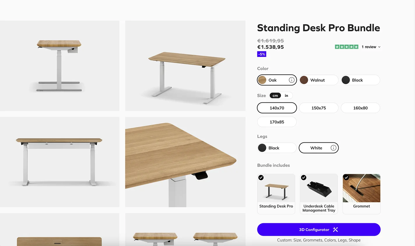
#2 Oakywood
UX rate: ⭐⭐⭐⭐⭐
.webp)
A workspace should be as functional as it is stylish, and Oakywood’s Shopify store delivers on both fronts. We wanted to create an uninterrupted, informative shopping exploration with a well-structured menu, customisation tools, and content-rich sections.
Mega menu
Oakywood makes navigation seamless with a mega menu that displays top-selling products alongside category links. Users can immediately see what’s available and check out promoted blog content or new collections. With visuals, the menu provides more information without cluttering up the space.
Promoting samples
The brand encourages conscious shopping as it offers sample material kits. As a result, it helps users feel confident in their purchases, reduces unnecessary returns, and aligns with Oakywood’s sustainability efforts.
Blog
A well-integrated blog adds another layer of value – it offers content that is both educational and product-driven. Oakywood’s articles cover topics like workspace organisation and ergonomic setups. The result is both positioning the brand as an authority and promoting products.
Configurator
Customisation is key in Oakywood’s UX strategy. The product configurator lets users modify desks. They can adjust dimensions, colours, and features like wire holes or caster wheels. Unlike static 3D renders, the system uses parametric models, making the customisation process fast and intuitive without overloading the site.
What makes Oakywood different?
Oakywood’s Shopify store balances aesthetics with performance. From an intuitive mega menu to a sophisticated configurator, every element is here to make shopping for workspace solutions simple and personalised.
#3 Home Carpet One
UX rate: ⭐⭐⭐⭐⭐
.webp)
Home Carpet One’s Shopify store is designed for effortless product discovery and purchasing. Whether homeowners are selecting flooring for a renovation or professionals are sourcing materials for large-scale projects, the UX ensures clarity, convenience, and customisation at every step.
Calculators
Flooring selection is simplified with built-in calculators. Instead of guessing how much material is needed, users enter their room size, and the system automatically calculates the exact number of packs or square feet required. Bulk pricing adjustments and a +10% stock buffer are included to prevent under-ordering.
Sample ordering system
A dedicated sample ordering system lets users build a custom sample box while browsing. The feature is fully integrated across the site and allows shoppers to add samples to their cart at any time. For professionals working on multiple projects, this tool may streamline their decision-making.
Navigation
The store’s intuitive navigation makes finding products, services, and resources easy. Instead of overwhelming visitors with excess information, content is structured into digestible sections: a simplified menu, a categorised FAQ, and a refined “About Us” page.
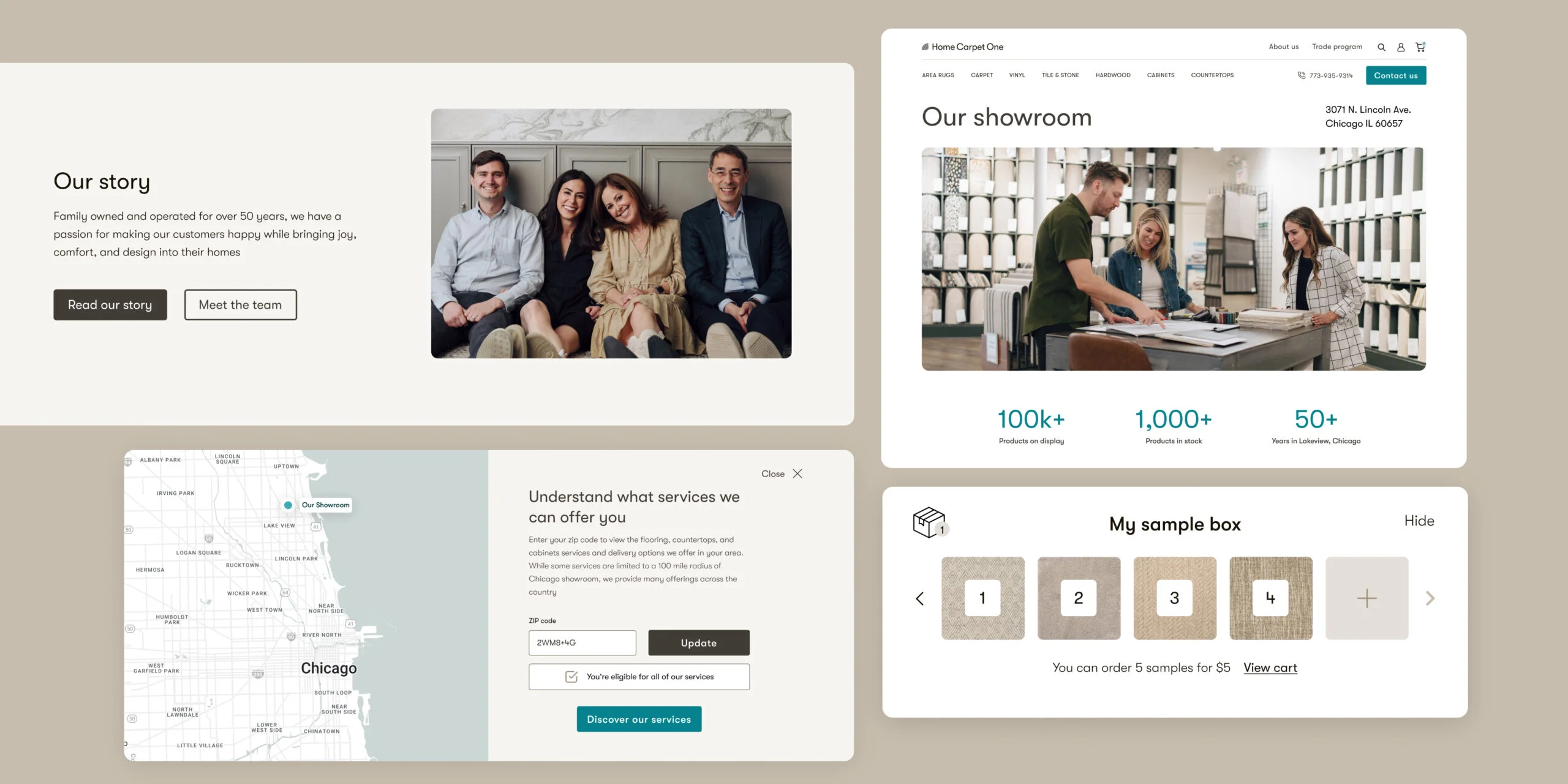
Integrated tools
Home Carpet One integrates advanced tools. For example, RoomVo AR lets shoppers visualise flooring in their space before purchasing, and ERP Integration guarantees accurate inventory and a smooth checkout process.
What makes Home Carpet One’s UX exceptional?
Home Carpet One creates experiences that are as practical as engaging. That’s because of blending intelligent features with a clean, user-friendly interface. The store’s UX is designed for a confident evaluation process and a seamless path to purchase.
#4 Monolith
UX rate: ⭐⭐⭐⭐⭐
.webp)
Monolith’s Shopify store is an elegant fusion of craftsmanship and modern technology. It reflects the brand’s deep respect for nature while providing an intuitive and refined shopping experience.
Videos and interactive elements
Monolith online store captures uniqueness through immersive design elements. The site features high-quality videos, animations, and interactive elements that bring each product to life. Customers can see tables from different angles, view close-up details, and appreciate the craftsmanship behind each piece.
Filters
Thanks to a thoughtfully designed product catalogue, finding the perfect table is now a seamless process. The site uses advanced filtering and now, customers can search based on material, resin transparency, wood type, and other essential factors. The addition of icons and tooltips offers real-time explanations of product features.
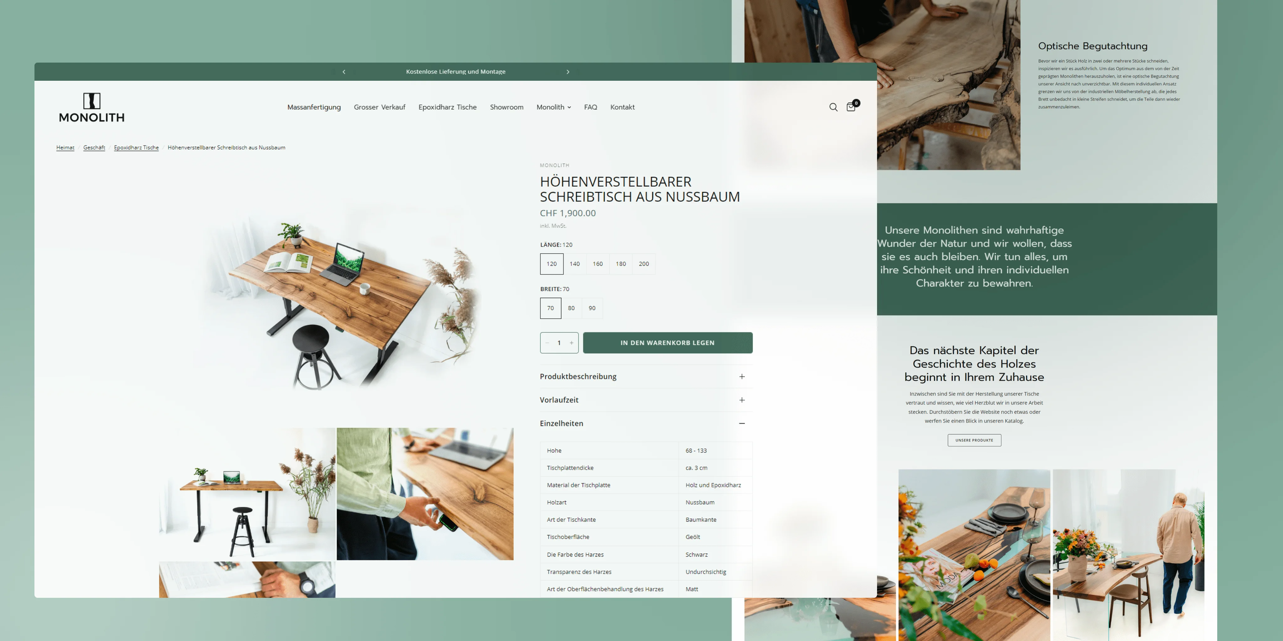
Support
Recognising the importance of direct interaction, Monolith’s store integrates multiple communication channels, including live chat and WhatsApp. Customers can connect with a representative to ask questions, receive guidance, or finalise a purchase.
Why be inspired by Monolith UX?
The combination of a visually striking design, polished navigation, and practical shopping tools makes Monolith a standout in the luxury furniture market. Every element reflects Monolith’s philosophy: honouring nature, embracing craftsmanship, and delivering a premium customer journey.
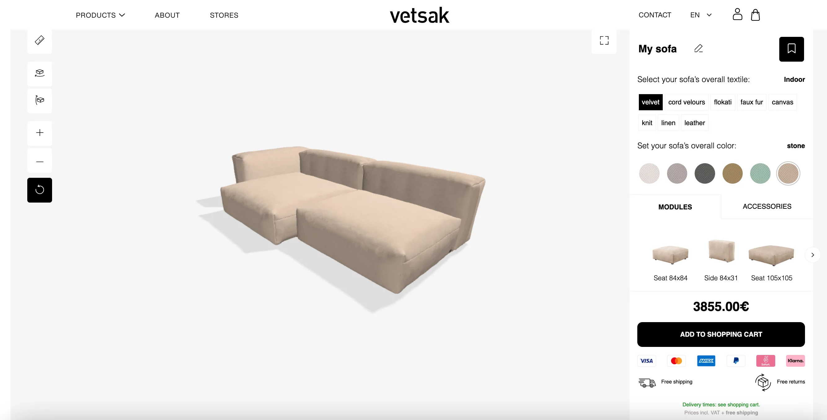
#5 vetsak
UX rate: ⭐⭐⭐⭐⭐
.webp)
vetsak’s Shopify Plus store is a testament to how modern e-commerce should function – visually striking, technically robust, and user-friendly. The platform blends high-end aesthetics with practical, conversion-boosting solutions.
3D configurator
The star of the store’s UX is its product page. It goes beyond static imagery, featuring a 3D furniture configurator that allows customers to explore different materials, colours, and sofa layouts in real time. It makes online shopping feel tangible and shows how a product will fit into a space.
Mobile shopping
vetsak’s store is optimised for seamless browsing on smaller screens. The navigation is streamlined, pages load quickly, and essential actions – such as adding items to the cart – effortless. Express checkout options like Apple Pay, Google Pay, and PayPal reduce friction.
Multi-storefront approach
Selling in multiple markets comes with challenges, but vetsak’s multi-storefront approach eliminates common roadblocks. Each region operates on its subdomain – customers can see localised pricing, payment options, and shipping methods.
Visuals
The store is designed to showcase large, high-resolution images and videos without sacrificing performance. The product displays are immersive so that customers can appreciate the materials and craftsmanship. The created balance between visual appeal and responsive performance keeps users immersed.
Why does the UX stand out?
vetsak’s Shopify Plus store is an extension of the brand’s luxury experience. All page sections prioritise convenience, personalisation, and engagement. It’s an e-commerce platform that makes buying an encounter worth remembering.
#6 Parachute
UX rate: ⭐⭐⭐⭐⭐
.webp)
Parachute’s Shopify store sets a high standard for home and decor e-commerce UX. The brand creates a serene, premium atmosphere that reflects the quality of its products.
Homepage
Parachute’s homepage balances minimalism with functionality. A clean grid layout highlights essential product categories (such as bedding, pillows, and robes) and calls for effortless navigation. As featured sections showcase bestsellers, new arrivals, and curated collections, visitors can quickly find inspiration and key products.
Navigation
Rather than overwhelming users with broad categories, Parachute offers smart filtering options. The “Shop by Material” feature simplifies decision-making thanks to grouping products according to fabric type, such as linen or brushed cotton. Such a customer-first approach helps shoppers easily filter based on what matters most.

Mega menu
The structured mega menu divides products into logical subcategories, so customers can easily locate specific items. Users can shop according to type or material and avoid scrolling through extensive product lists.
Product pages with high-quality imagery
Parachute’s product pages are designed for clarity and ease of use. Each listing features large, high-resolution images that showcase textures, colours, and product details. Users can select size, material, and style variations with a simple, well-spaced layout.
Bundles
Parachute offers bedding bundles to enhance the shopping experience. Customers can easily purchase complementary products in one go. In this way, the company reduces decision fatigue, encourages upselling, and creates a more cohesive shopping journey.
Why does it work?
Parachute’s Shopify store prioritises user needs at every touchpoint. A calm, intuitive design, strategic navigation, and thoughtful product organisation make for a seamless, enjoyable shopping experience. It’s exactly what customers expect from a premium home and decor brand.
#7 Fest
UX rate: ⭐⭐⭐⭐⭐
.webp)
FEST blends minimalist aesthetics with a highly functional user experience. The store’s UX prioritises clear product presentation, interactive sampling, and well-designed listing pages.
Product presentation and visualisation
FEST’s homepage showcases a vibrant yet minimalistic design, with high-quality images that reflect the brand’s character. The main categories are placed right under the hero section and include a curated, prominently displayed selection of bestsellers. Now, shoppers don’t have problems finding the most sought-after pieces.
Samples
Understanding the importance of material and texture in furniture shopping, FEST offers a sample ordering feature. Customers can see and feel textiles before committing. The website’s simple yet powerful UX addition reduces hesitation and boosts conversions.
Product listing pages
FEST’s PLPs are designed for easy navigation. They feature a carousel with product categories and images at the top. The inclusion of well-structured filters with a strong visual hierarchy allows users to refine searches based on specific needs.

Product specs
FEST keeps specifications clear and accessible. A dedicated section displays dimensions, materials, and collection details in a simple format, so users don’t have to search for key information. The result is seen in a frictionless judgment process.
Why did FEST UX hit the target?
FEST’s Shopify store is a prime example of how a well-balanced UX can elevate a brand’s online presence. With its high-quality visuals and attention to detail, the store provides a fluid and informative exploration.
#8 Feum
UX rate: ⭐⭐⭐⭐⭐
.webp)
Feum’s Shopify store stands out with its structured and interactive approach to product presentation. From a well-designed hero section to a streamlined PDP, the store provides a captivating and informative shopping experience.
Hero section
The first viewport of Feum’s homepage is designed to deliver essential information at a glance. A clean navigation bar, a prominent banner leading to new arrivals, and clearly stated Unique Selling Points ensure that visitors immediately understand the store’s value proposition.
Spots with products and features
The feature appears on both the homepage and individual product detail pages. It lets users experience items in real-life settings. The “Shop the Look” section is particularly effective, as it helps customers visualise products in a curated space while offering a direct path to purchase.

Product detail pages
Product pages prioritise clarity and ease of navigation. A simple configurator allows to select colour and size variations effortlessly, while key details about shipping, returns, and payment options are presented upfront. The image gallery is structured to display two images at once, reducing the need for excessive scrolling.
Dimensions
Feum goes beyond standard product descriptions through technical drawings for precise measurements. They include details such as shelf dimensions and cable entry holes. A small sticky “Add to Cart” button makes purchasing accessible from any part of the page.
Why did FEUM UX hit the target?
Because aesthetics and functionality are balanced. Through FEUM’s intuitive hero section, interactive product spots, and well-structured PDP, the brand gives customers what they want: explore, configure, and purchase with confidence.
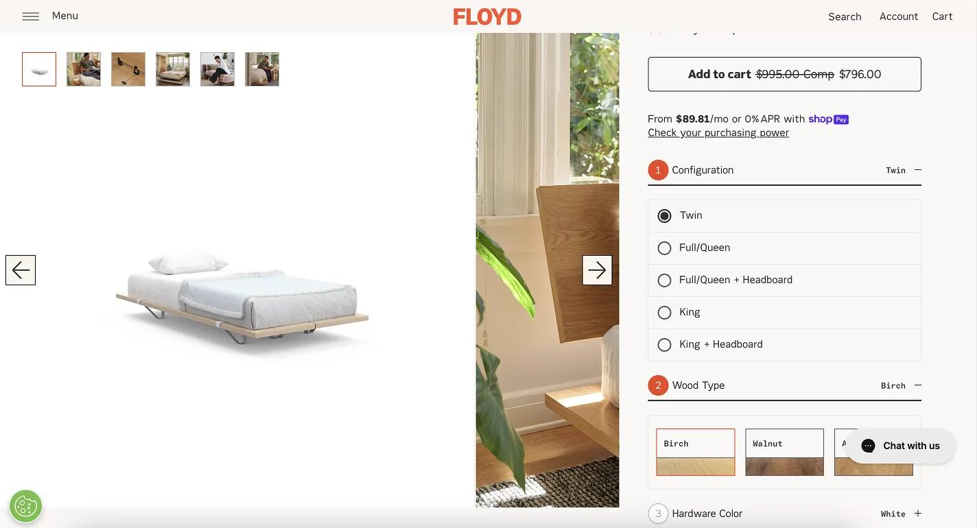
#9 Floyd
UX rate: ⭐⭐⭐⭐
.webp)
Floyd blends minimalism with functionality. With a strong visual identity, well-structured product displays, and thoughtful customisation features, the store makes browsing and purchasing effortless.
Featured products
A dedicated featured products section, complemented by a tile-based layout, highlights key items while maintaining a clean, visually appealing structure. The store strategically places high-quality images with a consistent design style to reinforce the brand’s premium look and make product selection seamless.
Variants
Floyd simplifies the customisation process using accordion-style dropdowns to arrange product variants. Users can select their preferred size, material, and finish without overwhelming the page with too many options at once. The store also uses a signature accent colour – orange – to highlight important elements like selected items.
Reviews
The store effectively leverages Shopify review apps to create an engaging and informative feedback section. Customer feedback is integrated into Floyd’s product pages in a clean, scannable layout. Reviews follow a clear typography hierarchy, so star ratings, user comments, and Floyd responses are easy to read.
Product listing page
Floyd’s PLP is divided into sections, with a prominent overview title and individual product variants. The layout helps users distinguish between similar items but still provides quick access to purchase options. With concise descriptions and clear images, the store makes it easy to navigate through different models.
What makes Floyd’s store experience exceptional?
Floyd’s Shopify store maintains a functional yet stylish e-commerce design. Its structured product presentation, smooth customisation, and engaging customer reviews create a well-balanced shopping journey. Every element is carefully designed to guide the user.
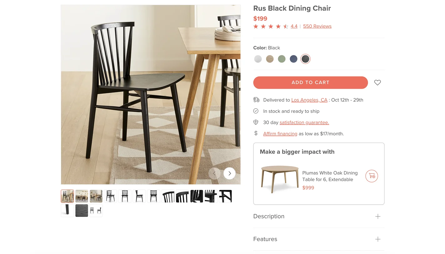
#10 Article
UX rate: ⭐⭐⭐⭐
.webp)
Article’s Shopify store creates a pleasant shopping journey and balances practical navigation with engaging inspiration. With room-based categories and dynamic upsells, customers can browse and discover new designs without wasting time.
Shop by room
A well-structured navigation system allows one to search for products based on their intended space. Right below the hero section, there are room-based filters that take users to relevant categories like living room, bedroom, or home office. The layout remains clean and intuitive.
Inspirations
A standout feature of Article’s UX is its shop-the-look section, which showcases real-life interiors with tagged products. Customers can evaluate how different pieces fit together in a natural setting and click directly on items they like. This feature transforms browsing into an engaging experience.
PLP with filters
Instead of displaying an extensive product list, Article structures its product listing page with smart filters and subcategories. Users can refine searches without endless scrolling. The combination of images and clear typography is an attractive approach for impatient clients.
Upselling
Article integrates a thoughtful upsell section into its product detail pages. For example, a customer sees a complementary dining table suggestion when viewing a chair. Upselling is a subtle but effective approach that enhances convenience and encourages larger purchases without disrupting the shopping flow.
What sets Article apart?
Article’s Shopify store feels both practical and aspirational. Room-based browsing, lifestyle imagery, and smart upsells create an immersive experience that guides users from inspiration to purchase.
Get inspired and improve your UX
The best home & decor Shopify stores make every step of the shopping process individual and effortless. Shoppers aren’t slowed down by confusing layouts, missing details, or complicated checkout processes – they move through the store without distraction and focus only on what matters.
Want to create an experience that keeps shoppers involved? Focus on clarity, ease of use, and smart functionality.
The smoother the journey, the more likely customers are to buy and return for more.