Cursor Label


Shopify UX & Usability Audit Services
Book a meeting

They trusted us


The key to a successful online store lies in providing a seamless user experience (UX). When users have a positive experience, they are more likely to stay longer and make purchases.
However, if their shopping journey is marred by unpleasant experiences, they may leave without a second thought.

Why do you need it?
01
Retain 88% More Customers
88% of consumers are less likely to return to a site with bad UX. Focusing on experience keeps customers loyal and coming back.
02
Prevent Billions in Lost Sales
Online retailers lose an estimated £1.73bn each year due to slow loading speeds. Faster speed directly translates into preserved revenue.
03
Meet Mobile Expectations
83% of mobile users expect a flawless experience on their devices. Optimization ensures you meet this demand and avoid alienating key shoppers.
04
Reduce Cart Abandonment
70% of customers abandon purchases because of bad user experience. Improving UX is the critical step to converting browsers into buyers.

Why is it worth to work with us?
Experience
200+
Relised Shopify projects
Team
50+
Shopfiy Experts in the team
"Their professionalism, commitment, and flexibility made the migration to Shopify Plus and the development of the platform smooth and seamless."
Daria Żornaczuk
E-commerce Specialist
Services & technologies we use
With over 10 years of experience in the field, you’re in good hands with us, as we know exactly just what your business might need for a successful launch. So what are we especially good at?
01
UX Audit and Pain Point Discovery
Reviewing your e-commerce store through a Usability Audit to discover any issues or pain points that might keep your customers from converting, identifying what works and what doesn't.
02
Comprehensive Research and Live Testing
Reviewing your website and analytic metrics, combined with recruiting people for live testing of your store to figure out the main usability issues.
03
Actionable Report and Improvement Plan
Delivering a detailed report on your site's usability, together with a list of actionable steps and suggestions you can implement right away to improve your Shopify site.
04
Shopify UI Redesign and New Store Planning
Offering specialized assistance to redesign your Shopify UI or lending a hand while planning the design and user experience of a new Shopify store.
Learn more
Tailored services
for your Business
We know Shopify like the back of our hands. We can clearly assess the time and resources that you need to deliver you the result you want.


How can you determine whether your store needs minor fixes or a complete revamp? This is where a UX audit for your Shopify store can be immensely helpful. Let’s delve into what it is and how you should use it.
What is a Shopify UX Audit?
A Shopify usability audit entails a thorough evaluation of your online store to identify any potential issues that might be driving customers away. While it may not directly solve all your store’s problems, it plays a pivotal role in answering crucial questions:
- Where do your users encounter the most significant challenges while navigating your store?
- Can you gather valuable insights about your users’ behavior and needs from the collected data?
- What changes can you implement to enhance your store’s performance and conversion rates?
- Which aspects of your store are functioning well and which ones require updating?
If you’re experiencing low conversion rates, high cart abandonment, or a sudden decline in customer satisfaction, a UX audit can precisely pinpoint the major issues and provide you with a comprehensive list of optimizations for your website.
To conduct a Shopify UX audit, focus on the following key elements:
- Navigation and Usability: Assess the ease of navigation, clear labeling, and logical organization of your store’s pages.
- Page Load Speed: Analyze the loading time of your website to ensure a smooth browsing experience.
- Mobile Responsiveness: Verify that your store is mobile-friendly and provides an optimal experience across different devices.
- Visual Design: Evaluate the overall aesthetics, visual hierarchy, and consistency of your store’s design elements.
- Checkout Process: Review the checkout flow to eliminate any barriers or friction points that may hinder conversions.
By optimizing your Shopify store’s user experience through a thorough UX audit, you can enhance customer satisfaction, boost conversion rates, and ultimately drive the success of your e-commerce venture.
Why Shopify User Experience is important for e-commerce?
With how much work you already have running your Shopify store, adding a UX audit and reviewing your entire store might seem like far too much work for what it’s worth.
- Every dollar spent on improving UX will return $10 to $100.
- Improved UX and UI design can boost your conversion rates by up to 400%.
- 90% of smartphone users say they’re more likely to keep shopping if they’re having a great user experience.
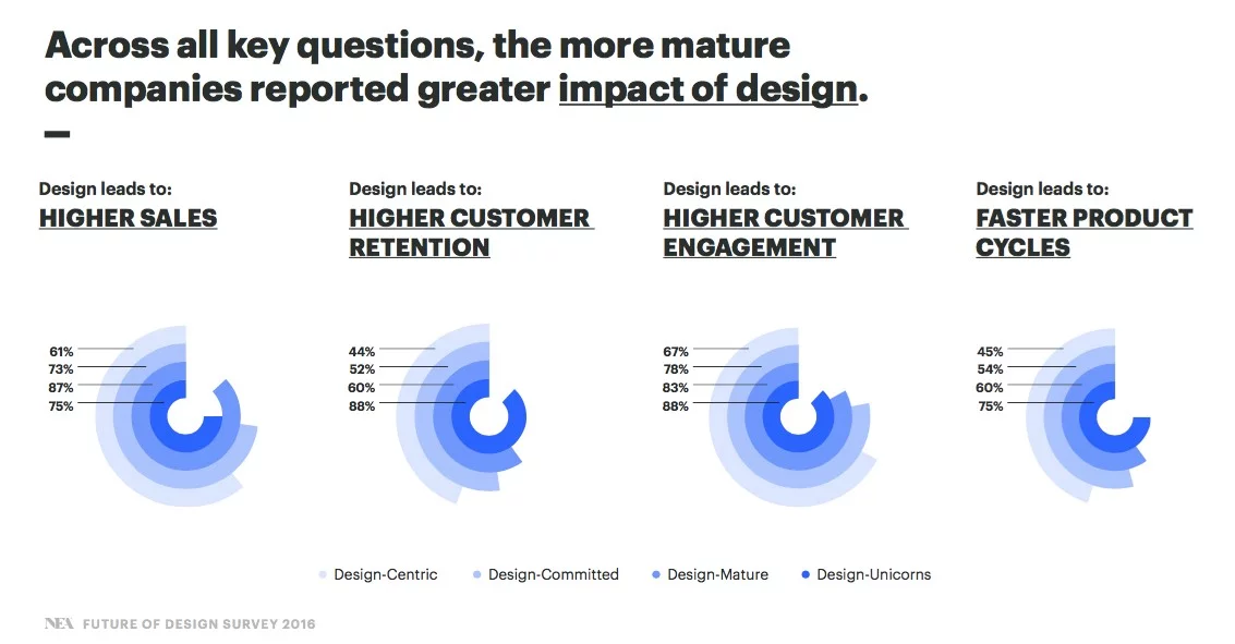
Those statistics should make it clear that if you want to keep bringing people to your store and raise your profits, then working on improving the UX of your Shopify store is essential.
That’s exactly what a UX audit is for – telling you what parts of your e-commerce UX design might need some tweaking because they are frustrating your store users. But if you are looking for hints on how to design a Shopify website so it would be both visually pleasing and give your shoppers a fantastic user experience, then the usability audit can lead you in the right direction as well.
When should you go for a Usability Audit?
When exactly should you think about either performing the Shopify audit in-house or hiring UX design services experts to help you with it? If any of the issues ring a bell to you, then doing a UX audit might be a good start:
- The conversion rate of your e-commerce site is low, and you get a lot of bounces and abandoned shopping carts.
- You are planning a website redesign but first, you want to know what were the weak and strong parts of your current store design to address those during the redesign.
- Your customers regularly ask your support about the information they should be able to easily find themselves (like available payment options) or complain about website bugs
- You want to make your website accessible to people with disabilities.
- There’s a sudden drop in your conversion rates and customer satisfaction, and you need help pinpointing the reason.
- You want to update your store to reflect the latest trends in the industry.
A good idea would be also to schedule periodic UX audits for your store to ensure that your store meets both your business objectives but also that all issues that could negatively affect your users’ experience are spotted and fixed immediately.
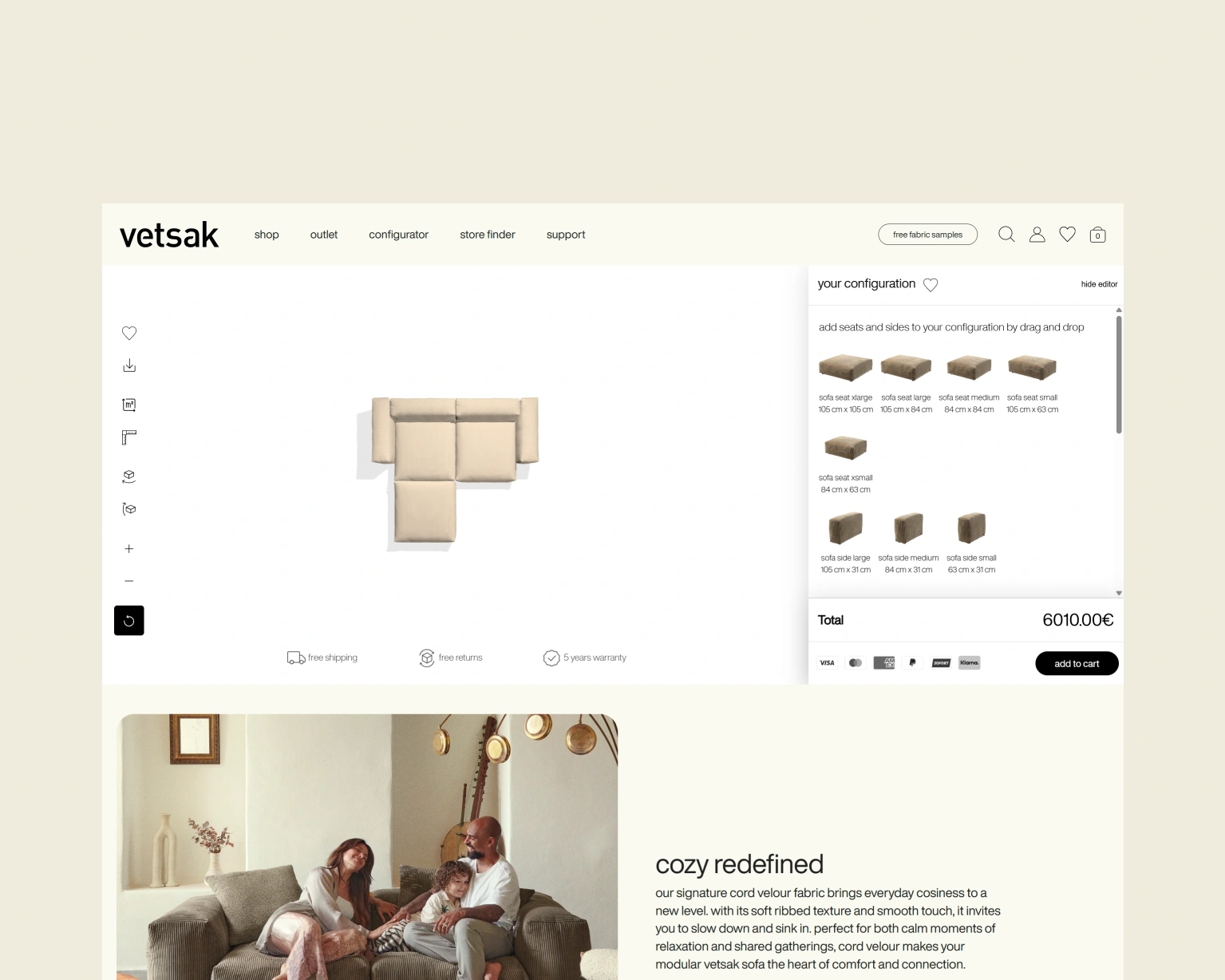
Shopify website design and usability – how important are those for user experience?
The main problem with running the UX audit though is how many elements can affect the user experience. The first thing that came to your mind was most likely your Shopify website design – and you are right. In an Adobe survey, 38% of respondents said they will leave a website if the content or layout is unattractive.
While you can find plenty of Shopify theme templates (free and paid, created by Shopify designers) for you to use, if you are serious about building your brand though then going for a Shopify custom design would be a much better idea – we’ve given some reasons why exactly in our previous article about Shopify themes.
But just as important as the Shopify store design is how easy to browse and use your website is. As many developers now say, “Content is king but usability is the queen” – usability means designing the websites in a way that makes the pages fast, intuitive, and meets all needs of the people who visit them.
What are the main parts of Shopify UX website usability?
- The content form, structure, and organization (is it easy for the users to find the information they need)
- Store performance and speed
- Mobile responsiveness
- Clear, consistent, and intuitive website design, layout, and navigation
- A search engine in a visible place
Basically, your store might have outstanding products and a great design, but if it’s confusing to or can be barely used on mobile devices, then people who came to your website are unlikely to stay on it for long. But if you make it a breeze for them to find whatever information or product they need at the moment, they are far more likely to buy something from you – and return to the store later.
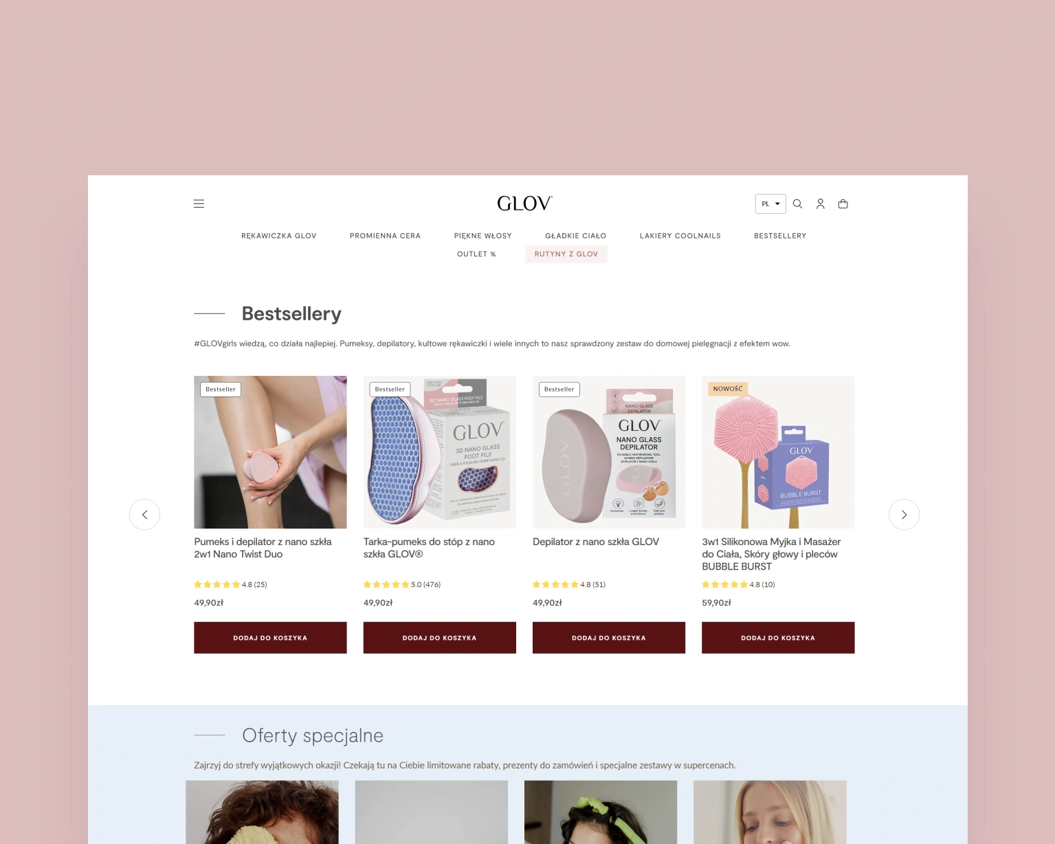
5 effective tips to enhance e-commerce usability
As you can see, while it’s still important to plan and design a visually appealing main theme for your Shopify store, you also want to make the store as easy to use as possible. To know where your store might fall short when it comes to smooth user experience, running a thorough UX audit is your best bet. But while the audit is ongoing, there’s also a few things you can do to make your store more “user-friendly” almost immediately:
Use page headings, subheadings, and breadcrumbs
To make navigating your e-commerce website easier, you should add headings and breadcrumbs to all pages as they help customers find their way in a large e-commerce website. The heading and subheadings can show the user where they are now, while breadcrumbs show the navigation path they have followed so far.
Breadcrumb navigation is especially useful for stores with many different categories and pages since it reduces the number of actions a website visitor has to take to return to any of the categories they previously visited. For example, if you sell cosmetics and your customer is visiting the “face cream” page, the breadcrumb navigation could look like this:
Beauty → Care → Face→ Face cream
with the face cream bolded to show the website user what page he’s currently on it.
Keep contact information visible on all pages
Buying something from your store is a sign the customer trusts you. But how can they trust you if they can’t find your contact information anywhere? Without your contact information easily accessible, you could be missing out on a lot of potential business as potential customers might fear they will be left alone if they have any problems with the purchase.
That’s why you should always show your contact information in an easily visible place (for example bottom right corner of your page) so your website visitors would know how and when they can contact you. Office address, phone number, email address, and a social media account if you have one are usually enough, though it’s a good practice to add your working hours as well.
Have the site search function in a visible place
What is the first thing most people do when visiting a store website? Quite often, it’s looking for the search bar. In fact, statistics say that 43% of users on retail websites go directly to the search bar.
Adding a search function in a visible place might sound like an obvious thing to do when working on your Shopify website design, but you would be surprised to hear just how many online users got frustrated because they couldn’t find the information or product they wanted. A search bar should be located in the “above the fold” section of your site or at the top right corner of your page since that’s where most users expect to find one.
Also, make sure that the search bar works smoothly on mobile devices as well – smoothly as in not requiring the users to enlarge the screen to use the search bar or with the main buttons not covered by any other parts of the website.
Don’t ask your customers to register first
A lot of e-commerce websites still require customers to create an account before they can add products to their shopping carts or make a purchase. The only thing they manage to achieve this way though is getting the customers to leave the store and search for another – around 24% of customers abandon their carts because they are asked to create an account!
For shoppers, buying products through guest checkout is a far better option for several reasons:
- It takes far less time to finish their purchase
- They can decide themselves whether they want to create an account or not, rather than being forced to make one.
- New customers who don’t yet trust your store might be more convinced to make a purchase when they only have to add their address data and payment data for their order rather than having to create a customer account.
A much better way to convince customers to create an account is to show them what benefits they can get by doing so – for example, gaining loyalty program points or hearing first about the newest products.
Add all product information customers might want to know before purchasing to your product page
Struggling with low conversion rates? There’s a good chance that the problem is on your product page – or, to be more precise, on what’s not on the product page.
Finding out about hidden charges, long delivery time, and lack of the preferred payment methods while on the checkout page is actually one of the biggest reasons why customers decide to leave a store and look for another one. Putting all the information they might need right at the front (such as shipping options, return policies, or payment methods) meanwhile shows your customers you care about them making the right purchase decision.
Start to grow your shop with a good Shopify UX strategy
Your content or products are what bring people to your website. But unless those users can read your content, browse the products and make a purchase easily, you might be struggling with keeping those people on your website for longer. Here’s when a Shopify UX audit will come in handy. After the audit, you’ll know exactly what might keep your users from purchasing and returning later to your store and what you should do to fix the issues.
Having trouble running the audit? We can help! With our Shopify website design services and UX experts, you’ll quickly find out what should you change in your store to bring more customers to it. And more importantly, get them to return to the store because of just how fast and easy to use your Shopify store is 🙂
Frequently Asked Questions
We delivered results for many types of Shopify brands. We have gained a deeper understanding of Shopify's challenges. Our experience makes us excellent project managers who can clearly see what lies ahead.
01
When and why does my website need UX audit?
02
What is the difference between UX/UI design and web design?
03
What is a usability audit, and why do I need that?
04
How does the website design process look like?