
In this blog post

Are you thinking about giving your online store a fresh start? That’s smart but risky if you go in blind. A redesign can fix real problems. However, if done without a clear plan, it can create new ones. And the cost? Time, lost traffic, fewer sales… the list goes on.
Before you start changing things, make sure you’re not repeating mistakes others have already made. We put together this list based on real projects we’ve worked on. Read on if you’re curious:
What exactly is an ecommerce website redesign?
It’s when you take your existing website and change how it looks and works. The goal is to make the online store easier to use for you and your customers.
Sometimes it means starting from scratch. Sometimes it’s fixing key things like the checkout page or how it works on mobile devices. A good redesign project helps people find what they need and want to come back.
It’s not just about visual appeal. A successful website redesign strategy improves:
- how your website visitors move through the site,
- how fast it loads,
- how it ranks in search,
- and how well it supports your marketing efforts.

When should you consider a redesign process?
Let us be honest: if you’re even asking this, your gut may already be telling you something’s not working.
There are clear signs it’s time to begin a website redesign project:
- Your existing website looks outdated or doesn’t reflect your brand identity anymore
- The site feels slow or website visitors often bounce before buying
- You’ve added new services or products, but your website pages stayed the same
- Your site isn’t mobile-friendly, and your website performance drops hard on phones
- You’re planning a bigger marketing push, but fear your online store won’t support it
- Your team spends more time fixing bugs than growing the ecommerce business
- Your SEO dropped, and you worry that search engine optimisation wasn’t handled well in the past
- Your existing content is hard to manage or update without a developer’s help
- You don’t know how many pages you have, or which ones still get visits
- Your site’s performance feels weaker with each month, and existing customers stop engaging
In these moments, doing a major redesign is necessary. You don’t have to rush the entire process, but you do need a clear website redesign strategy.
Top 10 biggest mistakes to avoid during an ecommerce website redesign
There’s more to an ecommerce website redesign than updating fonts or moving buttons. A successful one can improve how your store works.
From missing data to forgotten mobile views, here are the most common (and costly) mistakes we’ve encountered again and again.
Let’s go through them, one by one:
#1 Skipping Google Analytics insights before a redesign project
Before starting any website redesign process, always check how users move through the existing website. Google Analytics shows you insights like where people land and what they ignore.
If you skip that step, you risk fixing the wrong thing (or worse, breaking something that worked). You might remove important pages that bring traffic. Or change the URL structure, which hurts your search engine rankings.
You need to understand the user behaviour. Look at:
- which devices they use,
- how long they stay,
- and what pages they visit most.
Study the checkout flow and spot where people stop. That’s where the friction is.
Skipping this part means you’re guessing. And guessing leads to a redesigned website that still has the same problems, just with nicer colours.
So once you’ve studied how users behave on your site, the next step is to understand which parts are actually helping (or hurting) their experience.
#2 Ignoring your current website’s strengths and pain points
Before touching anything in a website redesign process, we always ask: what’s already working?
Skipping a UX/UI audit means you might delete the parts that help people buy. It’s a common scenario: someone rebuilds their ecommerce site, thinking they’re doing a full upgrade. But the new site performs worse, just because they removed what users liked.
Tools like Hotjar help you spot real problems, like messy menus or confusing landing pages. They also show where people scroll and what they never even see.
At the same time, they highlight what to keep. Maybe your product filters work well. Maybe your mobile layout already feels user-friendly.
Without that input, you’re guessing. And a guess leads to wasted internal resources and a poor user experience.
Audit first. Set clear site redesign goals. Then build from there. That’s how a successful redesign is done.
💡 Do you want help spotting what works and what doesn’t on your current site? At WeCanFly, we run in-depth UX and usability audits for Shopify stores. We’ll help you keep what matters and fix what blocks your growth. See our Shopify UX audit services.
Now that you’ve mapped out what to keep and what to fix, it’s time to get clear on the goals. A redesign without direction is a fast road to wasted time.
#3 Redesigning without clear goals or key performance indicators
If you jump into a website overhaul without clear goals, it’s easy to get lost. We’ve seen new websites that looked great on the outside but didn’t solve any problems. No better sales. No better clicks. Just a nice layout and a confused team.
Before touching any web design, write down what you want to change:
- Is it a shorter checkout?
- Better search?
- Faster page load times?
- Higher sales on high traffic pages?
Be specific. This helps everyone stay focused, from your project manager to your developers.
Also, think about what your target audience expects. If your site is full of jargon or hides product categories behind vague menus, people will leave. They don’t have time to figure it out.
A redesigned site without a clear plan often leads to more mess and more money spent fixing it later.
Set your goals. Know your numbers. Then start.
#4 No continuous testing after launch
But even if your goals are set, they mean little without tracking what happens after launch. This is where most teams slip. If you stop there, you’re guessing again.
A new website isn’t a finished product. It’s a test bed. You launch, and then you watch and tweak. Then you repeat.
Without A/B tests, you don’t know if that new checkout layout works better or just looks better. Without tracking, you won’t see which product pages keep people scrolling and which make them quit.
Some teams spend months on a website overhaul. They hit publish and walk away. No follow-up. No testing. And then wonder why conversions stay flat.
The truth is: what looks clean in your draft might be confusing in real use. That’s why you need to conduct usability testing, even after launch. Keep a pulse on user behaviour. Use data, not gut.
No testing means slow decline. Small changes, tested and measured, keep a successful ecommerce site alive.
🔁 A new store isn’t the finish line. It’s the test lab. WeCanFly helps Shopify brands run experiments and optimise on the go. See how we support Shopify growth.

With ongoing testing in place, you’ll start spotting patterns, like where people drop off or struggle to navigate. That brings us to your site’s structure.
#5 Messy or unclear site architecture that confuses users
If the structure of your site feels messy, people get lost. We’ve worked on full redesign projects where the sites looked great, but users couldn’t find the products. They looked around and gave up, clicking the “X” button.
Your sites set the tone. So they should help potential customers understand what you sell and what makes you different. If your bestsellers or categories are hidden behind odd labels or icons, you’re losing sales.
A weak layout not only hurts trust. It also makes technical SEO harder and creates more support work later.
Clear structure means clear paths. Confused users don’t come back.
Of course, structure starts with the homepage. It’s your front door. If it’s unclear, people won’t explore further.
#6 Neglecting the power of your homepage design elements
The homepage is often the first thing people see, and sometimes the last. If it’s weak, they won’t stay long enough to care what else you sell.
Your homepage should say:
- who you are,
- what you sell,
- and why someone should keep clicking.
If you hide your best products or stuff everything under one button, you’re wasting prime space.
Think about your target audience. Do they see something they connect with? Can they find what matters in seconds?
Use this space to highlight unique selling points and guide people to key website pages where they can see real-life images instead of stock photos. Every element should help someone feel like they’re in the right place.
A homepage that confuses or overwhelms not only looks bad, but also costs you sales.
Designing a winning Shopify homepage – UX/UI best practices
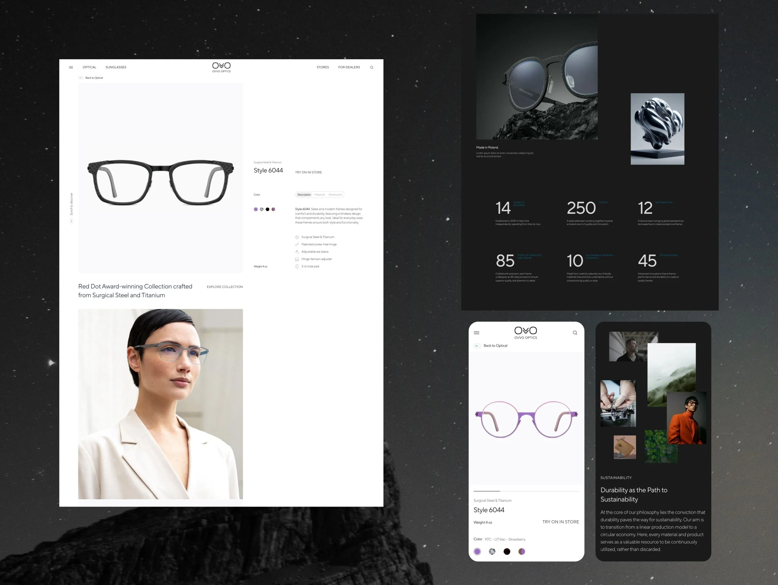
#7 Weak product pages that hurt conversions
Once the homepage sets the tone, the product pages have to seal the deal. But if they miss key details, users hesitate.
A weak product page is one of the fastest ways to lose a sale. We’ve witnessed online shopping sessions where users were interested but left because the page didn’t give them enough to decide.
People want to see the product up close. They want to know how it looks and how it works. If your images are blurry or don’t show real use (like a sofa in a living room), they’ll start doubting.
That’s not the only problem. Missing details, like ingredients or sizing, can stop someone from clicking “Buy.” And if they don’t trust what they read? They’ll look somewhere else.
Customers expect clear and honest information. If your product pages don’t do that, your successful ecommerce plan will fall apart, no matter how nice the visual aspects look. And data proves this.
As Baymard reports:
“50% of users shopping for beauty products needed ingredient details. If that info wasn’t there, they moved on to another product.”
📦 Product pages sell, or they don’t. WeCanFly works with fashion, beauty, and home brands to build high-converting PDPs that look great and work hard. Our services include:
- conversion rate optimisation
- Shopify App development
- Shopify speed optimisation
- Shopify site maintenance
- Shopify B2B/wholesale channel
- headless ecommerce development
#8 Forgetting to build trust throughout the ecommerce website
Even if your product looks great, people won’t buy if they don’t trust your store. That trust must be visible at every step.
Customers expect to see:
- return policies,
- clear shipping costs,
- and safe payment options.
If that information is hard to find, they leave. No second thoughts.
Your task? Add things that build confidence:
- visible reviews,
- security badges,
- SSL certificates,
- guarantees,
- and store policies in plain language.
These will answer doubts that stop sales.
It’s not only about trust during checkout. It’s about trust from the first click to the last. Every page matters.
As Shopify shared:
- 19% of users abandon their cart because they didn’t trust the site with their credit card.
- 16% leave when the return policy is not clear.
If your online shopping experience feels uncertain, you’re risking creating doubt where there should be action.
How do you secure your online store on Shopify?
#9 Clunky checkout and cart experience
Speaking of action, let’s have a look at your checkout experience.
People are ready to buy, and then your checkout page gets in the way:
- Maybe the form asks for too much.
- Maybe the shipping cost shows up last minute.
- Maybe the “Place Order” button is there, but it’s not clear what happens next.
All small things. All enough to make someone click away.
The problem isn’t always the price. It’s friction, mixed with a second of doubt. A page that loads too slowly and a field that throws an error without saying why.
And here’s the thing: customers expect this part to feel easy and predictable.
Keep in mind Shopify’s findings:
- 22% of shoppers left because checkout took too long.
- 17% left because they couldn’t see the total price in time.
You’re not losing sales because people don’t want the product. You’re losing them because the cart makes them work too hard.
Fix that.
Tips on solving high cart abandonment rates on Shopify
Now – picture all this on a small screen. If your site doesn’t work well on mobile, none of the above we’ve just covered matters. This brings us to the last mistake.
#10 Failing to optimise for mobile users
If your entire website looks fine on desktop but falls apart on a phone, that’s a problem. How big? Well, imagine that for Shopify stores alone, 80% of traffic comes from mobile devices.
People scroll fast. They tap with thumbs. They expect pages to load quickly and buttons to work instantaneously. When they don’t? They leave, often without even seeing your product.
You can check how many visitors use mobile in Google Analytics. For most ecommerce websites, it’s over half. Yet, we still see development services ignore the mobile version until the end. Or worse, treat it like a side task.
Text that jumps. Broken links. Half-hidden filters. These things kill conversions and trust.
And this isn’t guesswork. Shopify says: “More than 58% of global web traffic comes from smartphones and tablets.”
Conduct usability testing on mobile early, before launch. Because if it doesn’t work in one hand, it won’t work at all.
📈 Are you thinking of your own ecommerce redesign? WeCanFly is a Shopify Plus partner agency that’s helped brands like L’Occitane and Shoepassion grow faster. From full migrations to custom themes, we build stores that perform. Let’s talk about your needs now.

Over to you
Now you’ve got the list: 10 mistakes that can sink a redesigned site before it even gets a chance. Some are technical. Some are about content or structure. But all of them are fixable if you catch them early.
So, before you move pixels or rewrite website content, take a step back.
What do your website visitors actually need? What’s already working? What’s really broken?
Start there. Then build forward – with data, not guesswork. That’s how real improvement happens.
And for more insightful content like this, check out our blog.