

In this blog post

When people shop for home décor, they don’t always come with a plan. They browse. They imagine how a lamp would look in the corner or if a rug matches the sofa. Most of them leave without making a purchase. That’s where good store experience matters.
On Shopify, small changes in how visitors move through your shop can turn quiet browsing into real sales. It’s called conversion rate optimisation, or CRO. In this article, we share the top website design practices for optimising your store’s conversion rates.
What is CRO?
We like to think about a home décor shop on a quiet street. People step in, look at textures, touch fabrics, then walk out with nothing. Online stores see the same thing. Lots of visits. Few orders. Conversion rate optimisation helps you turn more visits into real purchases.
In simple words, CRO is the practice of improving how people move through your store. Small steps add up. Clear steps at each stage help a visitor pick a product and finish the checkout. Here is the basic math.
Conversion rate equals the number of transactions divided by the number of sessions. Then multiply by 100. If you record 1 transaction for 10 sessions, your conversion rate is 10 per cent.
You can track purchases. You can also track other actions that matter to you, like a newsletter signup or a loyalty join. In that case, you can count goals met instead of transactions. CRO is not only a number on a dashboard. It reflects how healthy the store feels to a visitor. It touches layout, image quality, page speed, and support. When these parts work together, more people finish their orders.
10 Best Shopify Home & Decor CRO Practices
From navigation, through product listings and filters, all the way up to how your checkout is designed, let’s see how you can get more people to convert in 2025 and beyond.
1. Navigation: help people move with ease
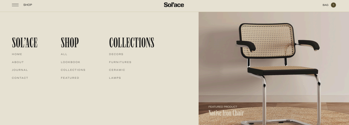
A good home décor store guides visitors gently, the way Sol’ace does. Its menu feels calm and open, with clear categories like Shop and Collections. Nothing competes for attention. Each word has space, and the structure helps people move from inspiration to products without effort. That’s the goal: navigation that feels invisible because it just works.
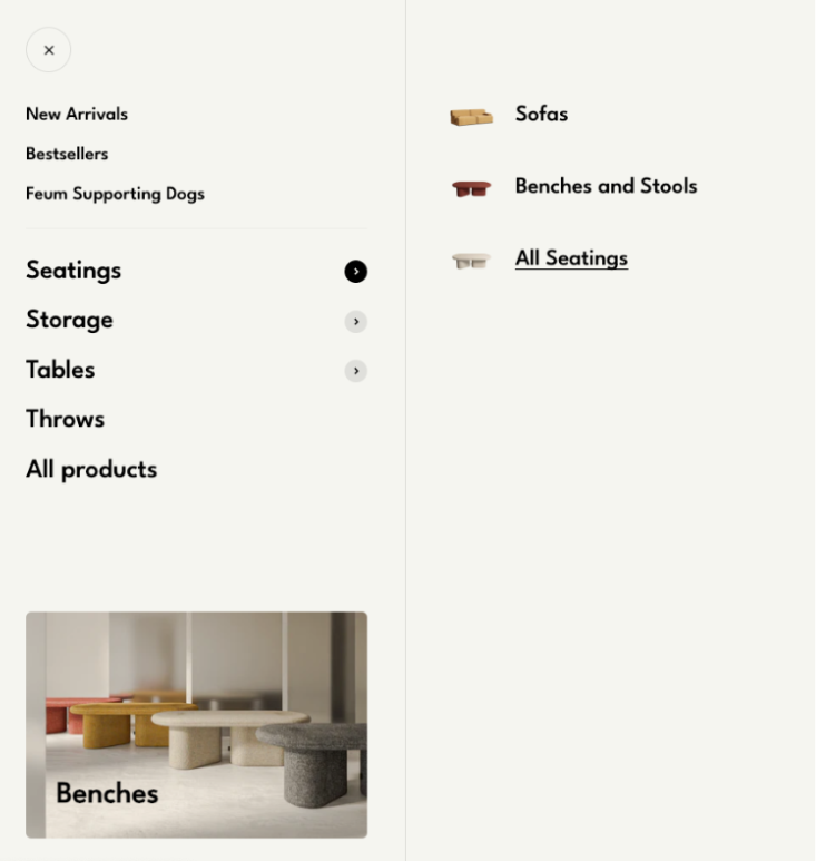
On mobile, take a cue from Feum. Their collapsible menu is clean and focused. When a shopper taps Seatings, only a few choices appear: Sofas, Benches and Stools, All Seatings. The rest waits quietly in the background. This makes it easy to explore even on a small screen.
Keep your top-level categories short, about five to seven at most. Put the most visited ones first, like Furniture or Lighting. Always keep a visible search bar for people who already know what they want. Clear menus create calm minds. When navigation feels smooth, people explore longer and reach the checkout more often.
2. Filters: help people find what fits their taste
Good filters turn browsing into discovery. They give shoppers quiet control, especially in stores with many products and styles.
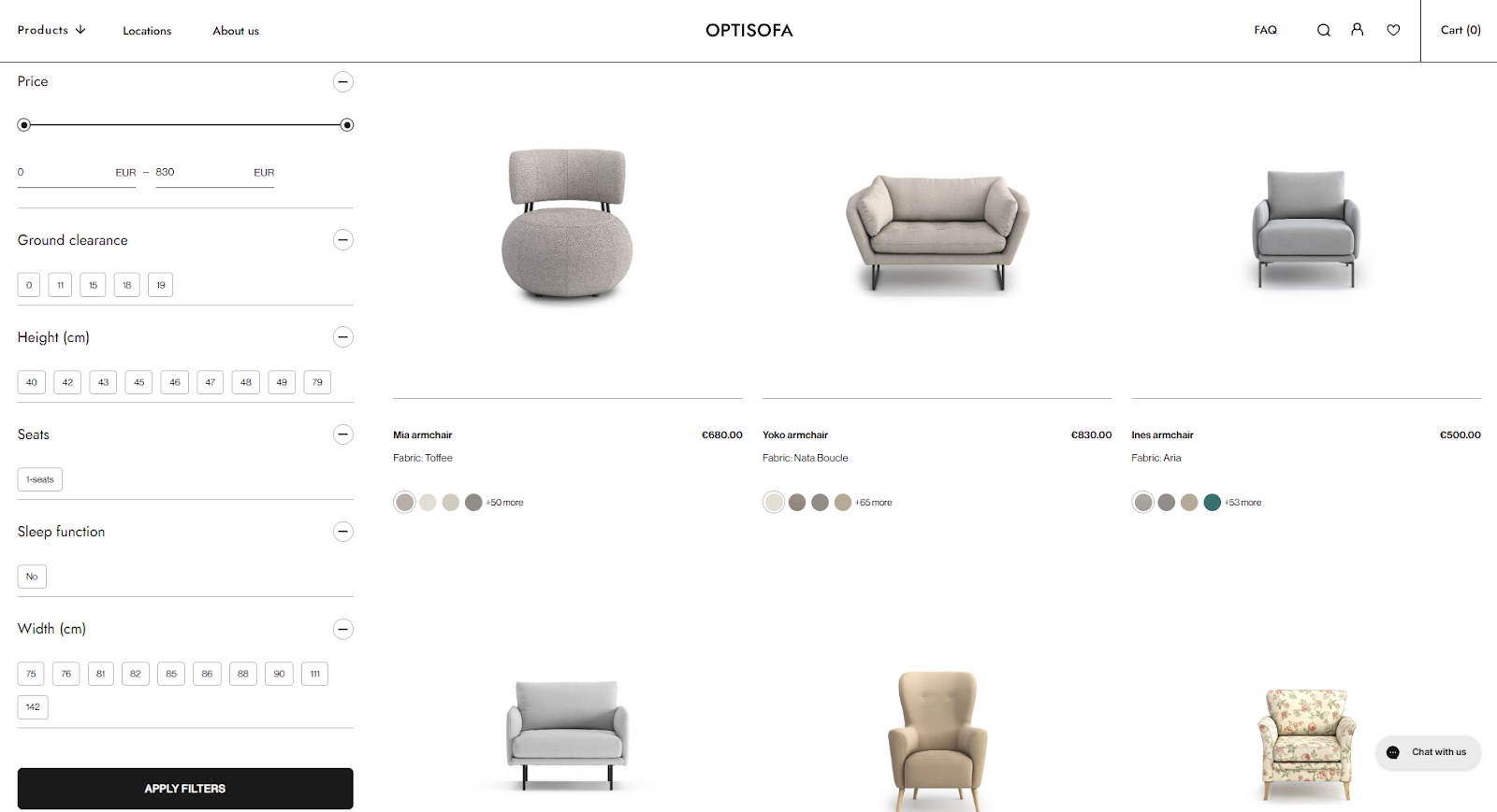
Look at Optisofa. Their collection page shows how structure can support choice. A visitor can adjust price, height, or width with sliders, tick boxes, or number fields. Filters appear on one side, clean and steady, while the products update in real time. This kind of layout helps shoppers narrow down what fits without losing sight of the bigger picture.
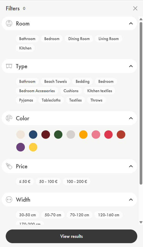
Noo.ma takes a more visual path. Their filter menu on mobile uses colour circles instead of text. It’s quick and fun as people recognise their favourite shade instantly. The filters expand and collapse with a tap, keeping the screen neat and focused.
When building filters, always think about how people shop. Let them combine a few options at once, like price and colour, and reset all with a single button. Show how many items match each filter so the shopper knows what’s left.
Good filters are quiet helpers. They don’t interrupt the experience but guide it instead. And when visitors can refine their search easily, they find pieces that truly feel like home.
3. Product listings: guide the eye, not overload it
A strong product listing lets the product speak for itself. It shows just enough to spark interest but never too much to distract.
Optisofa does this beautifully. Each item sits in its own space with a clear photo, short name, and price. Underneath, you see small colour circles showing fabric options. This quick visual cue helps shoppers imagine the product in their home without scrolling through endless menus. The balance between image and information keeps attention exactly where it belongs: on the furniture.
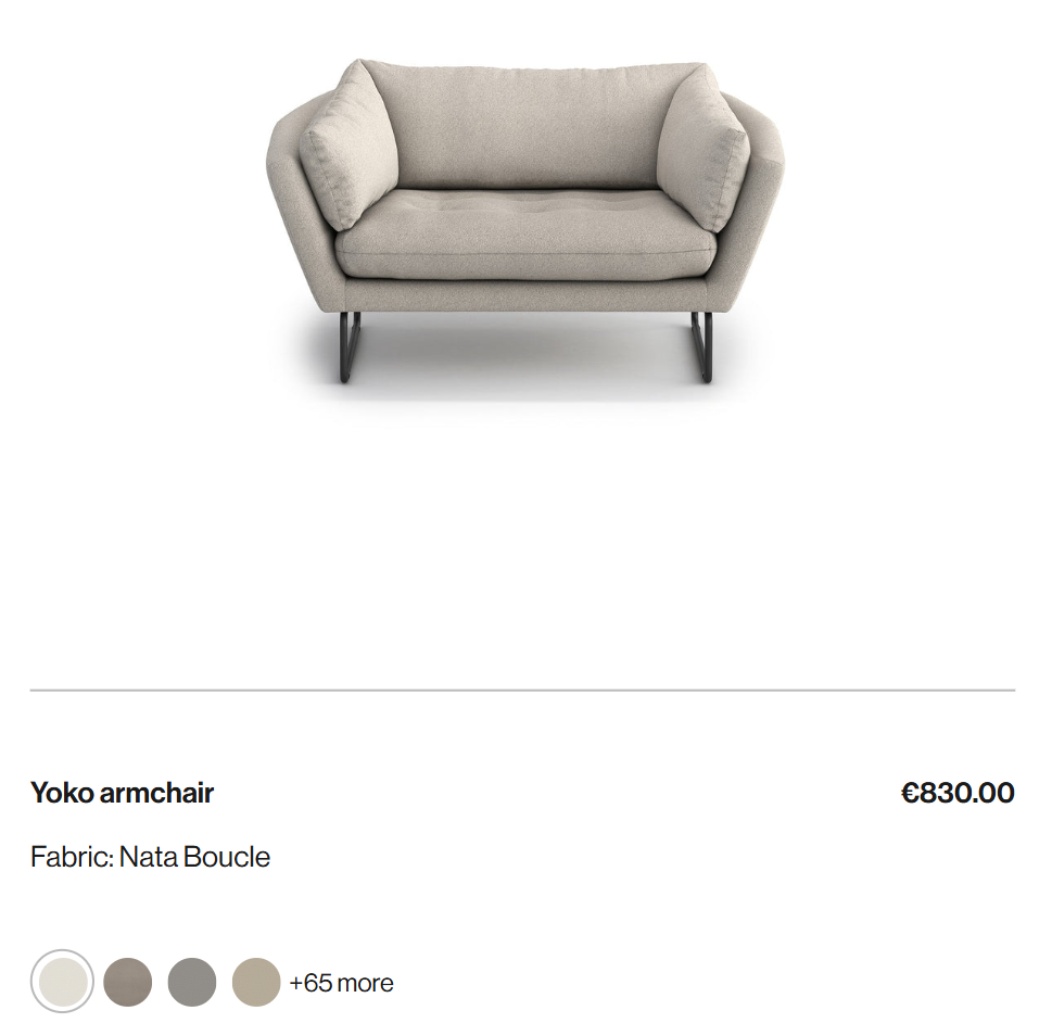
When shaping your own listings, keep that same clarity. Lead with the name, price, and one or two key details. Use colour swatches or icons to add speed and meaning. Add subtle hover effects to signal interaction.
Test how users react. Watch where they pause or click. The goal isn’t to fill every inch but to create a layout that feels like a quiet conversation between your store and your visitor.
4. Product gallery: let the images do the talking
In home décor, people buy with their eyes. A good gallery lets them explore textures, shapes, and materials as if they were standing in a store.
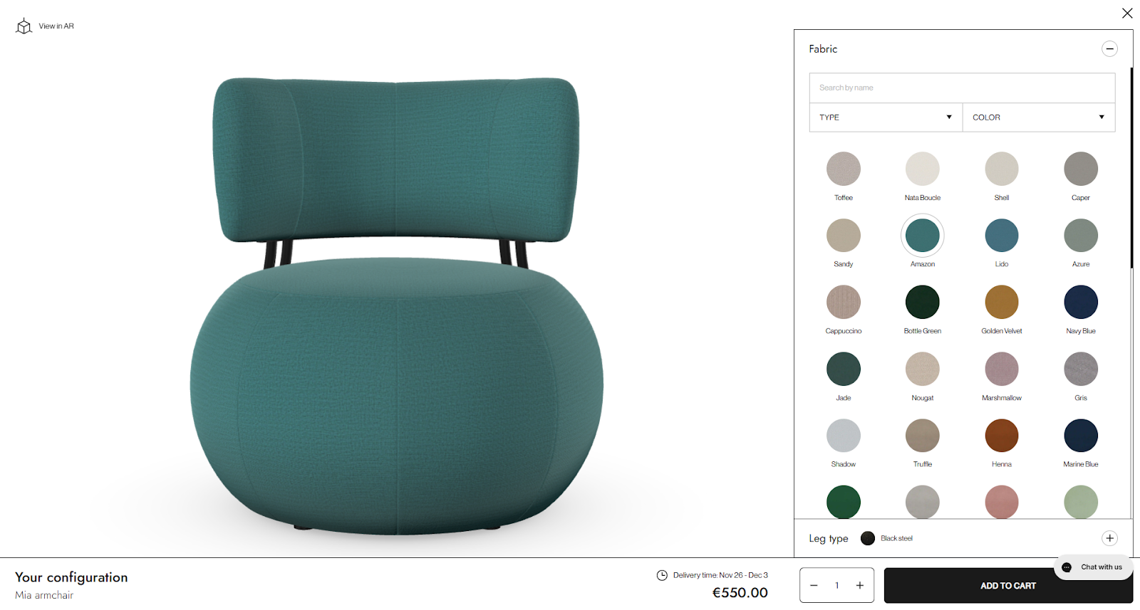
Optisofa’s Mia armchair page lets shoppers switch between dozens of fabric colours, instantly updating the image. The chair turns into a personal project where each click builds trust and ownership. The zoom feature and neat layout give space for details like stitching and surface texture. Every photo stays clean and quick to load.
Grado Design takes a lifestyle approach. Their gallery places furniture inside real rooms, showing how a table fits next to a sofa or how the lighting changes the mood. Multiple angles and close-ups make the product feel real and reachable.
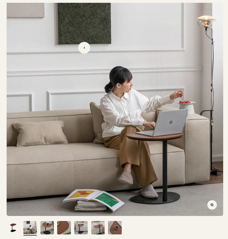
This is the best practice: mix clarity with emotion. Show the product from all sides. Use close-ups for material and structure. Add a video or a 360° view when possible. Let people zoom freely. A gallery should do more than show a product – it should tell a story that helps visitors imagine it in their own homes.
5. Add to Cart: make the next step clear
A strong “Add to Cart” section helps shoppers act fast. It shows all the details they need, but never too much to distract from the main action.
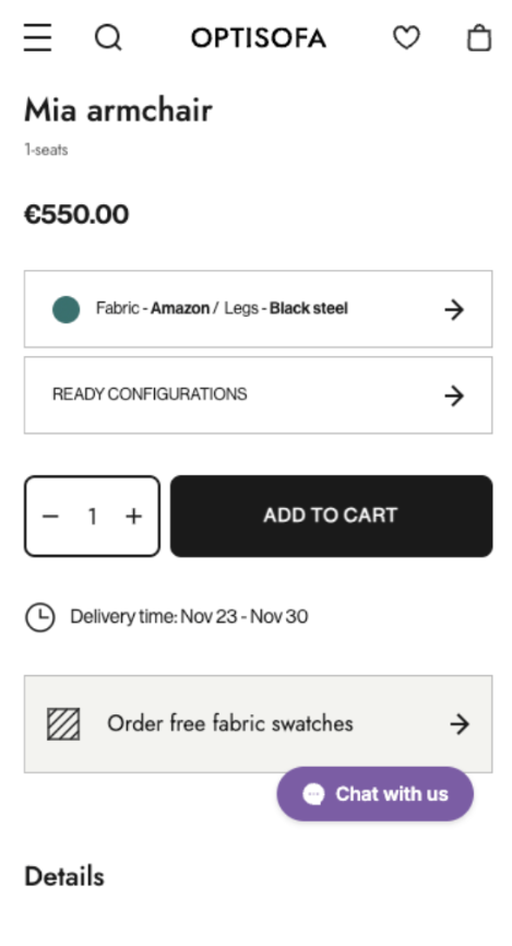
Optisofa shows how clarity builds confidence. The Mia armchair page keeps the name, price, and options in plain sight. Customers can pick fabric and leg colour right away, and the price updates instantly. There’s no guessing. The delivery time appears just below, reminding shoppers when to expect the product. The black button is large and direct. It also leaves no doubt about what to do next.
Feum adds a human touch to the same idea. The Cube Side Table page places colour swatches front and centre, along with shipping time and reassurance right below: Made in Poland, Free shipping, 100 days for return. These short, calm phrases work like a promise as they make the choice feel safe.

This is what every good “Add to Cart” section should do:
Keep the main action visible, the information short, and the message clear. Use colour contrast, so the button stands out. Show shipping, delivery, and trust notes nearby. A visitor who knows what happens next is far more likely to finish the journey.
6. Cart: keep the excitement alive
A good cart holds attention. It should stay visible, simple, and ready when the shopper is.
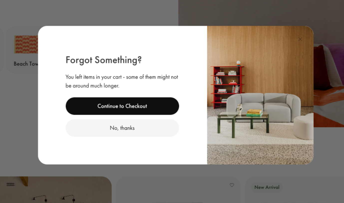
Noo.ma’s cart keeps things clean and focused: product images, names, colours, and prices all lined up neatly. Nothing feels hidden or messy. But the clever part is what happens when someone leaves. A gentle pop-up appears: “Forgot something?” It’s friendly and not pushy. With one clear button, “Continue to Checkout”, the customer is reminded to finish what they started.
This is a best practice worth following. Keep the cart easy to find on every page. Show totals, shipping information, and delivery times upfront. Add simple controls for quantity or removal. And if someone steps away, send a quiet reminder. A short message or exit pop-up can bring them back better than any ad.
When the cart feels organised and human, people don’t second-guess their choice.
7. Checkout: keep it short and calm
This is the finish line. People are ready to buy, but small hurdles can still break the moment. Your goal is a clean flow that feels quick and clear.
- Let guests pay without creating an account. Many shoppers do not want another login. Returning customers can move even faster with saved details for shipping and payment.
- Use simple forms. Labels should be clear. Real-time checks catch small mistakes like a missing ZIP code. Fewer errors mean fewer drop-offs.
- Show shipping choices with prices and delivery dates. Most people pick the first option that meets their needs when they see the timing upfront.
- Set billing to match the shipping address by default. Add a checkbox for a different billing address when needed.
- Include payment methods that suit your audience. Cards with familiar logos help trust. Digital wallets like Apple Pay, Google Pay, and PayPal speed things up on mobile. Buy Now Pay Later helps with larger carts. For global stores, add local methods that shoppers know.
- Keep a clear box for promo codes. Update the total right after the code is applied so people see the change.
- After the order is placed, show a confirmation page with the full summary. List the items, prices, shipping details, and payment status. Add a link to print or save a PDF.
- Send a confirmation email right away. Include the order number, delivery estimate, and a tracking link. It gives the shopper peace of mind and reduces support questions.
8. Mobile experience: make every tap feel easy
More and more people shop for home décor on their phones. They scroll during lunch breaks or while watching TV. If your Shopify store feels heavy or confusing on mobile, they’ll leave in seconds.
- Start with speed. Images should load fast, even on weaker connections. Compress them, but keep the quality good enough to show textures and colours clearly.
- Menus should stay small and simple. Use collapsible sections where a tap reveals the next level instead of showing everything at once. It helps the page breathe.
- Keep your “Add to Cart” and “Checkout” buttons visible as people scroll. A sticky button at the bottom of the screen keeps the next step close at hand.
- Text must be large enough to read without zooming. Forms should fit the screen, with easy taps between fields. Autofill for names and addresses can make checkout quicker.
In short, your mobile store should feel natural to explore. When each tap leads smoothly to the next, people shop longer and buy without hesitation.
9. Testing: learn from real visitors
No store is perfect from the start. What looks good on your screen might confuse someone else. Testing helps you see your store through your customers’ eyes.
Start small. Change one thing at a time and watch what happens. Try a different button colour, a new product photo, or shorter text. Then compare how people react. This is called A/B testing: you show one version to some visitors and another version to others.
You can also use heatmaps and session recordings. They show where people click, scroll, or stop. You might notice that visitors often miss an “Add to Cart” button or skip a section that matters.
Don’t guess. Let data guide you. When you learn what people actually do, not just what you think they do, it becomes easier to improve the store step by step. Each test gives you a small truth about your audience. Keep collecting them. That’s how you build a shop that fits how people really shop.
10. Speed and trust: the quiet power behind conversions
Even the best-looking store can lose sales if it feels slow or uncertain. People shop with instinct. When a page loads quickly and feels secure, users stay longer. When it doesn’t, they leave quietly.
Start with speed. Compress images, remove unnecessary code, and test loading times on both desktop and mobile devices. A one-second delay might sound small, but in eCommerce it can cost real sales.
Then, think about trust. Use clear payment icons like Visa, MasterCard, or PayPal near the checkout area. Add short lines about free returns, money-back guarantees, or safe payments. These small signs reassure shoppers they are in good hands.
Show reviews close to the products. A few honest opinions from past buyers help more than lengthy marketing text.
Together, speed and trust make visitors relax. When your store feels quick and dependable, people stop thinking about risk and start thinking about what fits their home.
Check this out: Shopify speed optimization services
What makes a good CRO strategy
A good conversion strategy starts with curiosity. You look at numbers, read patterns, and ask why people stop before buying. This kind of thinking turns a store from guesswork into progress.
Start with your analytics. Check where visitors leave most often. Is it during checkout? On mobile? After adding to the cart? Each clue points to what you should improve first.
Next, focus on the basics: speed, clear paths, and easy actions. Keep your store light and your pages friendly to every screen size.
Then, test. Change one thing, watch the results, and keep what works. CRO is never done because it grows as your audience changes.
When you treat your store like a living space that always adapts, you build a smoother experience step by step. That’s how small details turn into more finished orders.
Why CRO matters for eCommerce
Conversion rate optimisation isn’t only about higher numbers on a report. The typical ecommerce conversion rate in 2025 is just 1.81%, meaning fewer than two out of every hundred visitors make a purchase. CRO is about how people experience your store from the first click to the final order. A store that feels clear and quick helps visitors stay calm: one that loads in just 1 second converts up to 2.5 times more sales than one that takes 5 seconds. Small fixes, like a faster load or fewer form fields, can move your site above the average and reduce moments when people hesitate or abandon their cart.
CRO also makes your marketing budget work harder. Brands that focus on it can potentially see an average ROI increase, so more people buy from the same amount of traffic, letting you spend less to earn more.
And there’s another layer. Every improvement in CRO also builds customer trust. A faster checkout and honest reviews make shoppers more likely to return and recommend you.
For home décor stores, where beauty and emotion meet function, even a 1% conversion rate increase can add significant revenue - up to $100,000 on a $10 million store. CRO turns a simple visit into a story that ends with a “thank you for your order.”
Conclusion
Selling home décor online takes both creativity and structure. The beauty of your brand draws people in, but it’s the clear, thoughtful path that leads them to checkout. Conversion rate optimisation ties these two together and turns browsing into buying.
At WeCanFly, we understand that balance. As Shopify Plus experts, we help home & decor brands create stores that look stunning and perform even better. From navigation and speed to checkout flow and trust signals, every detail we build is backed by experience and data.
If you want your Shopify store to turn more visitors into loyal customers, our team is ready to make it happen. Get in touch with WeCanFly and see how small changes can bring big results.