

In this blog post

Clear Shopify product categories are a must for shoppers to move through your shop with confidence. Today, with so many merchants running several online stores at once, each collection page feels like a small aisle that guides visitors from one group of products to another. Calm visuals, tidy layouts, and simple structure make the browsing experience smoother.
We won’t surprise you by saying that cluttered or heavy pages push visitors away, while clear layouts and smart filters keep people on the site longer. Many studies also show that, even in 2026, navigation in online shops remains a weak point for most stores.
In this guide, you’ll learn about manual and automated grouping, collection structure, and the newest rules Shopify follows for building product categories that feel natural for visitors. Let's jump right in.
Why UI/UX matters for online store product collections
At wecanfly, we often see that visitors reach Shopify categories before they open any product page. These collection pages shape the first impression of the whole shop. When a page is messy or slow, people leave fast. Clean layouts, tidy lists, and fast loading help shoppers easily navigate and understand the product range. A well-organised collection encourages conversions and supports higher conversion rates across various sales channels.
Here are the points we focus on when checking the UI/UX of collection pages:
No dead ends
Intermediary pages should guide shoppers forward. A clear hierarchical structure helps people move from a main category to subcategories with ease.
These pages can also use internal links to highlight groups like women’s shoes or t shirts. A simple “View All” link stops visitors from feeling stuck and helps them move through all the products inside the product catalogue.
Visual clarity
Strong visuals support trust. A good featured image, short product descriptions, and organised lists help customers scan fast.
When pages look busy or inconsistent, shoppers lose trust and search engines may reduce the store’s visibility. Adding relevant keywords and SEO-friendly titles to each card also helps search results show the right items and supports customer behaviour patterns we track in sales data.
Check this out: Shopify SEO optimisation
Mobile friendliness
More people shop on phones every year. Responsive layouts, smooth lists, and light images help shoppers on small screens. This also helps menu items, such as the main menu, stay clear so people can move through product organisation steps without confusion.
Accessibility
Good headings, simple text, a readable category field, and keyboard-friendly menus help everyone browse. A clear checkmark icon for selected filters makes the experience even better.
When we refer to product attributes, we keep wording simple so the category assigned to each item is easy to understand.

Key elements of a winning Shopify collections page
There is no "perfect recipe" for a successful collections page in Shopify, but combining the following ingredients certainly will bring you closer to creating something deliciously effective:
Clear and intuitive navigation
When we review navigation during a Shopify usability audit, we always start by looking at how easy it is for people to move between groups. Good navigation helps visitors understand where they are and what they can browse next. At wecanfly, we often help merchants create categories that match common characteristics such as colour, season, or product type.
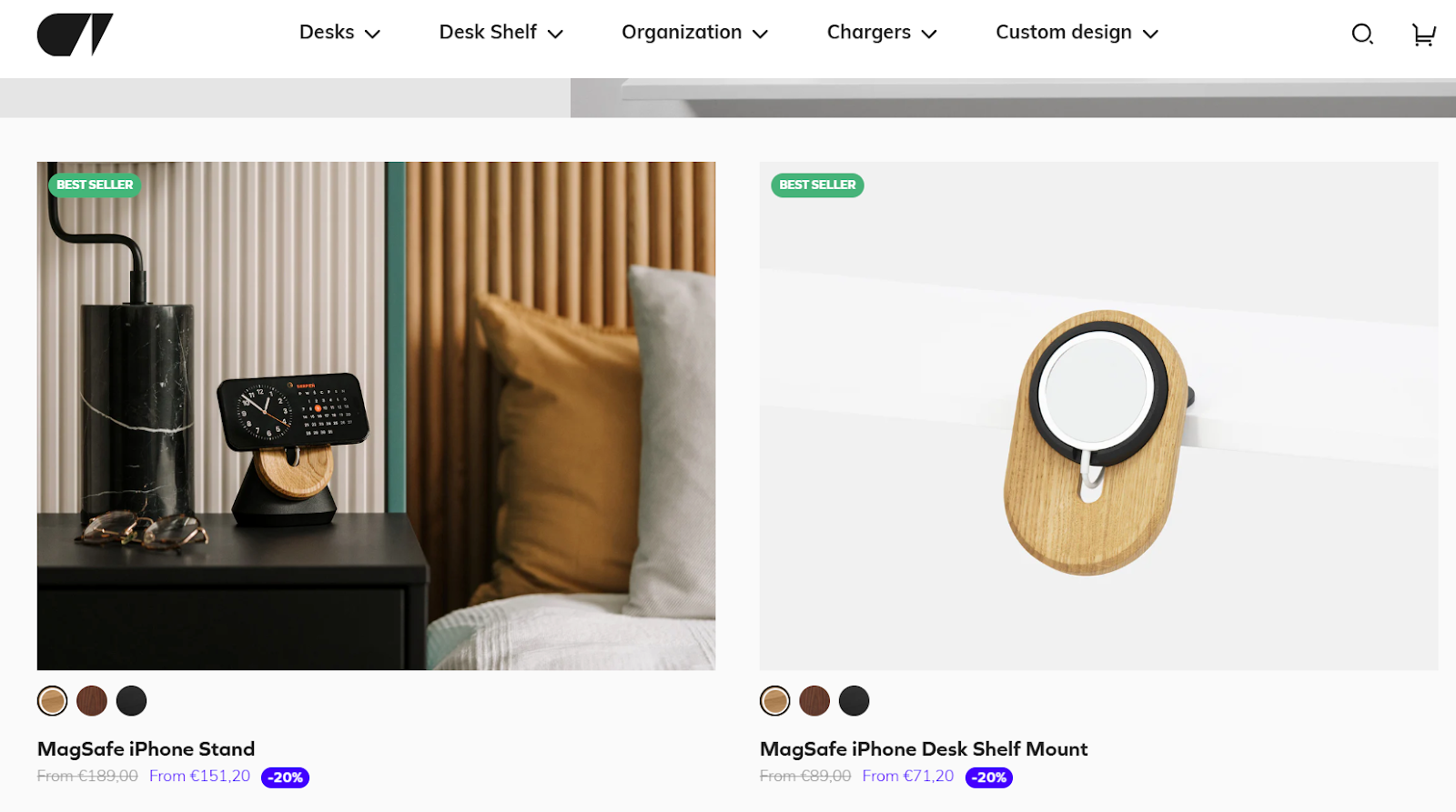
Oakywood is a strong example. On their MacBook collection page, the cards act like steady signposts with clean titles such as “Home Office Essentials.” Each block guides visitors into subcategories without confusion. This clear path supports the whole customer experience and helps people easily navigate, even when they jump between pages.
Inside the Shopify admin, merchants sometimes need to reorder menu items. In the product organisation section, you can drag menu items and click bulk edit when working with a standardised list for larger sets of product data. This keeps proper categorisation tidy, especially in shops with large product catalogues.
When categories share similar logic – for example, accessories that have shared characteristics – placing them close together creates a simple flow. A breadcrumb trail and short menu groups help visitors keep track of the following actions. Nothing feels lost or hidden, and this calm structure often lifts click-through rates.
High‑quality product images and thumbnails
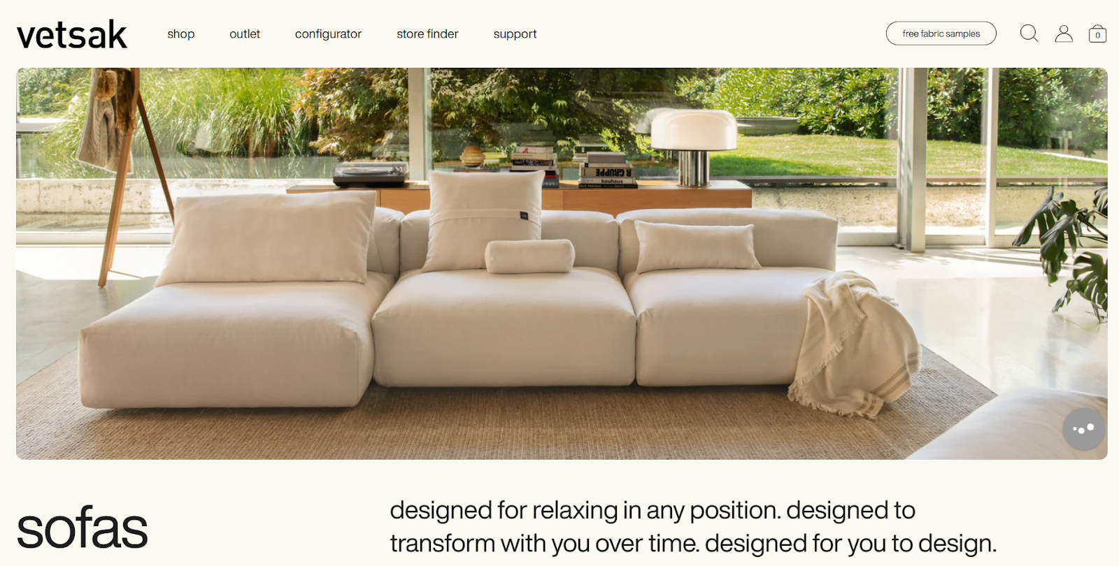
Clear images set the tone for the whole page. vetsak’s sofa collection is a great example. Their wide lifestyle shots work like a visual story, and each featured image communicates comfort without heavy text. For big categories, this style helps shoppers understand the product range quickly.
When we help clients with organising products, we remind them to keep one image ratio across the grid. This helps the page feel calm. Shops on other platforms often forget this, but Shopify supports simple setups here. Clean images reduce noise and make it easier to compare shapes or sizes.
Descriptive product titles and descriptions
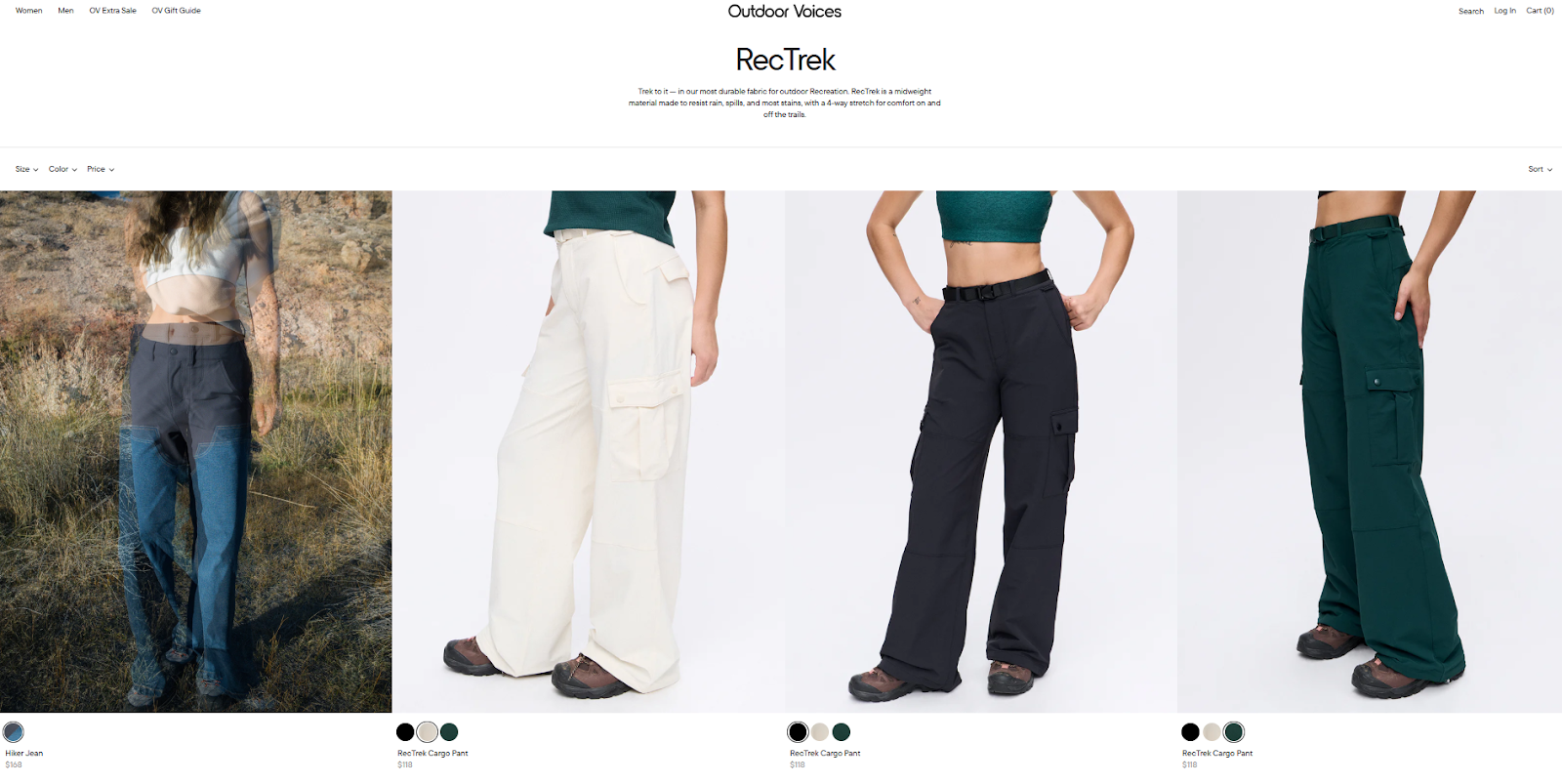
Short, clear titles help visitors understand an item before they open it. Outdoor Voices does this well in their women’s RecTrek collection. Each title shows the product type and the colour in a direct way. This helps shoppers skim fast and supports better visibility in search engines.
For merchants who like bulk changes, titles can be updated through a CSV file. This is helpful when you need product categorization at scale or when syncing with other platforms. When rewriting copy, we check that each line stays short and steady so nothing cuts off mid-word.
Relevant and helpful product filters
- Filters help users narrow results. Always add filters for price, rating, colour, size and brand.
- Seasonal collections might use a seasonal tag like “Winter 2025” or “Spring Sale.” For limited promotions, add a one-time flash sale filter.
- Sort options such as “Price: Low to High,” “Newest,” and “Bestselling” should appear at the top of the grid. Avoid default alphabetical order. Use a drop-down menu to house filter attributes and let users set custom ranges.
- On mobile, collapsible filter panels keep the interface tidy. Automated grouping depends on the collection's conditions – for example, adding products with a specific tag – so plan conditions carefully to have items automatically added.
Prominent calls‑to‑action
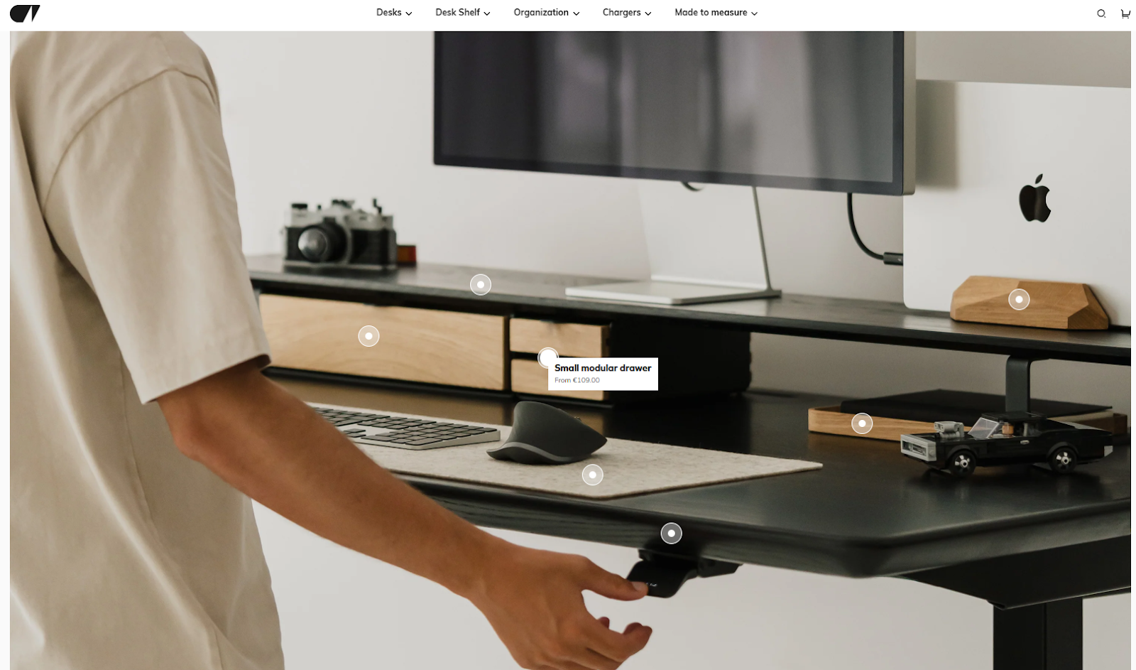
Clear calls-to-action guide visitors to the next step. On Oakywood’s MagSafe collection, the buttons are strong and easy to spot. They sit in open space, so the shopper knows instantly where to tap. This helps users stay focused and builds confidence in the page flow.
Small badges and price notes also help people compare items fast. These details matter when the shop tries to work on conversion rate optimization without heavy changes.
Related or recommended products
Kylie Cosmetics uses this on their page. The “You May Also Like” row stays short and shows items that match the main product’s shared characteristics, such as shade or finish. This keeps attention on the main item while still guiding the shopper to related choices.
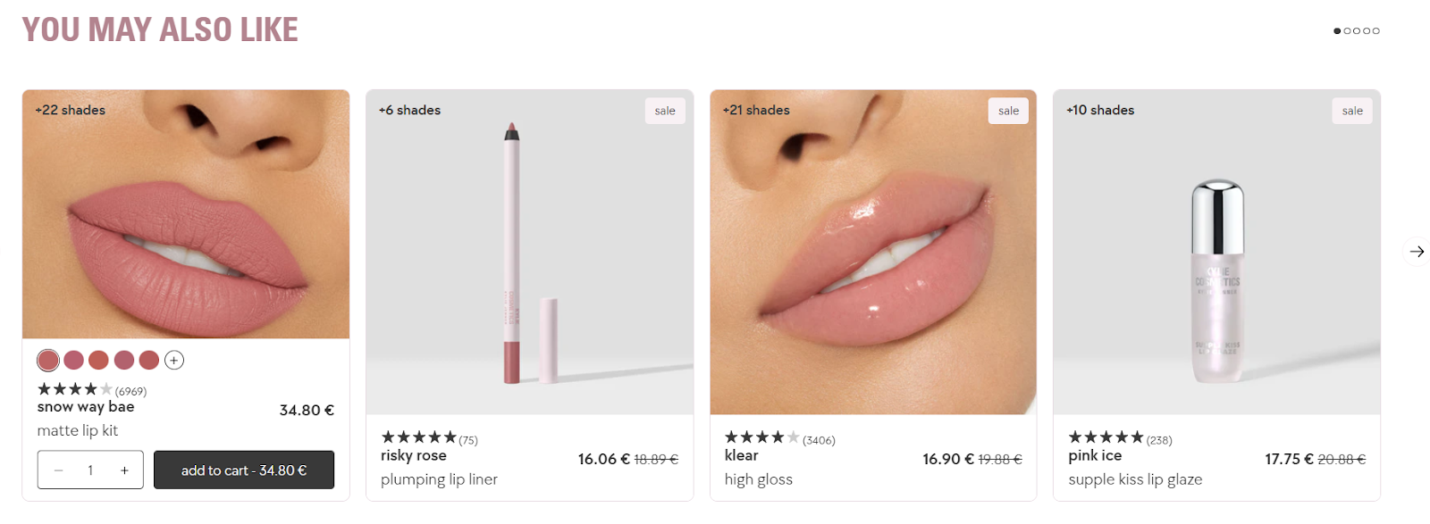
When we test this at wecanfly, we check that suggestions do not push the main product too far down the screen. The aim is to support the shopper, not distract them.
This also helps with reading sales data, because we can see how these small groups respond to customer behaviour.
Running a Shopify beauty store? Check out these top strategies to boost sales and conversions and learn how to run your business successfully.
Mobile responsiveness
Art of Play shows how strong a mobile layout can be. Their Playing Cards collection loads quickly, and the grid stays easy to read on a small screen. The filter button stays sticky, and the items do not stretch too tall. This works well for shoppers who scroll with one hand.
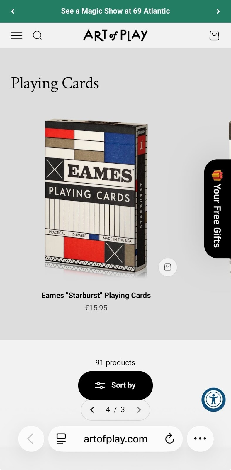
When merchants need a mobile-first setup, we often build new categories with shorter titles and tighter spacing. In some cases, a new template helps, especially when the shop sells many item types in one place.
A tidy mobile layout also keeps the category assigned to each product clear, helping navigation feel light even when the store has all the products spread across many branches.
Best practices for UX‑friendly product categories pages
Below, we share our best practices for the most UX-friendly product categories:
Keep layouts simple and consistent
When we work on layout reviews at wecanfly, we often think back to Optisofa’s Modular collection. Their page shows how a clean layout can help shoppers focus right away. Each module sits in an open space with a calm rhythm across the grid. The large white background helps each shape stand out, and the titles sit just under the items in a steady order.
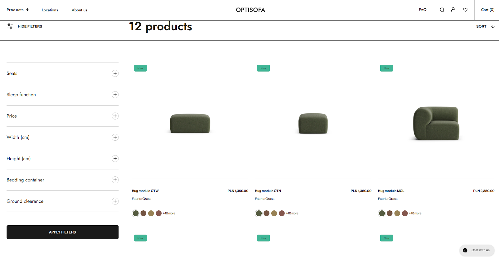
Their left panel shows filters in a simple, standardised list, and the items load in a tidy row so the shopper can scan without stress. This is helpful for stores with large product catalogues, because it keeps the view light even when there are many items to show. The layout is also friendly for organising products with shared characteristics, such as shape or size.
For merchants who want to adjust layouts later, Shopify gives tools like the product organisation section and simple steps to update a collection template without breaking the rest of the shop.
Develop a reliable navigation system
Clickable breadcrumbs and hierarchy‑based links let customers move up or jump to related categories quickly. We avoid infinite scroll and use “Load More” buttons or numbered pages so users aren’t overwhelmed.
Support the browser’s back button when shoppers go between the list and product pages. On desktop, we load around 100 products for visual collections and 50 for spec‑driven. On mobile, 15-30. Always include a progress indicator when new items load to give a sense of where the page stands.
Create robust product filters and sorting options
Art of Play illustrates strong filtering and sorting in their Playing Cards collection. Their filter button is easy to spot, and the sorting menu offers choices that match how shoppers think. The list includes “Best selling,” “Price: low to high,” and “Date, new to old.” This helps users shape their view based on customer experience patterns.
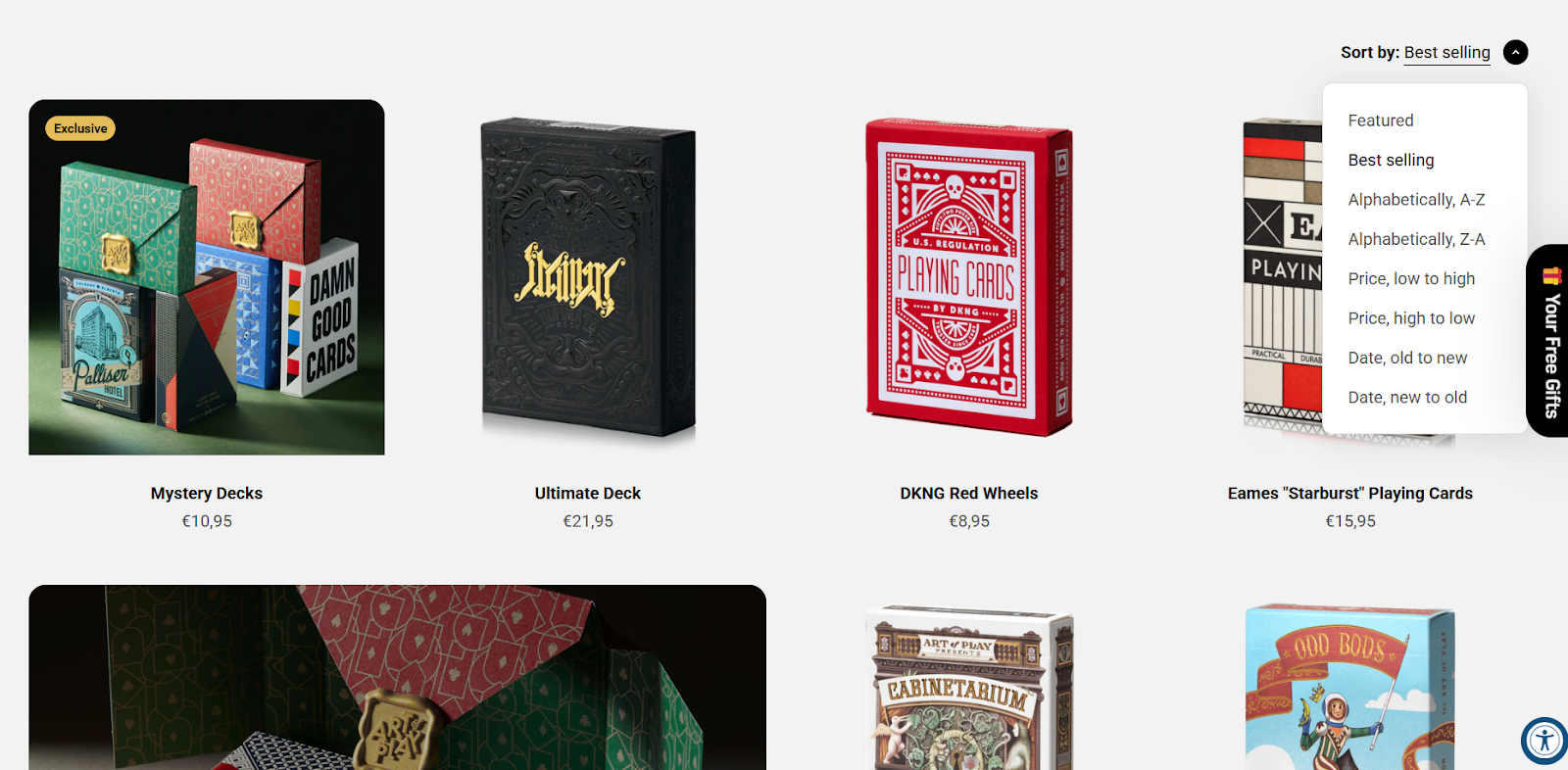
For merchants who need to tune filter groups, Shopify supports steps like using a product category column inside a CSV file, or using click bulk edit to update sets of items at once. These tools help maintain product categorization across many rows, especially when new styles arrive, and the shop needs new categories that stay neat.
Show social proof
Honey Pot’s “Find Your Ritual” page shows how social proof can comfort shoppers. Each item displays the star rating and review count right under the name. This small detail supports trust and helps people compare sets with shared characteristics like skin type or scent.
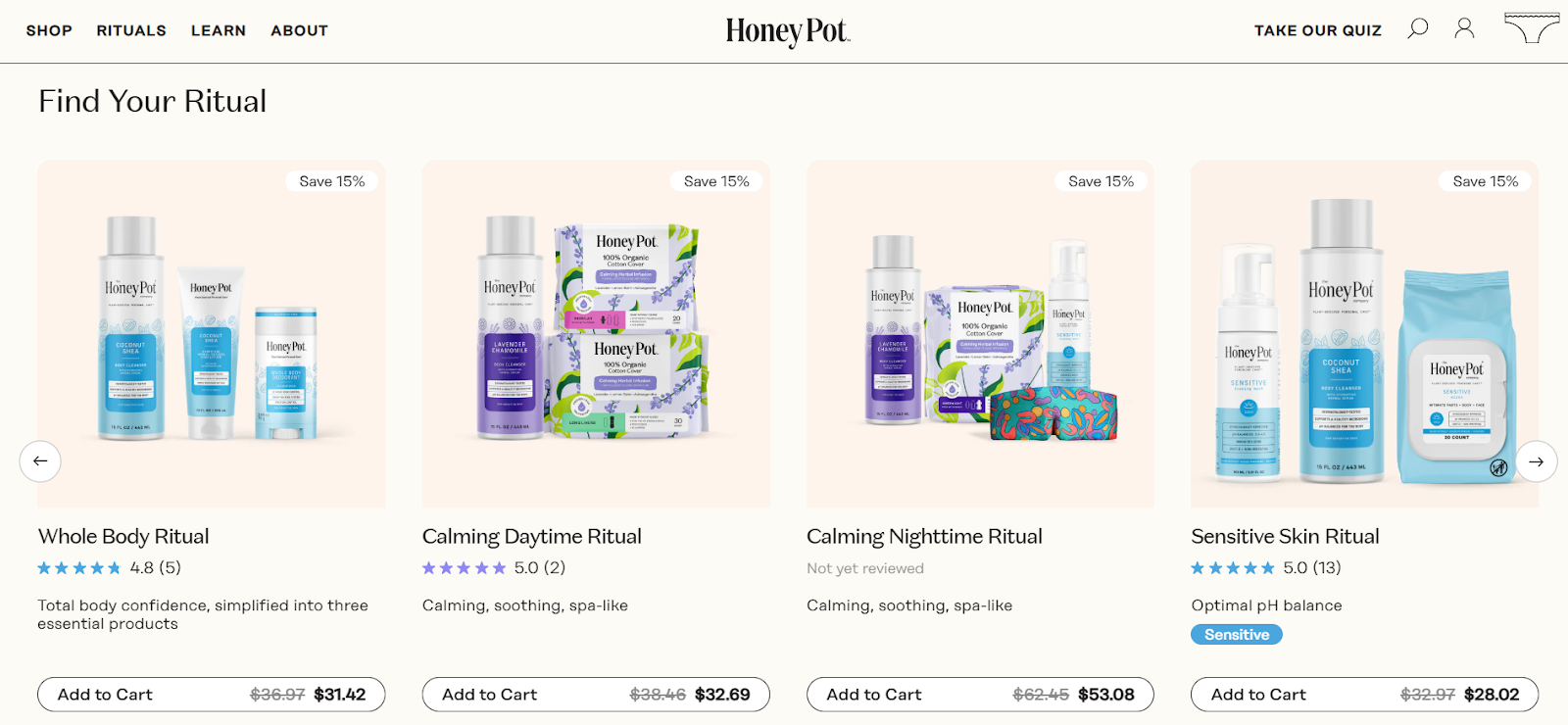
When we look at how shoppers move through a page like this, we see clear patterns in customer behaviour: items with reviews catch attention faster, and shoppers stay longer on them. These signals also help merchants read their sales data and plan improvements for future pages.
Make pages mobile responsive
Verve Coffee provides a strong mobile example on its All Coffee page. The filters button sits at the top where thumbs can reach it. The grid stays narrow and clear, and each card holds just the right amount of text. The layout keeps items within a small height, so scrolling feels smooth.
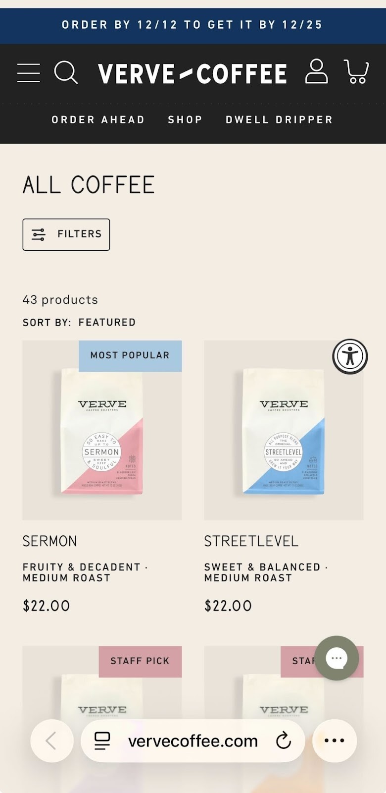
On mobile, every Shopify step must stay fast and simple. Forms, filters, and sort buttons should collapse into small icons, and items should follow a calm, straight path down the screen. When shops want to refine mobile layouts, we sometimes build a second template and refer back to it when testing. A good mobile structure helps users easily navigate and gives a steady flow, even for shops that show all the products in one place.
Understanding collection types
Shopify has two methods to group products: manual and automated.
Manual collections let you pick items yourself. It's great for smaller inventories or curated categories. We used a manual collection for a one-time flash sale, so we had full control over what appeared.
Automated collections rely on rules based on tags, prices, stock levels or vendors. They’re perfect for large inventories because products are automatically added when they meet the criteria. For example, a seasonal collection can pull in all items with a seasonal tag, saving hours when updating the catalogue.
Setting up collection conditions
- When creating a new automated collection, you set the collection's conditions, such as including products with the tag “holiday2025” or “under‑30”.
- With manual collections, you select products from your catalogue by drag and drop and click save when done.
The collection template you choose in your theme controls how the collection looks, and you can assign a different template to each one. Use descriptive names when creating collections, so other team members know their purpose. Once created, collections can be edited in the Shopify admin at any time.
Using the Shopify theme editor and tools
The theme editor in Shopify lets you customise collection and product layouts without coding. You can create a new template for a collection and assign it to a page, adjust the number of products per row or add sections like banners and testimonials.
- To change the layout, select the collection in the Shopify admin, open the theme editor and move the elements with drag‑and‑drop. When happy, click save. This workflow lets you experiment. For example, adding a left sidebar for filters or repositioning the products section.
- For more advanced changes, you can edit the liquid files directly (such as editing a page template to include extra links or a discount banner), but always make a backup before you edit code.
- When testing new features, set up a new page or duplicate your collection to avoid disruptions.
- Shopify’s analytics help you see how changes affect conversions and bounce rate. Keeping track of who is creating or maintaining each template helps the team stay organised.
You don't have time to design your own Shopify theme? Check out our Shopify Theme Development Services.
Conclusion
Building strong product collections is both a creative task and a careful, step-by-step process. When you shape clear navigation, use steady visuals, add filters that match how people shop, and keep layouts responsive, you help visitors move through the store with confidence. Manual collections work well for special drops, while automated sets help shops with wide catalogues stay organised. Clear rules and steady templates keep everything tidy across the whole shop.
At wecanfly, we support this work every day as a Shopify Plus Agency and through the help of our Shopify consultants who guide merchants through growth and long-term planning. Taking time to shape thoughtful collections often leads to better customer comfort, higher conversions and a shop that feels ready for the needs of 2026.
Contact us today, and let's take care of your Shopify product categories together.