

In this blog post

Your product pages either sell for you, or they quietly push shoppers away. Many store owners miss this point and then wonder why traffic does not turn into sales.
This article is written for you and your Shopify store. We will walk through the UI and UX features that help product pages guide shoppers from interest to action. These are lessons learned from real stores and buying behaviour. If your pages look fine but sales stay flat, the problem is often hidden in small details. If you want deeper help with structure, layout, and product page logic, professional Shopify website design services can change how shoppers interact with your store.
Now let’s break down what truly matters on a Shopify product page, and why your current setup might be holding you back:
What is Conversion Rate Optimization (CRO) and why is it important for an online store?
Conversion Rate Optimization, often called CRO, is about turning more visitors into buyers. You already bring people to your store. CRO focuses on what happens after they arrive. It looks at how shoppers read, scroll, click, and decide on your product pages.
For your ecommerce website, CRO means improving small page elements that influence buying actions. This includes product layout, content order, buttons, images, and trust signals. When these parts work together, shoppers move forward with less doubt and fewer pauses. Many store owners try to fix sales by adding ads or discounts. CRO takes a different focus. It helps your current traffic work harder for your business. Instead of guessing, you learn what pushes visitors to add items to the cart and complete a purchase.
If you want expert support in this area, shopify conversion rate optimization services focus on data, testing, and user behaviour. This approach helps your store grow without chasing more traffic, and it builds a stronger base for long-term sales.
The role of UI/UX design in creating high-converting product pages in Shopify
UI and UX shape how shoppers move through your Shopify store. They decide if visitors understand your products fast, or if they get confused and leave.
Good UI is about what people see. Good UX is about how they move, click, and decide. Together, they turn visits into sales. When UI and UX work well, your pages guide shoppers step by step. They know where to look first. They know what the product is, who it is for, and what to do next. This is how high-converting product pages are built. Poor UI/UX creates friction. Buttons blend in. Important details sit too low on the page. Shoppers must think too much before taking action. Every extra second of doubt lowers the chance of a sale. Your job is to remove confusion.
A Shopify usability audit looks at your product pages from a shopper’s point of view. It checks flow, clarity, and interaction points. This type of review helps you spot hidden blockers that stop visitors from moving forward, even when they like your product.
Ecommerce website redesign? Don't make these 10 mistakes.
Boosting conversion on Shopify product pages: tips for effective UI and UX design
Now we move from theory to action. This part of the article speaks directly to how your product pages should work in real life. Every click and scroll from a shopper tells a story. Your task as a store owner is to guide that story toward a purchase.
Think about how visitors land on a product page. They often arrive with questions and limited time. Your UI and UX choices should answer those questions in the right order. Not all at once, and not hidden behind confusing layouts.
The following sections break down the most important UI and UX tips for Shopify product pages. Each tip focuses on one clear goal: helping shoppers understand the product faster and move forward with confidence. Read each one as a checklist for your own store, and compare it with what you currently show on your pages:
#1 Create clear and high-quality product images and videos
When someone opens a product page, images speak first. Before reading text, shoppers study visuals to decide if the item fits their needs. This is why high-quality images sit at the centre of every strong product page.
Look at the Optisofa Loft Sofa page. You can see the sofa from the front, the side, and at an angle. There are also lifestyle shots that place the sofa inside a real room. This helps shoppers imagine the sofa in their own home. Images with pillows and tables give a clear size reference without extra explanation.
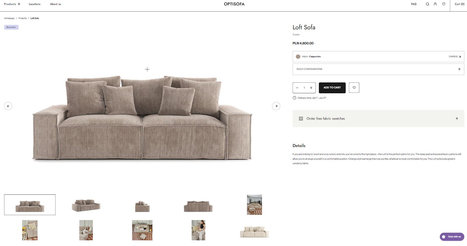
Your image gallery should include three to five visuals from different angles. Add close views for texture and materials. Add at least one image that shows the product in daily use. When scale is hard to judge, place common objects or people nearby so size becomes obvious.
Now compare this with the Outdoor Voices Exercise Dress page. The dress appears on real people, not mannequins. Shoppers can see how the fabric sits on the body and how long the dress is. This builds trust fast, especially for apparel and cosmetics.
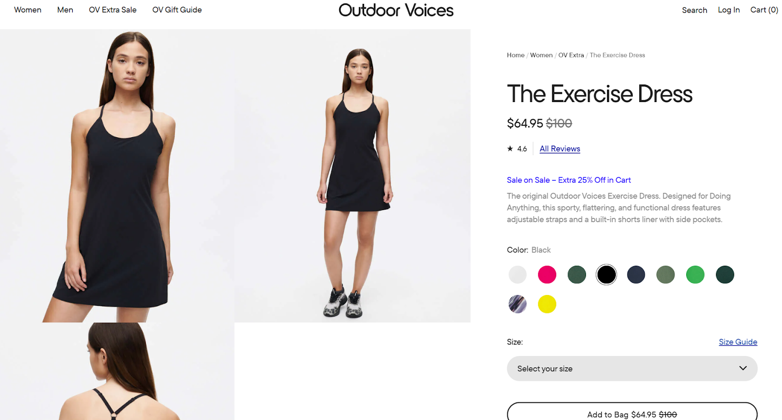
For clothing, showing the item on more than one model helps many shoppers. Different body types answer silent questions and reduce doubt. For cosmetics, visuals should show the product exactly where it is worn in real life. Lip colour on lips works better than swatches on skin.
Text and small graphic notes next to images also matter. Use them to point out pockets or hidden details that may not be obvious at first glance. This supports your visuals and keeps shoppers from guessing.
When your images do this job well, shoppers stay longer and move closer to the buy button without needing extra explanations.
Check this out: How to get my clothing brand noticed? Best practices.
#2 Prepare detailed and compelling product descriptions
Strong visuals catch attention, but text explains what images cannot. This is where detailed descriptions guide shoppers who want clarity before buying. Your product page should speak to both fast scanners and careful readers.
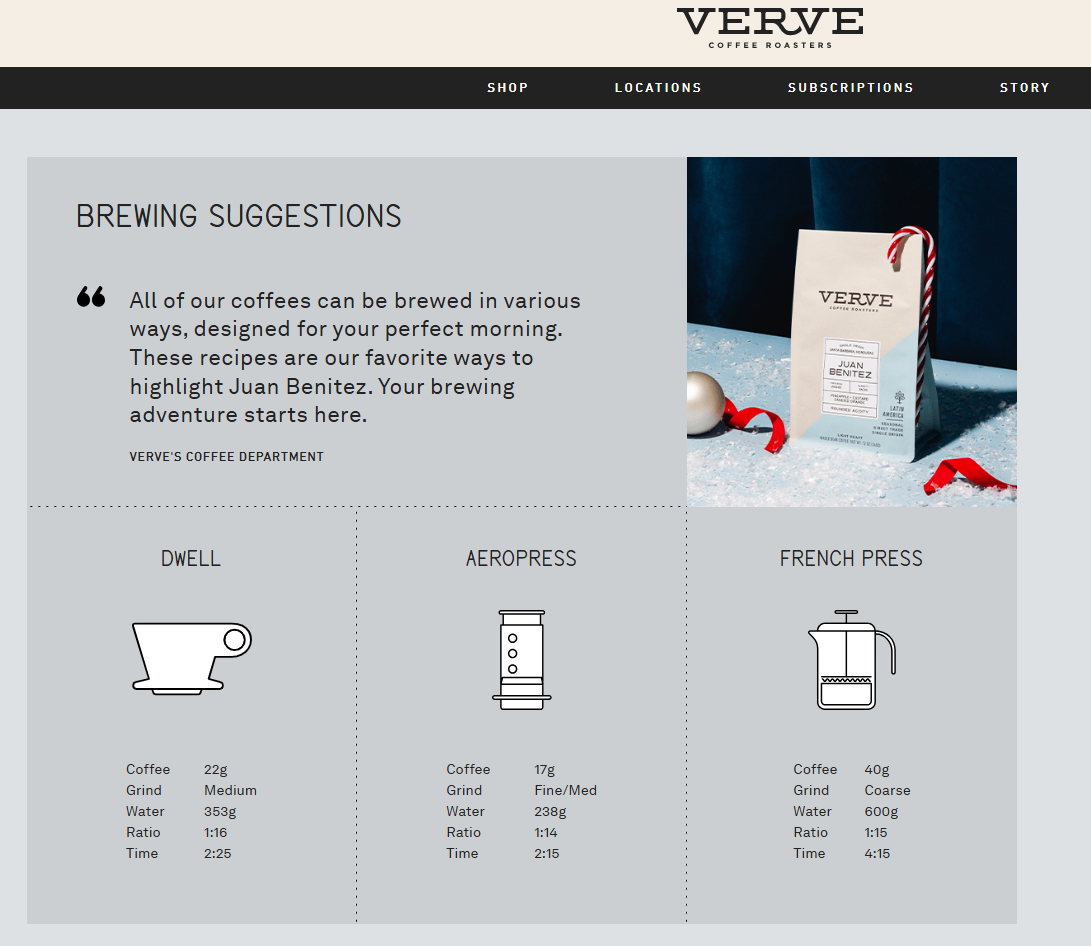
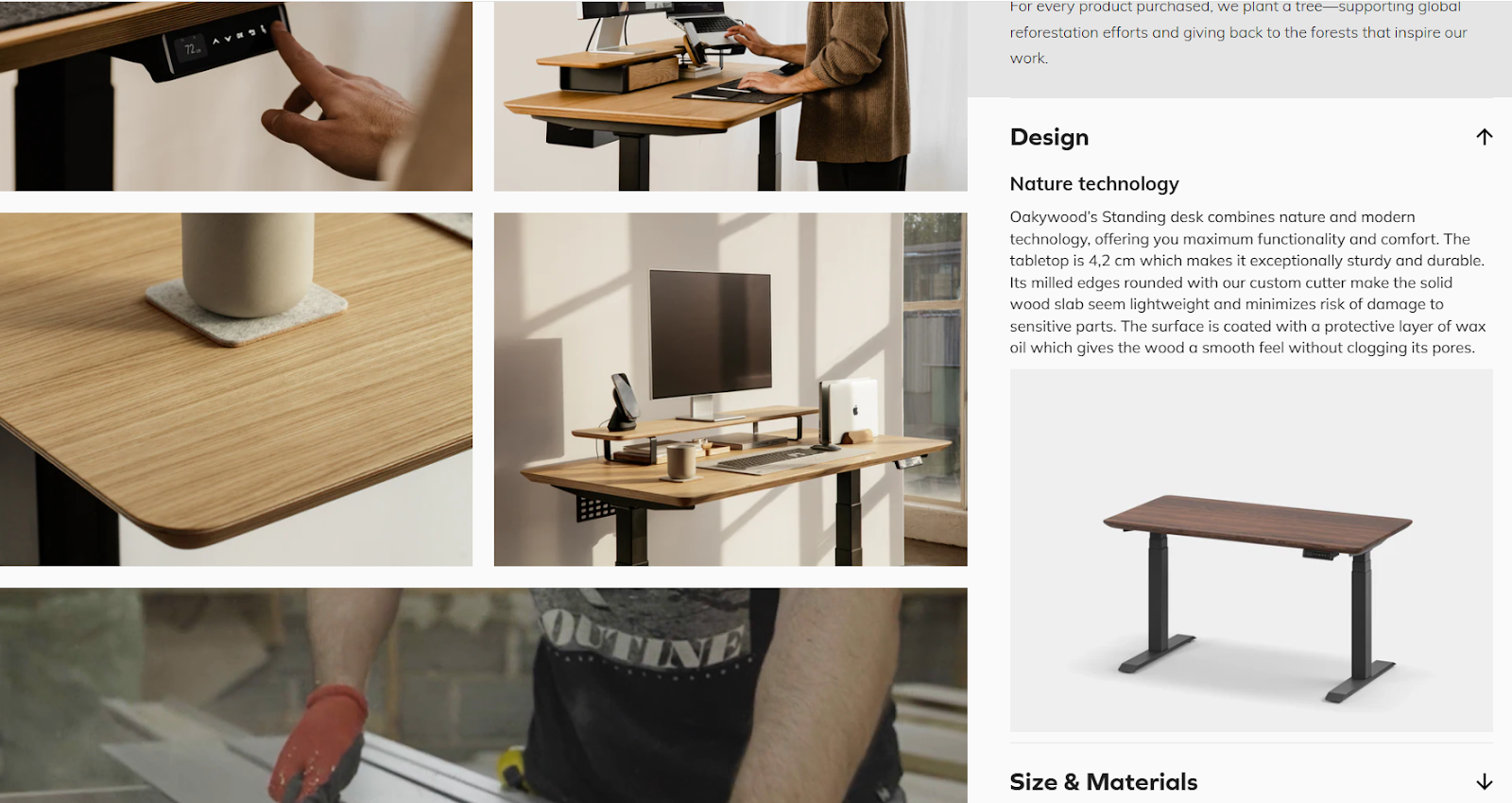
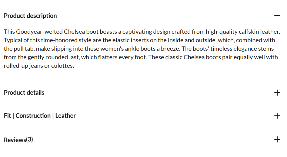
A smart layout here is Vertically Collapsed Sections. You see this clearly on the Verve Coffee and Oakywood pages. Each section has a clear title, such as brewing tips or materials. Even when collapsed, the content still exists on the page. This helps shoppers search the page and find exact details without frustration.
Look at the Verve Coffee example. The text explains taste notes and brewing methods shown in the visuals. If a shopper wonders why grind size matters, the description answers that question. Text supports the image instead of repeating it.
Oakywood follows a similar structure. The desk page keeps the same detail level across sections. Materials, surface finish, and daily use all get their own space. This consistency builds confidence, especially when you sell items of the same type.
Your text should mix short paragraphs and a comprehensive list. Paragraphs explain the product story and special traits. Bullet lists focus on facts such as size or care instructions. Clear spacing between these parts helps readers move through the page without effort. When every product of the same category follows this structure, shoppers learn how to read your pages faster. Less guessing means fewer doubts, and fewer doubts lead to more confident buying actions.
Check this out: 7 brilliant examples of furniture configurations.
#3 Build easy and intuitive navigation and user flow
When shoppers land on a product page, they should never ask, “What do I do next?”. Your navigation and flow must guide the eye naturally from top to bottom, with one clear action at the centre.
The Shoepassion Ella CB page shows a strong example of a focused product detail page layout. Instead of horizontal tabs, all information sits in vertical sections. This keeps the page easy to scan and avoids hidden content that many users never open.
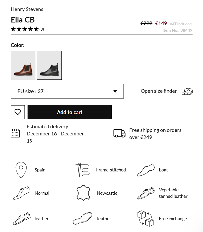
Notice the “Add to cart” button. It stands out clearly from every other button on the page. No other action competes with it. This visual priority tells shoppers what matters most at this moment.
The buy section itself stays clean. It includes only what is needed to add the product to the cart: colour choice, size selection, delivery timing, and price. Extra details, such as materials and reviews, sit below. This keeps decision-making simple and focused.
Customisation options, like size and colour, appear directly in the buy area. They are shown as visible choices instead of hidden drop-down menus. This helps shoppers see all options at once and reduces mistakes.
If your product requires many choices before purchase, consider reducing pressure at this stage. A single buy action that leads into a step-by-step selection flow can work better than crowding the page with too many controls. A clean flow respects the shopper’s time. When the page guides them calmly and clearly, moving forward becomes the natural next step.
Check this out: 10 essential Shopify design tips for beginnners.
#4 Create a mobile-friendly design for ecommerce Shopify product detail page
More than 50% of shoppers visit your product pages on a phone. This means your mobile layout must work perfectly from the first second. If users need to zoom, hunt for details, or jump between screens, many will leave.
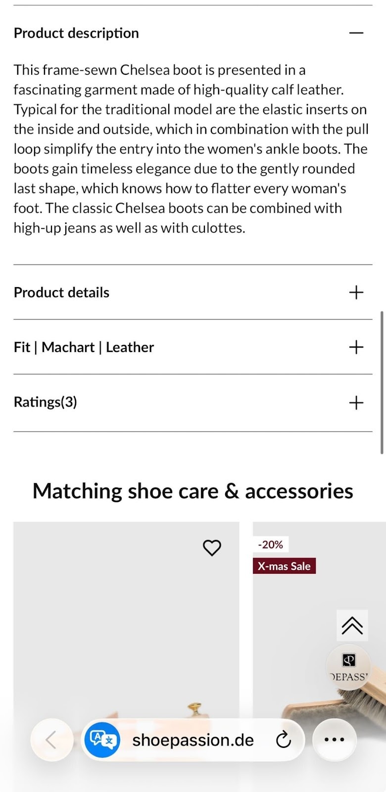
A strong mobile pattern is Vertically Collapsed Sections. You can see this clearly on the Shoepassion page. Key content like description and star ratings sits in stacked sections with clear titles. Shoppers scroll and move on without losing context. Nothing feels hidden or overwhelming.
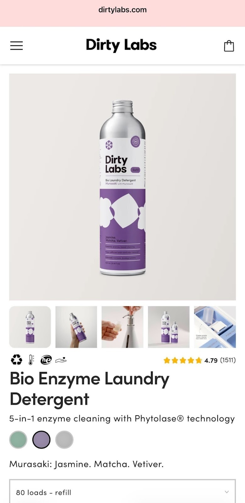
Dirty Labs shows another smart option. The page works almost like one long scroll. This fits products that are very visual and do not need heavy explanation. Images, colour choices, and the main action stay close together, which keeps attention high.
Avoid subpages on mobile. Sending users to another screen breaks focus and slows decision-making. If you truly must link to extra content, make it very clear that more information waits behind the tap.
One rule matters most: the main product image, thumbnail gallery, and colour choices should fit inside one screen view when the page loads. Shoppers should understand the product and its options without scrolling first.
Mobile screens differ in size and resolution. Test your pages on popular devices often. Small spacing issues or crowded sections can hurt clarity fast. When your mobile layout stays clean and readable, shoppers move forward with less effort and more confidence.
Check this out: How to sell footwear on Shopify? Best practices for great UX.
#5 Collect customer reviews and ratings for social proof and trust building
Reviews are one of the strongest trust signals on a product page. When shoppers hesitate, they look for proof from other buyers. This is where social proof does the heavy lifting for your store.
The Outdoor Voices product page shows this clearly. Reviews appear with star scores, written feedback, and real photos from buyers. Shoppers see how the product looks after real use. This builds confidence much faster than brand messages alone.
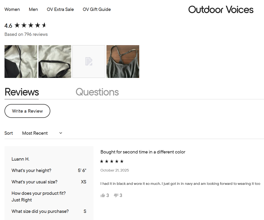
Let shoppers leave reviews without friction. Do not block review writing behind forced account creation. Some users simply want to share feedback quickly. Accounts can stay optional for those who want to track their activity later.
Images inside reviews matter a lot. Encourage customers to add photos by using small rewards or simple reminders. These photos show fit and wear over time in a natural setting. This gives future buyers insights that studio photos cannot show. Place user images next to the written review, and add filters so shoppers can view only photo reviews if they want. This helps fast decision-makers scan real-life results.
By default, show at least six reviews on both desktop and mobile. This number helps shoppers spot patterns instead of relying on a single opinion. At the same time, limit the number that appear at once – around fifteen on desktop and ten on mobile to keep the page readable.
When reviews are easy to read and rich with real content, they turn hesitation into confidence and push shoppers closer to checkout.
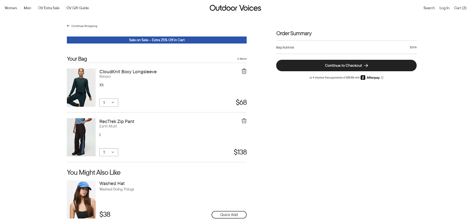
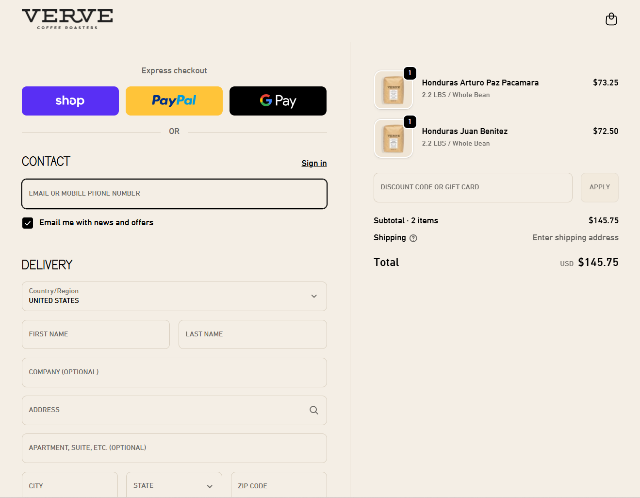
#6 Work on your cart in the shopping process
The cart is where many buying decisions are either confirmed or lost. Shoppers pause here to check prices and details one last time. Your goal is to remove doubt and keep the next step obvious.
Look first at the Outdoor Voices cart. Products are easy to recognise thanks to large images. Size and colour are visible right away, and prices sit close to each item. The main checkout action stands out clearly, while secondary actions stay quieter. This helps shoppers focus on moving forward instead of thinking too much.
Now compare this with the Verve Coffee cart. Coffee buyers often check details like weight, grind type, and quantity before paying. Verve places this information directly next to each product name. The order summary stays visible at all times, so shoppers always know the total. Express checkout options appear first for returning buyers, while the standard form remains clean and linear for new ones.
- Start with cart access. Place the cart icon in the upper-right corner of the header. Use a clear symbol with enough space around it so it never gets lost. Avoid text-only links.
- Inside the cart, separate the cart view and the checkout action clearly. Either show only the cart link in the header or make checkout visually different from browsing links.
- Show full cost details early. Item prices and extra costs should be visible. If some values are estimates, explain what they are based on.
- Use large thumbnails and show core details such as size or variant. Let shoppers adjust these directly in the cart to prevent errors.
- Quantity controls should react instantly. When a number changes, totals should update right away. If an item is removed, give a short undo option.
- Keep cart items saved across visits, even for users without an account. This matches shopper expectations and reduces frustration.
- Finally, link both product names and images back to the product pages. A clear, honest cart keeps shoppers confident and ready for checkout.
Check this out: 6 tips on solving high cart abandonment rates
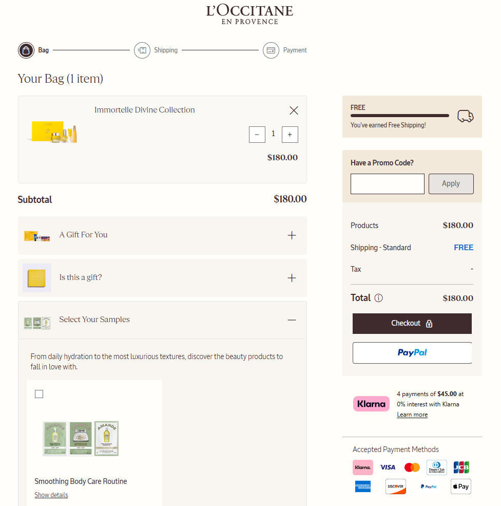
#7 Make checkout easy for purchase
Checkout is the last test before a sale. Shoppers already said “yes” to the product. Now your task is to help them finish without confusion or stress.
The L’Occitane example shows a calm and clear flow. Shoppers see where they are at all times: bag, shipping, then payment. Each step is visible and matches the real process. Nothing feels hidden, and nothing feels rushed.
- If your checkout uses several pages, show every step clearly. Make the review step easy to spot, and let shoppers change details like address or quantity without forcing them to go back and lose progress.
- If you use a single-page checkout, break it into clear sections. Contact details, delivery, and payment should feel separate, even when they live on one screen. Avoid side paths or pop-ups that pull attention away from finishing the order.
- The main action button must stand out more than any other button. Keep it in the same place on every step. Use short helper text on the button to explain what happens next, such as moving to payment or placing the order.
- Form layout also matters. Use one main column for fields. This keeps reading natural from top to bottom. Some payment or address fields can sit on one line, but only when it is easy to scan.
- Language should stay simple. Avoid technical terms or brand-only names during checkout. If a special term must appear, explain it in plain words so shoppers know exactly what it means.
When checkout feels calm and predictable, shoppers complete their order with confidence instead of second thoughts.
#8 Add related products and recommendations for cross-selling and upselling
Related items can raise order size, but only when they respect the shopper’s moment. At this stage, users are close to paying. Your role is to suggest, not to interrupt.
The L’Occitane cart shows a balanced approach. Recommendations appear below the cart summary, not in the middle of the main action. Shoppers can notice them without losing focus on checkout. Labels like “Customers are loving these” explain why the items appear, which keeps the section clear and honest.
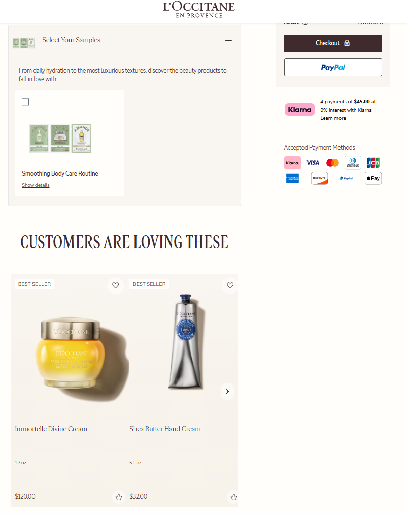
All promotions are visible by default. Free gifts, samples, or discounts are explained in plain text before anything is added. Nothing feels hidden, and shoppers stay in control because every extra is opt-in.
Never force users to accept or reject extra items before moving on. Do not block checkout with pop-ups or full-screen offers. Keep suggestions inside the cart or after the order is complete. Buttons tied to these suggestions should look quieter than the main checkout button.
Relevance matters more than quantity. Show only a few items that truly fit the main product. Adjust how many you show based on how closely they match the cart contents. Generic suggestions reduce trust and get ignored. When related items are clear and well placed, shoppers explore them calmly. This keeps the buying flow intact while still opening the door for higher order totals.
Check this out: Increase customer loyalty on Shopify with these 10 rewards apps.
#9 Build a user-friendly search bar for easy product discovery
Search helps shoppers who already know what they want. When it works well, it saves time and keeps users inside your store instead of leaving to search elsewhere.
The below Naturopathica example shows a clear and calm search experience. The search bar is easy to find, with strong contrast and a clear input area. Nothing around it pulls attention away, so shoppers can focus on typing and reviewing results.
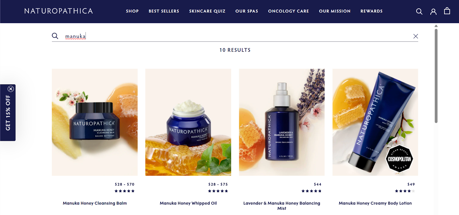
- Use clear boundaries around the search field. Add a visible submit action and placeholder text that stands out. Avoid banners or moving elements near the search bar. These distractions slow people down.
- Keep the search scope selector close to the search field. If shoppers want to switch between categories, they should do it in the same spot. A simple drop-down works best here because it stays familiar and easy to scan.
- Do not lock users into a narrow default scope. If search starts too specific, results may look empty or wrong. Let shoppers decide what they want to search through instead of guessing for them.
When search is clean, visible, and predictable, shoppers find products faster. This reduces frustration and helps users move smoothly from intent to action.
Check this out: Top Shopify beauty store startegies to boost sales and increase conversions.
#10 Insert quick view and add-to-cart buttons for faster checkout
Speed matters when interest is high. Some shoppers want details. Others want action. Quick view and add-to-cart buttons support both types without forcing everyone through the same path.
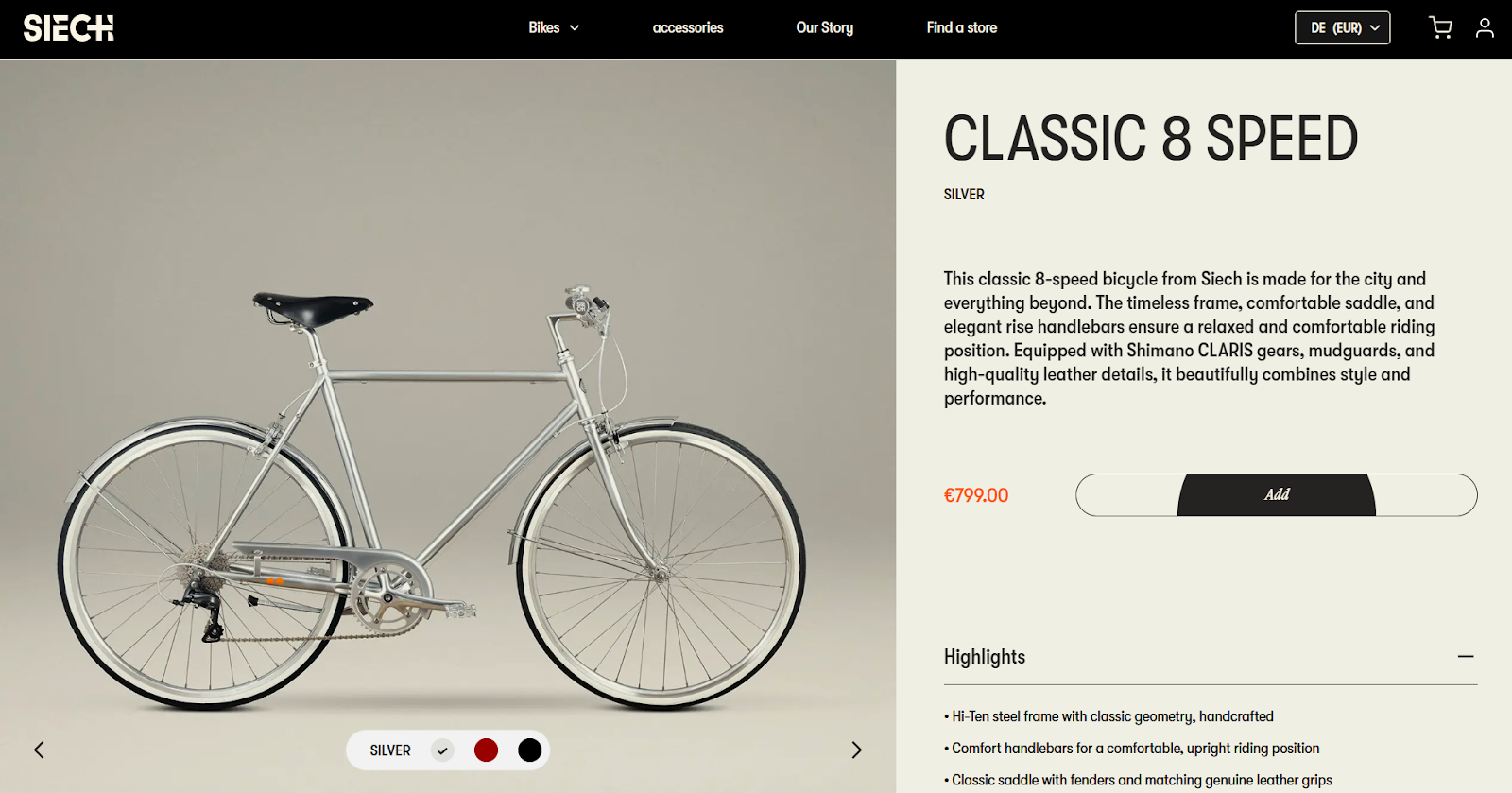
Look at Siech Cycles. The main action sits close to the product details and is easy to spot. Shoppers do not need to search for what to click next. This keeps momentum strong, especially for confident buyers.
- Place quick view and add-to-cart buttons near product listings or the main product area. They should stand out visually and stay within easy reach on both desktop and mobile screens.
- Use icons that are easy to understand. An eye icon works well for quick view, and a cart icon works for adding items. Add short labels so no one has to guess what each button does.
- Buttons must react well on touch screens. Size and placement should support tapping with one finger. If buttons are too small or too close together, mistakes happen.
- When someone opens quick view, show only what they need: images, price, short description, and available options like colour or size. Keep it light. If they want more details, guide them to the full page with a clear follow-up action.
- After adding a product to the cart, show immediate feedback. A small animation or confirmation message reassures shoppers that their action worked. Give them a clear choice to keep browsing or move to the cart.
These small interactions reduce friction and keep shoppers moving forward without breaking their flow.
How much does it really cost to run a Shopify store?
Transform your Shopify product pages with experts from wecanfly agency
Growing a store often means going beyond small fixes.
This is where a trusted Shopify Plus agency helps you rethink structure and flow on every new page. From using the theme editor in smarter ways to adjusting other elements like close-ups and a persistent sidebar, expert guidance saves time and wrong turns.
With support from experienced Shopify consultants, your store can tap into a strong template library, test tools like augmented reality, and decide when a paid plan truly fits your goals.
Insights shaped by work with each company’s founder help connect strategy with real business needs, not guesswork.
Don't hesitate - get in touch with us today.